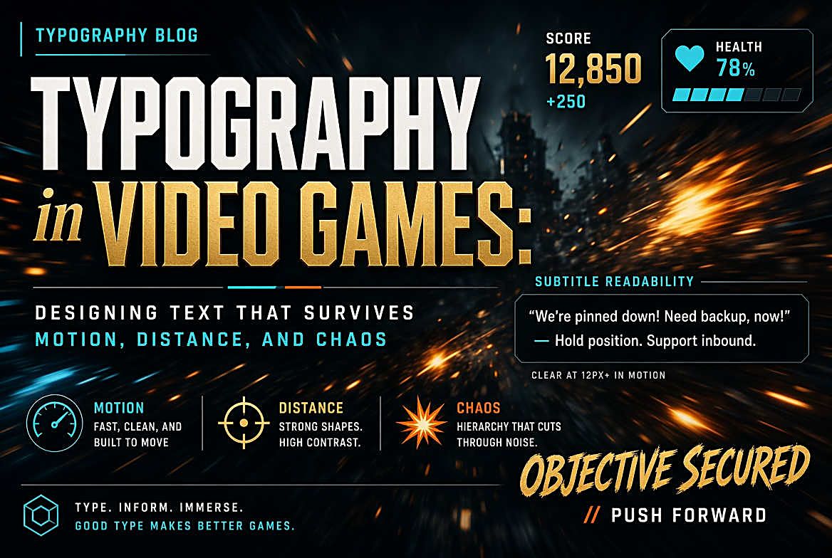
Game typography has to stay readable over an exploding building, at ten feet from a television, in twelve languages, while the player is being shot at. It is the most hostile environment type has ever been asked to work in.
Typography tips, font roundups, tutorials, and platform news.
Game typography has to stay readable over an exploding building, at ten feet from a television, in twelve languages, while the player is being shot at. It is the most hostile environment type has ever been asked to work in.
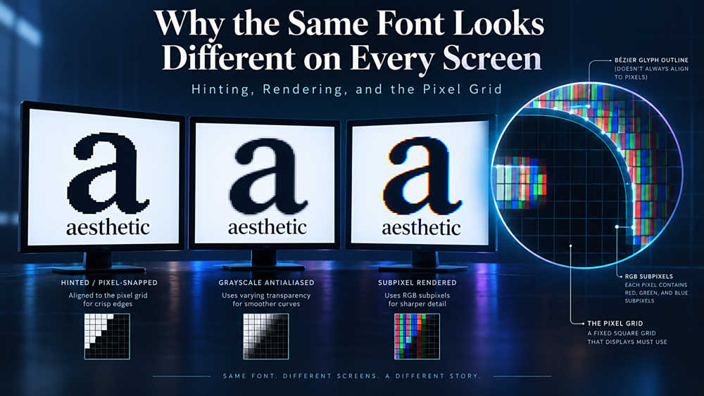
You picked one font, set one size, and shipped one stylesheet. So why does your site look crisp on Windows, soft on a Mac, and slightly wrong on your colleague's Linux laptop? The answer lives in the gap between a mathematical curve and a grid of physical pixels.
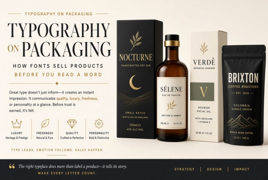
You have about 3 seconds to grab a shopper's attention on a store shelf. In that window, typography does more selling than any tagline or ingredient list ever could.
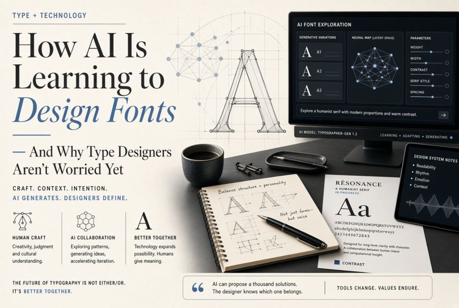
AI tools can now generate entire typefaces from a handful of sample glyphs. But the gap between "technically a font" and "a good font" reveals something important about what type design actually is.
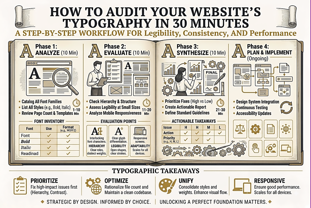
Your site probably has typographic inconsistencies you have never noticed โ redundant font loads, orphaned styles, accessibility gaps, and performance drains. Here is a fast, structured audit to find and fix them.
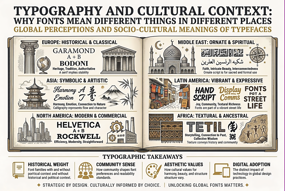
A font that communicates luxury in New York might signal formality in Tokyo and feel colonial in Lagos. Typography is never culturally neutral โ and designers who ignore this create work that miscommunicates.
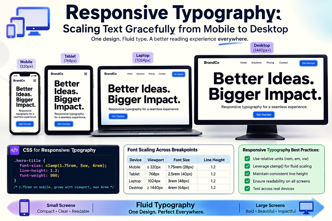
Setting font-size to 16px and walking away is not responsive typography. True responsive type scales fluidly with the viewport, maintains readable line lengths at every breakpoint, and adjusts its spacing and hierarchy dynamically.
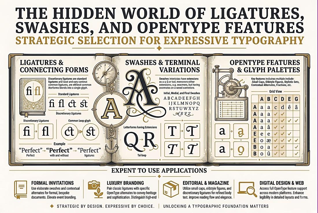
Most fonts contain dozens of alternate characters, special ligatures, and typographic refinements that are never activated because designers do not know they exist. Here is what is hiding inside your fonts.
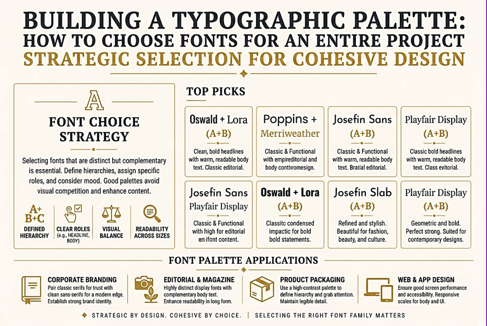
Choosing a font for a heading is easy. Choosing a coherent set of typefaces that work together across an entire website, app, or brand system is a fundamentally different challenge. Here is a systematic approach.
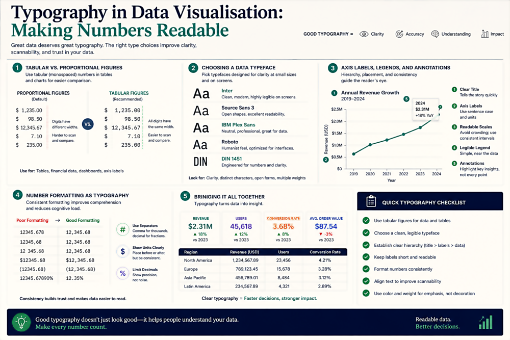
The fonts in your charts, tables, and dashboards are doing more work than you think. Bad typographic choices can make accurate data look misleading. Here is how to get it right.
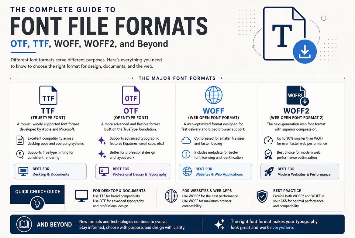
OTF or TTF? WOFF or WOFF2? EOT? SVG fonts? The number of font file formats is bewildering. Here's what each format actually does, when to use it, and which ones you can safely ignore.
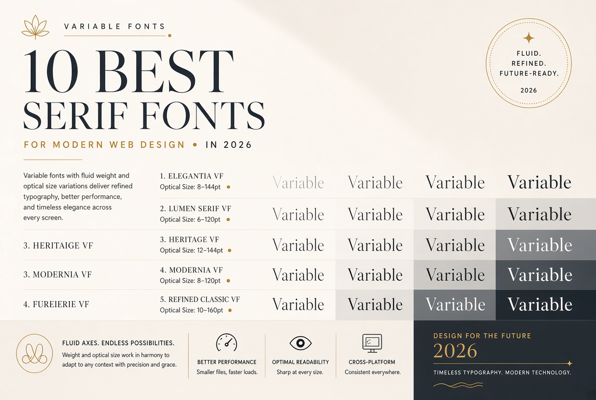
Serif fonts are making a strong comeback in web design. Here are the ten best options for giving your site a timeless, sophisticated feel.