
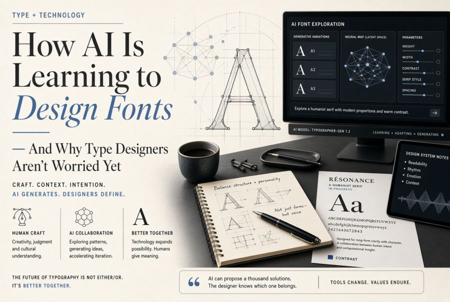
How AI Is Learning to Design Fonts — And Why Type Designers Aren't Worried Yet
The Pitch: A Complete Typeface in Minutes
Over the past two years, a wave of AI-powered font generators has emerged. Tools like Fontjoy, Prototypo's neural experiments, and a growing number of research projects from Google, Adobe, and independent labs promise to collapse what has traditionally been months of meticulous work into minutes. Feed the system a few letterforms — maybe just an "a," an "n," and an "o" — and it extrapolates the remaining glyphs, spacing, and even stylistic alternates.
The technology behind these tools typically involves one of two approaches. Generative Adversarial Networks (GANs) pit two neural networks against each other: one generates letterforms, the other evaluates whether they look like real type. Over thousands of iterations, the generator gets better at fooling the evaluator, and you end up with plausible-looking glyphs. The second approach uses diffusion models, similar to what powers image generators like Midjourney, but trained specifically on typeface datasets. Both methods can produce results that look surprisingly coherent at first glance.
Where the Output Falls Apart
The problem becomes obvious the moment you try to use an AI-generated font for real work. Type design is not just about drawing shapes that look like letters. It is about the relationships between those shapes — the optical corrections, the spacing rhythms, the way a lowercase "r" tucks under a following "a," the fact that a geometric circle actually looks wrong as an "O" and needs to be subtly adjusted. These are decisions that emerge from understanding how the human eye processes text at speed, and they are exactly the kind of nuanced, contextual judgments that current AI systems handle poorly.
Consider kerning alone. A professional typeface might contain 2,000 to 5,000 hand-tuned kerning pairs — specific adjustments for combinations like "AV," "To," and "fy" that would otherwise create awkward gaps. AI systems can generate baseline metrics, but they consistently miss the edge cases. A capital "T" followed by a lowercase "o" needs different treatment than "T" followed by "a," and both need to change again depending on the weight and width of the typeface. Professional type designers spend weeks on kerning tables. AI tools treat it as a secondary problem, and the results show in every paragraph of body text.
What AI Is Actually Good At
This is not to say AI has no role in type design. Where these tools genuinely help is in the exploration phase. A type designer sketching ideas can use AI to rapidly generate variations — what if this serif were heavier, what if the x-height were taller, what if the contrast were reversed? AI excels as a brainstorming partner, producing dozens of rough directions in the time it would take to sketch three by hand.
AI is also proving useful for extending existing typefaces. If a designer has completed the Latin character set and needs to add Cyrillic or Greek support, AI can generate a credible first draft that preserves the design DNA of the original. The designer still needs to refine every glyph, but starting from a machine-generated skeleton saves significant time compared to starting from scratch. Google's Noto project — which aims to cover every Unicode script — has explored this approach for the most under-served writing systems.
Another legitimate use is font restoration. Digitising historical typefaces from damaged specimens often means working from incomplete source material. AI can fill in missing or damaged glyphs by learning the patterns from whatever letters survive. The British Library and several European type archives have quietly used neural networks for exactly this purpose.
The Deeper Issue: What Makes a Font "Good"?
The real reason type designers are not panicking is that a technically complete font and a good font are vastly different things. A good typeface embodies intentional decisions about personality, readability, cultural context, and use case. Erik Spiekermann's FF Meta was designed to be legible on the terrible paper stock of German phone books. Matthew Carter's Georgia was drawn specifically for low-resolution screens in the 1990s. These constraints shaped every curve and every counter. An AI system generating fonts from statistical patterns has no understanding of purpose — it can mimic style, but it cannot design for anything.
There is also the question of originality. Most AI font generators are trained on existing typefaces, which raises both legal and creative concerns. If a model has been trained on thousands of commercial fonts, the outputs will inevitably echo those inputs. Some outputs land close enough to existing designs to raise licensing questions. More fundamentally, the outputs tend to cluster around the statistical average of what a "font" looks like, which means they are reliably mediocre — competent but characterless. The fonts that actually move the industry forward are the ones that break rules in deliberate, informed ways, and that requires understanding which rules exist and why.
Where This Is Heading
The most likely future is not AI replacing type designers but AI becoming another tool in their workflow — the way bezier curves replaced hand-cut punches but did not eliminate the need for people who understand letterforms. The designers who will thrive are the ones who learn to direct AI tools effectively: using machine generation for the repetitive, mechanical parts of the process while focusing their own expertise on the decisions that require taste, cultural awareness, and intentionality.
For everyone else — the non-designers who just need a font for a project — AI generators may eventually produce "good enough" options for low-stakes uses like internal documents or quick mockups. But for anything that matters to your brand, your readability, or your audience's experience, a typeface designed by someone who understands why each curve exists will continue to be worth the investment. The machines can draw letters. They cannot yet understand what letters are for.