
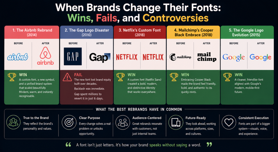
When Brands Change Their Fonts: Wins, Fails, and Controversies
A brand's typeface is often more recognizable than its logo. Change it, and you're changing something your customers recognize subconsciously every time they interact with you. The stakes are high — and the internet has strong opinions.
The Airbnb Rebrand (2014) — A Win
Airbnb worked with DesignStudio to create a completely new brand identity including a custom typeface called Cereal, commissioned from Dalton Maag. The font was warm, approachable, and slightly quirky — exactly right for a brand about staying in strangers' homes. The identity system won broad praise because every element — logo, color, font — reinforced the same emotional message.
The Gap Logo Disaster (2010) — A Historic Fail
Gap replaced its iconic blue-box logo with a new design featuring Helvetica and a small gradient box. The internet reacted with immediate and overwhelming hostility. Within six days, Gap reverted to the original. The rebrand cost an estimated $100 million in design and marketing spend and produced perhaps the most famous logo failure in retail history. The lesson: even technically fine typography can fail catastrophically if it abandons brand equity.
Netflix's Custom Font — Quiet Excellence
In 2018, Netflix commissioned Dalton Maag to create Netflix Sans, a custom typeface that has quietly replaced Gotham across the platform. The business case was simple: Netflix was paying substantial licensing fees for Gotham across billions of impressions. A custom font eliminated that cost while also creating a proprietary asset. Netflix Sans is deliberately understated — it's not meant to call attention to itself, but to work efficiently at every size from phone to living room TV.
Mailchimp's Cooper Black Embrace — Intentionally Weird
When Mailchimp did a major brand refresh, they leaned into Cooper Black — a chunky, 1920s display serif that reads as irreverent, even silly. For an email marketing platform trying to differentiate from cold corporate alternatives, the choice was genius. The unusual choice is the statement: we're not like those other companies.
The Google Logo Evolution — Slow and Invisible
Google replaced its modified Catull serif with Product Sans (a custom geometric sans-serif) in 2015. The change was deliberately gradual and the new font was distinctly unremarkable. That's appropriate for a company whose product is information retrieval — the logo should disappear, not compete with search results. The transition happened so smoothly that many users didn't consciously notice until much later.
What the Best Rebrands Have in Common
The successful font changes weren't necessarily the most beautiful choices — they were the most intentional ones. Each font change that worked served a clear strategic purpose: creating distinctiveness (Mailchimp), reducing cost (Netflix), expressing warmth (Airbnb), or signaling modernity (Google). Typography changes that fail tend to be cosmetic exercises without strategic grounding.