
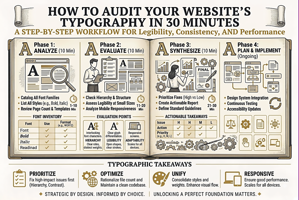
How to Audit Your Website's Typography in 30 Minutes
Why Audit Your Typography
Websites accumulate typographic debt over time. Designers and developers add fonts for new components without checking what is already loaded. A redesign replaces the heading font but leaves the old one in the stylesheet. A third-party widget injects its own font stack. Marketing adds a landing page with a "temporary" display font that is still loading on every page two years later. The result is a site that loads more fonts than it uses, has inconsistent sizing across pages, and presents accessibility issues that nobody has noticed because nobody has looked systematically.
A typographic audit is not a redesign — it is a diagnostic pass that identifies concrete, fixable problems. Most issues found in a typography audit can be fixed in a few hours of CSS cleanup and produce measurable improvements in performance, accessibility, and visual consistency.
Phase 1: Font Loading Inventory (10 Minutes)
Open your site in Chrome and go to the Network tab in DevTools. Filter by "Font" to see every font file the page loads. For each font, note: the filename, the file format (WOFF2, WOFF, or something older), the file size, and the source (your server, Google Fonts, Adobe Fonts, a CDN, or a third-party widget). Now ask these questions:
Are you loading fonts you do not use? Cross-reference the loaded fonts with your actual CSS. If a font file loads but no element on the page uses it, remove the @font-face declaration or the Google Fonts <link>. This is the single most common typographic performance issue. Are you loading multiple formats of the same font? If you are serving both WOFF and WOFF2, the browser will download only one, but the extra @font-face declarations add unnecessary complexity. For modern browsers, WOFF2 alone is sufficient. Are you loading weights or styles you do not use? Loading Regular, Italic, Bold, and Bold Italic when you only use Regular and Bold wastes bandwidth. What is the total font payload? Sum the file sizes of all loaded fonts. A healthy total is under 200KB. Over 500KB indicates serious optimisation opportunities. Over 1MB is a red flag.
Phase 2: Visual Consistency Check (10 Minutes)
Open five representative pages on your site: the home page, an interior content page, a list/archive page, a form or interactive page, and a page maintained by a different team or CMS user. For each page, inspect the following elements and note the font-family, font-size, font-weight, line-height, and colour: the main heading (h1), a subheading (h2 or h3), a paragraph of body text, a navigation link, a button label, and any captions or small text.
What you are looking for is unintentional variation. Is the h2 font-size 24px on one page and 28px on another? Is the body line-height 1.5 on the blog but 1.6 on the about page? Is the navigation font-weight 600 in the header but 500 in the footer? These discrepancies are usually the result of different developers working at different times without a shared style guide. Each one is small, but collectively they make the site feel subtly unprofessional.
Document every inconsistency. The fix is usually straightforward: define canonical values in a design token system or CSS custom properties file and replace the scattered hard-coded values with references to those tokens.
Phase 3: Accessibility Check (5 Minutes)
Check these specific accessibility criteria for your typography. Minimum font size: is any body text smaller than 16px? Text below 16px is difficult to read on mobile devices and may fail accessibility guidelines. Contrast ratio: does your text colour against your background colour meet WCAG AA requirements (4.5:1 for normal text, 3:1 for large text)? Use a contrast checker tool — many text/background combinations that look fine to young eyes with good vision fail the ratio. Text resizing: zoom your browser to 200%. Does the text reflow properly? Do any elements overflow, overlap, or become hidden? Font sizes in relative units: are your font sizes defined in rem or em (which respect user browser settings) or in px (which override user preferences)? Using px for font sizes prevents users who have set larger default text sizes from benefiting from their setting.
Phase 4: Performance Check (5 Minutes)
In Chrome DevTools, go to the Performance tab and run a page load recording. Look at the font loading timeline. When do fonts start loading? Fonts referenced in CSS do not load until the browser encounters an element that uses them — which means they can load late in the page lifecycle. For critical fonts (body text, primary headings), use <link rel="preload" as="font" type="font/woff2" href="..." crossorigin> in the document head to start loading them immediately.
Is there a flash of unstyled text (FOUT) or invisible text (FOIT)? FOUT shows the fallback font briefly before the web font loads; FOIT shows nothing until the web font loads. Neither is ideal, but FOUT is generally preferable because content is accessible sooner. Control this with the font-display property in your @font-face declarations: font-display: swap; gives you FOUT, font-display: block; gives you FOIT, and font-display: optional; uses the web font only if it loads almost instantly (best for non-critical decorative fonts). Every @font-face rule on your site should have an explicit font-display value.
This entire audit takes 30 minutes and typically surfaces 5-15 actionable issues. Fix them systematically, document the canonical values in a shared reference, and you will have a measurably faster, more consistent, more accessible typographic foundation — without changing a single design decision.