
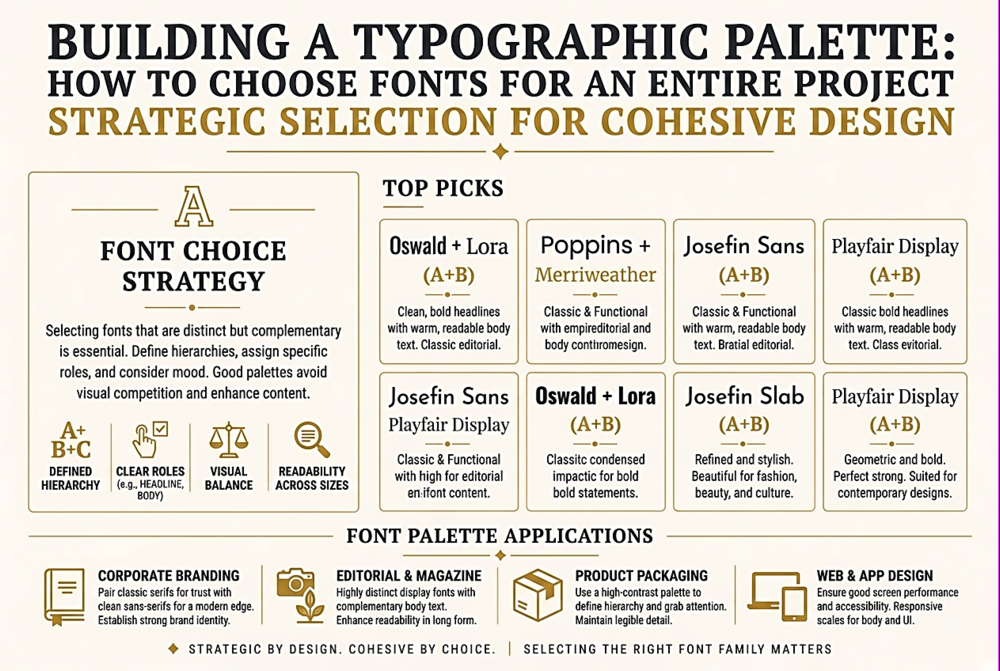
Building a Typographic Palette: How to Choose Fonts for an Entire Project
The Roles in a Typographic Palette
A comprehensive typographic palette for a digital project typically needs to fill five roles. Display/headline: the font used for large, attention-getting text — hero sections, page titles, marketing headlines. This is where personality and brand expression are strongest. Body: the workhorse font used for paragraphs, articles, and long-form content. Readability and comfort over extended reading sessions are paramount. UI/interface: the font used for buttons, labels, navigation, form fields, and system messages. Clarity at small sizes and quick scanability matter most. Data/tabular: the font used for numbers, tables, charts, and dashboards. Tabular figures and digit clarity are essential. Code/monospace: the font used for code snippets, terminal output, and technical content where character alignment matters.
Many projects do not need five different fonts — one or two well-chosen families can fill multiple roles. A superfamily like IBM Plex (which includes Sans, Serif, and Mono) can handle all five roles with a single design language. The point is to identify the roles first, then choose fonts to fill them — not to browse fonts and hope something fits.
Step 1: Define the Project's Typographic Personality
Before opening a font browser, answer these questions: What is the emotional register of the project? (Serious/playful? Corporate/personal? Technical/creative? Traditional/modern?) Who is the primary audience? (Age, technical literacy, cultural context, reading environment.) What is the content density? (Long articles? Dense dashboards? Marketing pages with minimal text?) What are the performance constraints? (Is this a high-performance web app where every kilobyte counts, or a brand site where visual richness is worth the weight?)
These answers will eliminate 90% of available fonts before you look at a single specimen. If the project is a medical information portal for elderly patients, you need maximum legibility, generous sizing, and zero ambiguity — which eliminates display fonts, compressed fonts, and anything with stylistic quirks. If the project is a creative portfolio, you have permission to be expressive with display type — which opens up hundreds of characterful options. Defining constraints is more productive than browsing possibilities.
Step 2: Start with the Body Font
Counter-intuitively, the best starting point is not the headline font (where most designers begin) but the body font. The body font will carry the most text, be read for the longest duration, and impose the strongest constraints on what pairs well with it. A body font with unusual proportions, distinctive letter shapes, or a strong personality will limit your headline options. A neutral, well-crafted body font gives you maximum flexibility for the rest of the palette.
For web body text, prioritise: x-height (larger x-height = better screen legibility), open counters (the enclosed spaces in letters like a, e, g), consistent colour (even stroke distribution across all characters), and a complete character set (including any languages your project needs). Test the font at the actual size, line-height, and line-length you plan to use — not in a font specimen browser where everything looks good.
Step 3: Choose the Display Font for Contrast
The headline font should create visual contrast with the body font — but contrast can come from many sources, not just serif-vs-sans-serif. Weight contrast (a heavy display font with a regular-weight body font), proportion contrast (a condensed display font with a standard-width body font), style contrast (a geometric display font with a humanist body font), or formality contrast (a casual display font with a structured body font) all create effective pairings.
The trap to avoid is choosing a display font that is merely different from the body font rather than deliberately contrasting. Two sans-serifs with similar proportions but slightly different details look like a mistake, not a choice. The contrast should be obvious enough that a non-designer can sense the difference.
Step 4: Audit the Full Palette Across Contexts
Once you have candidate fonts, test them in realistic contexts — not in a mood board or specimen page. Build test compositions using actual project content (or realistic placeholder content) at actual sizes, on actual screen types. Test: a long article page (does the body font hold up for 2000+ words?), a dense UI screen (are labels, buttons, and form fields clear at 12-14px?), a marketing page (does the display font create the right impact at large sizes?), a data table (do the numbers align and compare well?), a mobile viewport (does everything remain legible at 320px width?).
This audit almost always reveals problems that specimen browsing misses. The gorgeous display serif that looked amazing at 72px in a specimen turns out to have too-thin strokes at 24px on a mobile screen. The clean body sans-serif becomes monotonous across a 3000-word article. The monospaced font for code blocks has ambiguous characters that will confuse developers. Finding these problems before committing to a font saves enormous pain later — changing a project's typography after content has been created is one of the most expensive design changes there is.