
Typography in Data Visualisation: Making Numbers Readable
Why Data Typography Is Different
Typography in data visualisation operates under different rules than body text typography. In body text, the reader processes words and sentences — the shapes of individual characters matter less than the overall rhythm and flow. In data visualisation, the reader is processing individual numbers, comparing values across rows and columns, and scanning axis labels for orientation. Every character must be independently legible, and the spacing must support comparison rather than flow.
This means that some fonts that work beautifully for body text are actively bad for data. A lovely humanist serif with elegant old-style figures and proportional spacing can make a financial table nearly unreadable because the digits do not align in columns. The aesthetic priorities are completely different.
Tabular vs. Proportional Figures
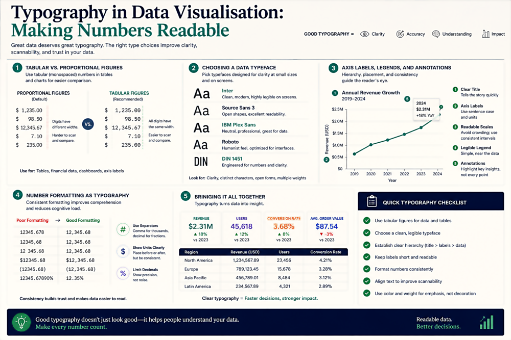
This is the single most important typographic concept for data visualisation. Proportional figures (also called proportional-width numerals) give each digit a width proportional to its shape — a "1" is narrower than a "0." This looks elegant in running text but creates a serious problem in tables and charts: numbers in a column do not align vertically. The digits in 1,111 and 8,888 occupy different horizontal widths, making visual comparison impossible.
Tabular figures (also called fixed-width or monospaced numerals) give every digit the same width. This means columns of numbers align perfectly — every "1" takes up the same horizontal space as every "8." For any context where numbers are compared vertically (tables, charts, financial data, dashboards), tabular figures are essential.
In CSS, you can request tabular figures with: font-variant-numeric: tabular-nums;. This works with any OpenType font that includes tabular figure alternates — which most professional-quality fonts do. Not all fonts include both sets, though, so test before you ship. If your font does not support tabular figures, switch to one that does for your data components.
Choosing a Data Typeface
The ideal typeface for data visualisation has: tabular figures (non-negotiable), distinct digit shapes (0 and O must be clearly different; 1, l, and I must be unmistakable), consistent stroke weights across the family, good legibility at small sizes (axis labels on charts are often 10-11px), and a range of weights for creating hierarchy (bold headers, regular data, light annotations).
Fonts that excel for data: Inter (free, excellent tabular figures, large x-height for small-size legibility), IBM Plex Sans (free, specifically designed for data-heavy interfaces), Roboto (free, the default on Material Design dashboards), DIN (a classic for technical and numerical applications), and Fira Sans (free, with extensive figure styles and good small-size rendering). For monospaced data contexts (code output, raw data), JetBrains Mono and Fira Code are excellent choices.
Axis Labels, Legends, and Annotations
Chart axis labels are some of the hardest typographic elements to get right. They are typically small (10-12px), often rotated (particularly on the x-axis of bar charts), and critical for the reader's ability to interpret the data. Rotated text is inherently harder to read, so if you must rotate axis labels, use a font with a large x-height and generous letter spacing. Better yet, restructure the chart to avoid rotation entirely — horizontal bar charts eliminate the need for rotated x-axis labels.
Legends should use a consistent font size smaller than the chart title but not so small that it requires effort to read. 11-12px is typical. Use font weight (not colour alone) to distinguish between legend items and their labels — this improves accessibility for colour-blind users. Annotations on charts (callouts pointing to specific data points) should use a slightly different treatment from axis labels — either a different weight or a subtle background — to signal that they are commentary rather than data.
Number Formatting as Typography
How you format numbers is a typographic decision, not just a data decision. Thousands separators (commas in English, periods in many European contexts) dramatically improve the scanability of large numbers: 1000000 vs. 1,000,000. Decimal alignment in tables (lining up the decimal point across rows) is as important as digit alignment. Consistent decimal places across a column (even if it means trailing zeros) help the eye compare values without counting digits. Currency symbols, percentage signs, and units should be consistent in style and placement within a data context. These are small decisions with outsized impact on readability.