
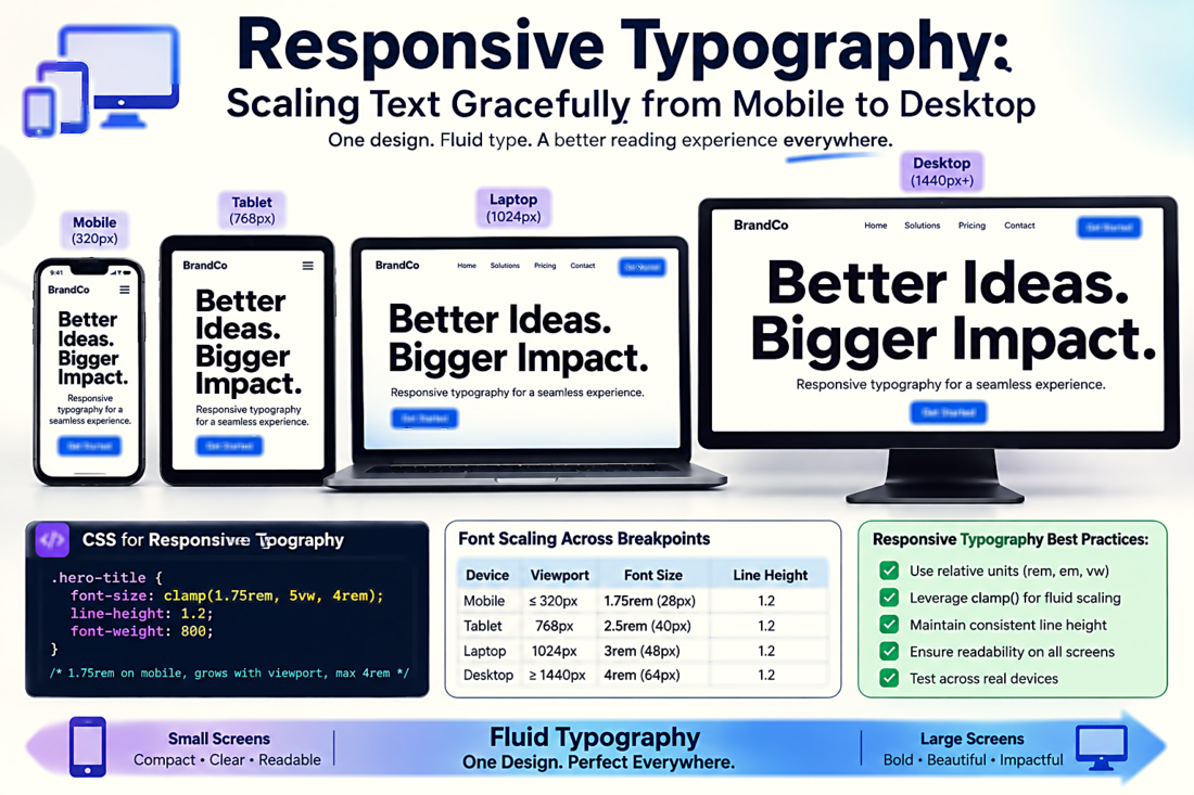
Responsive Typography: Scaling Text Gracefully from Mobile to Desktop
The Problem with Fixed Font Sizes
A heading set at 48px looks commanding on a 1440px desktop monitor. On a 375px mobile screen, that same 48px heading dominates the viewport, pushes content below the fold, and may cause awkward word breaks. The naive solution — setting a smaller font size at a mobile breakpoint — creates a jarring jump at the breakpoint where the text snaps from one size to another. Worse, at viewport widths just above the breakpoint, the desktop size may still be too large, and just below the breakpoint, the mobile size may feel too small.
The fundamental issue is that fixed font sizes do not respond to the continuous range of viewport widths. Breakpoints are artificial thresholds in a continuous spectrum. Real responsive typography should scale fluidly across the entire range, growing and shrinking proportionally as the viewport changes — with defined minimum and maximum sizes to prevent extremes.
The Modern Solution: CSS clamp()
The clamp() function is the most elegant tool for fluid typography. It takes three values: a minimum, a preferred (fluid) value, and a maximum. The syntax is: font-size: clamp(min, preferred, max);. The preferred value is typically expressed in viewport units (vw) to create fluid scaling, while the min and max are expressed in rem or px to set hard boundaries.
A practical example: font-size: clamp(1.5rem, 4vw, 3rem);. This means the font will never be smaller than 1.5rem (24px at default root), will scale at 4% of viewport width in between, and will never exceed 3rem (48px at default root). At a 375px viewport, 4vw = 15px, so the minimum of 24px kicks in. At a 1440px viewport, 4vw = 57.6px, so the maximum of 48px kicks in. Between roughly 600px and 1200px viewports, the font scales fluidly. No breakpoints, no jumps, no media queries.
Building a Fluid Type Scale
Rather than setting clamp values for each text element individually, build a fluid type scale — a system of font sizes that maintain consistent proportional relationships across viewport widths. Start by defining your body text size: typically clamp(1rem, 0.95rem + 0.25vw, 1.125rem) — this gives you 16px on mobile, scaling up to 18px on wide screens. Then define your heading sizes as multiples of the body size, maintaining a consistent ratio (1.2, 1.333, 1.5, or 1.618 are common scales).
A complete fluid scale might look like:
- Small text:
clamp(0.75rem, 0.7rem + 0.2vw, 0.875rem) - Body:
clamp(1rem, 0.95rem + 0.25vw, 1.125rem) - H4:
clamp(1.125rem, 1rem + 0.5vw, 1.5rem) - H3:
clamp(1.25rem, 1rem + 1vw, 2rem) - H2:
clamp(1.5rem, 1rem + 1.5vw, 2.5rem) - H1:
clamp(2rem, 1.5rem + 2vw, 3.5rem)
Store these as CSS custom properties (variables) and apply them consistently across your project. This creates a system where every text element scales in proportion — maintaining visual hierarchy at every viewport width.
Line Length: The Forgotten Responsive Variable
Font size gets all the attention, but line length (measure) is equally important for responsive readability. The optimal line length for body text is 45-75 characters, with 66 characters often cited as ideal. On a wide desktop monitor with no max-width constraint, lines can easily exceed 120 characters — far beyond comfortable reading. On mobile, short viewport widths naturally constrain line length, but aggressive padding can push it below 30 characters, which creates excessive line breaks and choppy reading.
The solution is to set a max-width on your text container, expressed in ch units (the width of the "0" character in the current font): max-width: 70ch;. This ties the line length directly to the font and size being used. As the font size scales up on larger viewports, the container width increases proportionally — maintaining the same character count per line regardless of font size. This is the most typographically correct approach to responsive line length.
Responsive Line Height and Spacing
Line height should also respond to font size. At large display sizes (36px+), tight line height (1.1-1.2) works well because the letters are big enough to track easily. At body text sizes (14-18px), more generous line height (1.5-1.7) is needed to prevent the reader from losing their place. A useful pattern: line-height: clamp(1.3, 1.1 + 0.3vw, 1.7); — though in practice, it is often cleaner to set line-height relative to the element's own font size using a unitless value and let it scale naturally.
Spacing between headings, paragraphs, and sections should also scale. Using em or rem units for margins and padding ensures that spacing grows proportionally with text size. A paragraph margin of 1.5em will be 24px when the body text is 16px and 27px when the body text is 18px — maintaining consistent visual rhythm without additional responsive rules.