
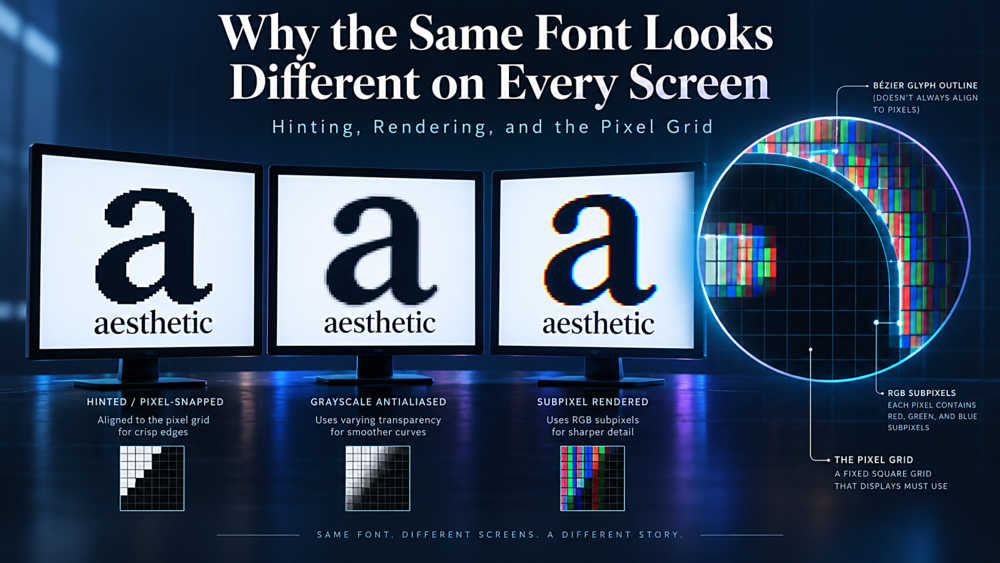
Why the Same Font Looks Different on Every Screen: Hinting, Rendering, and the Pixel Grid
One Font, Many Truths
Here is an experiment worth running. Take a single web page, set the body text in one typeface at one size, and open it side by side on a Windows desktop, a MacBook, and a Linux machine running Firefox. The text will not match. On Windows it will likely look tighter and more sharply defined, with stems that align crisply to pixel edges. On macOS it will look softer, slightly heavier, and more faithful to the shapes the designer originally drew. On Linux the result depends entirely on which rendering configuration the distribution shipped with, and may resemble either of the others or neither.
Nothing is broken. No browser is misbehaving. You are simply watching three different philosophies about an unsolvable problem: how do you take a letterform defined as a smooth mathematical outline and display it on a grid of square pixels that do not align with it?
This gap between outline and grid is where hinting, anti-aliasing, and rasterisation live. Understanding them will not let you force pixel-identical type across platforms — that goal is unreachable and chasing it wastes time. But it will explain the artifacts you have been seeing for years, tell you which font choices hold up across environments, and save you from a category of "fixes" that make things worse.
The Core Problem: Curves Meet Squares
A glyph in a font file is stored as a set of outlines — Bézier curves and straight segments describing the boundary of each shape. These outlines are resolution-independent. Scale them to 8 points or 800 and the proportions hold exactly.
A screen is not resolution-independent. It is a fixed grid of pixels, and each pixel is either lit or not, at some colour and intensity. The job of the rasteriser is to decide, for every pixel the glyph touches, how much of that pixel falls inside the outline and what value to give it.
At large sizes this is easy. A capital H at 72 pixels tall has stems many pixels wide; rounding errors of half a pixel are invisible. At 14 pixels tall — roughly the size of the text you are reading now — that same H might have stems that are 1.3 pixels wide. The rasteriser has to decide: is that stem one pixel or two? If one, which one? If it splits the difference and renders 1.3 pixels of coverage across two pixel columns, both columns come out grey and the stem looks blurry. If it snaps to a single pixel, the letter becomes crisp but its width is now wrong by 23 percent, and if the neighbouring stem rounds the other way, the two sides of the H no longer match.
Every rendering decision you will read about below is an attempt to manage that trade-off between fidelity (matching what the designer drew) and crispness (aligning to the pixel grid).
Hinting: Instructions Baked Into the Font
Hinting is extra data inside the font file that tells the rasteriser how to distort the outline at small sizes so it lands better on the grid. It is, essentially, the type designer leaving instructions for situations they knew would go badly.
The two outline formats handle this differently. TrueType hinting is procedural — it is a genuine programming language, executed by an interpreter in the rasteriser. A hinting program can say "align this stem to a whole pixel boundary," "keep the x-height consistent across all lowercase letters at this size," or "at exactly 11 pixels per em, drop this serif entirely because it will turn to mud." Fully hinting a professional typeface this way is enormously laborious. Georgia and Verdana, both commissioned by Microsoft in the 1990s specifically for low-resolution screens, were hand-hinted glyph by glyph — and that investment is the main reason they still render well at small sizes decades later.
PostScript/CFF hinting is declarative instead. The font describes features — stem widths, alignment zones for baselines and x-heights — and leaves the rasteriser to decide what to do with them. Less control for the designer, far less work, and more consistency across rasterisers that implement the rules faithfully.
There is also autohinting: rather than trusting the font's own instructions, the rendering engine analyses the outlines itself and generates hints on the fly. FreeType, the engine underpinning most Linux systems and Android, has a well-regarded autohinter. The open-source tool ttfautohint does the same thing ahead of time, and is how many independent and open-source fonts get respectable small-size rendering without a specialist spending weeks on hinting tables.
Anti-Aliasing and the Subpixel Trick
Hinting decides where the shape goes. Anti-aliasing decides how to colour the pixels at its edges.
Grayscale anti-aliasing is the straightforward approach: a pixel 40 percent covered by the glyph gets 40 percent of the text colour. Edges look smooth rather than jagged, at the cost of some softness.
Subpixel rendering — Microsoft's ClearType being the famous implementation — exploits a physical detail of LCD panels. Each pixel is not one uniform dot but three vertical stripes: red, green, blue. By lighting those stripes independently, the renderer gets three times the effective horizontal resolution. A stem can be positioned to a third of a pixel. The catch is colour fringing: examine ClearType text closely and you will see faint orange and blue edges. At normal viewing distance your visual system blends them away, which is exactly the bet being made.
That bet depends on assumptions that are increasingly shaky. It requires the display to have RGB stripes in that order. Rotate a monitor to portrait and the stripes become horizontal, breaking the effect. Many OLED panels use non-stripe subpixel layouts where it simply does not apply. And on high-DPI displays, pixels are small enough that plain grayscale anti-aliasing already looks clean — which is a large part of why Apple removed subpixel anti-aliasing from macOS in Mojave. The feature was solving a problem Retina displays had already made obsolete.
Three Platforms, Three Philosophies
Windows historically prioritised crispness. The older GDI rendering path applied full hinting and snapped glyphs hard to the pixel grid both horizontally and vertically. Text looked sharp and mechanically regular — and noticeably different from the designer's outlines, because letterforms were being visibly deformed to fit. DirectWrite, the modern path, relaxed this considerably: it hints vertically but allows fractional horizontal positioning, which preserves spacing rhythm and design proportions far better while keeping baselines and x-heights aligned.
macOS went the other direction from the start. Apple largely ignores the font's hinting instructions and renders close to the true outline, accepting blur in exchange for fidelity. Type on a Mac looks like what the designer drew, scaled down. The long-standing complaint that "text looks fatter on a Mac" came from this plus a gamma-correction difference; when Mojave dropped subpixel anti-aliasing, a great deal of text abruptly looked thinner, and a generation of designers discovered their carefully balanced light weights had been leaning on rendering behaviour all along.
Linux has no single answer. FreeType can run the font's own bytecode instructions, apply its autohinter, or skip hinting altogether, with independent controls for hinting strength and anti-aliasing mode. Distributions choose different defaults and users override them. If your site must look right on Linux, the honest approach is to test on a couple of common configurations rather than assume one.
What This Means for Web Fonts
A few consequences follow directly, and they are worth knowing before your next project.
Hinting survives into WOFF2 — usually. WOFF2 is a compression wrapper, and hinting instructions come along intact. But subsetting tools, used to strip unneeded glyphs and shrink files, often discard hinting by default. If your carefully hinted font starts rendering poorly after a build-pipeline change, check whether your subsetter is dropping the hinting tables.
Hinting adds real weight. A fully TrueType-hinted font can be substantially larger than the same outlines unhinted. On a high-DPI-first audience that overhead buys you very little. On a broad consumer audience still running 1080p Windows machines it buys a lot. This is a judgement call about your actual traffic, not a universal rule.
Beware -webkit-font-smoothing: antialiased. This CSS declaration spread through design systems as a cure for "fat text on Mac," and it does make text thinner — by forcing grayscale anti-aliasing and discarding rendering information. On light-on-dark layouts it can leave thin weights looking anaemic and genuinely harder to read. It is a blunt instrument that treats a perception problem as a rendering problem. If text looks too heavy, adjust the weight or size deliberately rather than reaching for a global override.
Some fonts are simply more robust than others. Typefaces with generous x-heights, open counters, moderate stroke contrast and sturdy stems degrade gracefully when the grid fights them. High-contrast display faces with hairline strokes do not — those hairlines fall below one pixel and either vanish or turn grey and patchy. This is the practical reason a Didot set at 14px on a standard-density screen looks broken while the same face at 60px looks superb. It is not a bad font; it is a font being asked to work at a size its design never anticipated.
What You Can and Cannot Control
Pixel-identical rendering across platforms is not achievable, and treating it as the goal leads to bad decisions. What you can control is how much the differences matter.
Choose typefaces with robust construction for body text, and save delicate high-contrast faces for display sizes where the grid stops interfering. Test at the sizes you will actually ship, on at least one standard-density display rather than exclusively on your Retina laptop — a substantial share of real users are still on 1080p screens, and type that looks elegant at 2x can fall apart at 1x. Prefer size and weight adjustments over smoothing overrides. And check what your build pipeline does to the font files, because an optimisation step that silently strips hinting is a common and invisible cause of "it looked fine last month."
The deeper point is that a font is not an image. It is a set of instructions negotiated, at display time, between the designer's intent and the physical constraints of a screen the designer never saw. Rendering differences are not defects in that process. They are that process, working as designed.