
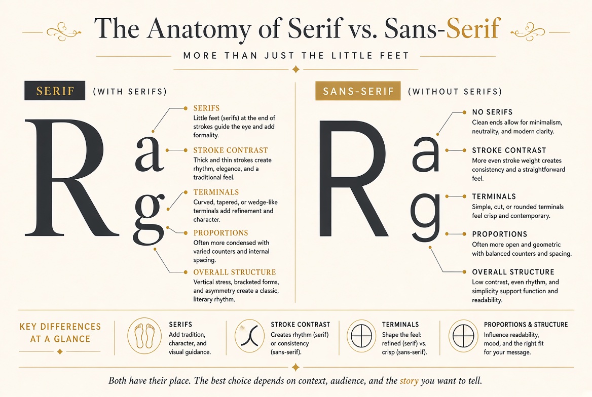
The Anatomy of Serif vs. Sans-Serif: More Than Just "The Little Feet"
Beyond the Simple Definition
Ask most people the difference between serif and sans-serif, and they will point at the small strokes at the ends of letterforms. That is technically correct but profoundly incomplete. The presence or absence of serifs is just the most visible symptom of fundamentally different design philosophies that affect stroke contrast, letter proportions, rhythm, and the overall texture of a block of text.
Serif typefaces typically exhibit high stroke contrast — the thick strokes are noticeably thicker than the thin strokes. This creates a visual rhythm when letters are set in paragraphs: a pattern of thick verticals and thin horizontals that the eye learns to ride along. Sans-serif typefaces typically have low or uniform stroke contrast, creating a more even, monotone texture. Neither is inherently superior; they create different reading experiences suited to different contexts.
The Historical Split
Serifs are not decorative additions to letterforms — they are remnants of how letters were originally made. Roman inscriptional capitals (the ancestors of our uppercase letters) were carved into stone with a chisel. The carver would finish each stroke with a small perpendicular cut to create a clean termination. These termination cuts became serifs. For over a thousand years, serifs were not a style choice; they were simply what letters looked like.
Sans-serif typefaces appeared in the early 19th century and were initially called "grotesque" — literally, ugly and unnatural. They were considered novelty display types, unsuitable for serious text. It took over a century, the Bauhaus movement, and the Swiss International Typographic Style of the 1950s and 60s for sans-serifs to achieve respectability as text faces. Today, sans-serifs dominate screen typography, but the historical prejudice occasionally resurfaces in arguments about "proper" typography.
The Readability Debate
The conventional wisdom that "serifs are more readable in print, sans-serifs are more readable on screen" is repeated so often that most designers accept it without question. The reality is more nuanced. Rigorous studies comparing serif and sans-serif readability have produced inconsistent results. Some studies show marginal serif advantages in print; others show no difference. Some show sans-serif advantages on screen; others find no significant difference.
What the research consistently shows is that familiarity matters more than category. People read faster in fonts they have read before. Since most web typography has been sans-serif for the past two decades, most people alive today have more cumulative experience reading sans-serif text on screens — which creates a self-reinforcing cycle. The key takeaway for designers: choose a well-designed, well-spaced typeface appropriate for your context. The serif/sans-serif distinction matters far less than quality of design and appropriateness of use.
Subclassifications Worth Knowing
Within the serif category, there are meaningful subgroups. Old-style serifs (Garamond, Caslon) have moderate contrast, angled stress, and bracketed serifs — they feel warm and humanist. Transitional serifs (Baskerville, Times New Roman) have sharper contrast, more vertical stress, and thinner serifs — they feel more refined and formal. Modern serifs (Bodoni, Didot) have extreme contrast, perfectly vertical stress, and hairline serifs — they feel elegant and dramatic but can be difficult to read at small sizes because the thin strokes disappear.
Sans-serifs have their own subgroups. Grotesque (Akzidenz Grotesk, Franklin Gothic) are the oldest, with some quirky irregularity. Neo-grotesque (Helvetica, Univers) smooth out those irregularities into neutral uniformity. Humanist (Frutiger, Gill Sans) reintroduce organic stroke variation inspired by handwriting. Geometric (Futura, Avant Garde) build letters from pure geometric shapes — circles, rectangles, triangles. Each subgroup has a distinct personality, and lumping them all together as "sans-serif" is like calling every car a "vehicle."
Practical Decision Framework
When choosing between serif and sans-serif, ask these questions: What is the reading environment? (Long-form reading favours high-quality serifs or humanist sans-serifs.) What is the emotional register? (Serifs tend to convey tradition, authority, and seriousness; sans-serifs tend to convey modernity, simplicity, and approachability.) What are the technical constraints? (Low-resolution screens or very small sizes favour simpler sans-serif forms.) What does the existing brand system use? (Consistency with established identity usually outweighs abstract preference.) The answer to these questions will narrow your choice far more effectively than the blunt "serif or sans-serif" question.