
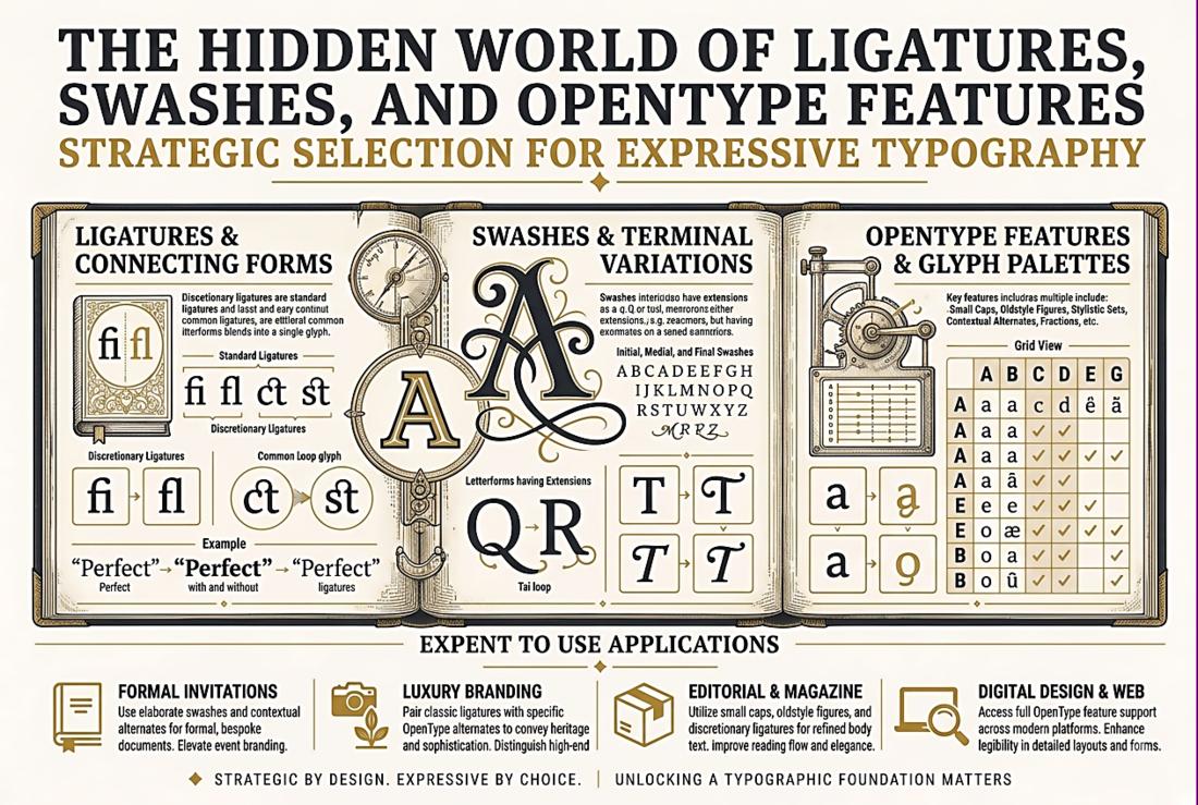
The Hidden World of Ligatures, Swashes, and OpenType Features
What OpenType Features Are
An OpenType font can contain far more glyphs and behaviours than what you see when you type on a keyboard. Beyond the standard alphanumeric characters, a well-designed OpenType font may include: standard ligatures (fi, fl, ff, ffi, ffl), discretionary ligatures (ct, st, and other decorative combinations), contextual alternates (letterforms that change shape depending on adjacent characters), stylistic sets (complete alternate designs for some or all characters), swashes (decorative extensions on capital or lowercase letters), small caps (properly designed small capital letters, not just scaled-down capitals), old-style figures (numerals that sit on the baseline with ascenders and descenders, like lowercase letters), lining figures (numerals that align with capitals), tabular and proportional figure variants, superscripts and subscripts, ordinals, fractions, and more.
A typeface like Adobe Garamond Pro contains over 1,100 glyphs. The average user accesses maybe 200 of them through normal typing. The rest are OpenType features waiting to be activated.
Ligatures: The Most Common Feature
Ligatures are single glyphs that replace two or more characters to solve visual problems or add refinement. The most common are standard ligatures: fi, fl, ff, ffi, and ffl. In these combinations, the dot of the "i" or the ascender of the "l" collides with the overhang of the "f." The ligature redesigns the combination as a single, harmonious glyph. Standard ligatures are enabled by default in most applications and browsers (font-variant-ligatures: common-ligatures; in CSS, which is the default).
Discretionary ligatures are more decorative: ct, st, Th, and other combinations that are aesthetically pleasing but not strictly necessary. These are off by default and must be explicitly activated. In CSS: font-feature-settings: "dlig" 1; or font-variant-ligatures: discretionary-ligatures;. Use these for display text and headings; they can be distracting in body text.
Stylistic Alternates and Sets
Many fonts include alternate designs for specific characters. A single-storey "a" instead of a double-storey "a." A "g" with an open tail instead of a closed loop. A "Q" with a dramatic sweeping tail instead of a short one. These alternates let you customise the font's personality without switching to a different typeface.
In CSS, individual stylistic alternates are activated with: font-feature-settings: "salt" 1;. Stylistic sets (groups of coordinated alternates designed to work together) are accessed with: font-feature-settings: "ss01" 1; through "ss20" 1;. The challenge is discovering what alternates a font contains — there is no standard naming convention for what each stylistic set does. You need to consult the font's documentation or use a tool like Wakamai Fondue (wakamaifondue.com) to inspect the font file and see all available features and their effects.
Small Caps: The Underused Refinement
True small caps are not simply capital letters scaled down to lowercase height — that produces letters with visibly thinner strokes that look anaemic next to regular text. True small caps are separately designed glyphs with stroke weights calibrated to match the surrounding text. They are slightly taller than lowercase x-height and optically harmonise with both upper and lowercase characters.
Small caps are traditionally used for abbreviations (NASA, BBC, HTML), acronyms in body text (to prevent them from shouting at the reader), and occasionally for subheadings or running headers. In CSS: font-variant-caps: small-caps; — but this only works correctly if the font contains real small caps glyphs. If it does not, the browser will fake them by scaling down the capitals, which looks terrible. Always verify that your font has genuine small caps before using this property.
Activating Features in Practice
In CSS, the modern approach uses font-variant-* properties: font-variant-ligatures, font-variant-caps, font-variant-numeric, font-variant-alternates. The older font-feature-settings property gives you direct access to four-character OpenType tags ("liga", "dlig", "smcp", "onum", etc.) and is still needed for features that font-variant does not yet cover. In Adobe InDesign, the OpenType panel (Type > OpenType) exposes all available features with visual previews. In Figma, the type panel includes toggles for common features, and the "..." menu reveals additional options. In Microsoft Word, the Advanced tab of the Font dialog (Format > Font > Advanced) includes checkboxes for ligatures, number forms, and stylistic sets.
The key insight is that these features are opt-in. They exist inside the font file, doing nothing, until you activate them. Every time you use a high-quality OpenType font, it is worth spending five minutes discovering what features it contains. You may find typographic refinements that transform good typography into exceptional typography — at no additional cost, with no additional font files, using capabilities the type designer already built and you are already paying for.