
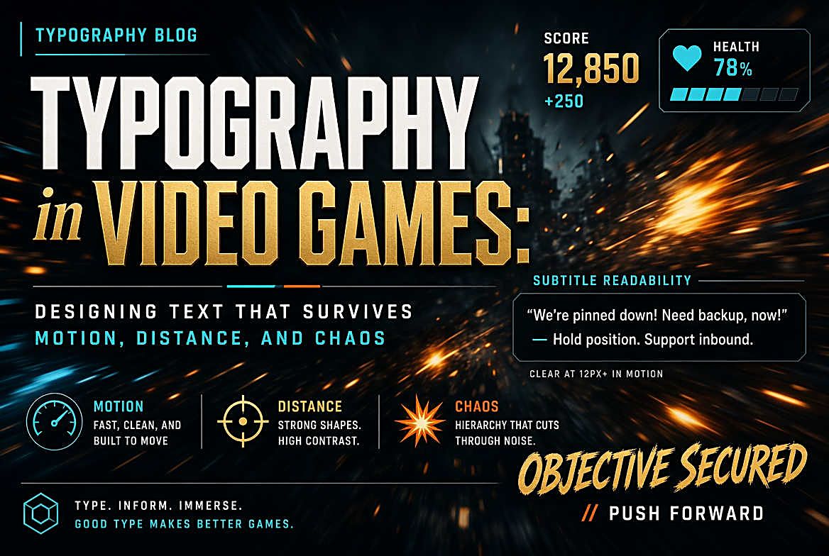
Typography in Video Games: Designing Text That Survives Motion, Distance, and Chaos
The Most Hostile Environment in Typography
Almost every discipline that uses type gets to assume a stable background. Print has paper. Web has a page that mostly holds still. Packaging has a fixed surface under predictable lighting. Video games have none of this.
Game typography must remain legible over a background that is moving, changing colour, exploding, or plunging into darkness — often all at once. It has to work on a phone held at thirty centimetres and on a television across a living room. It must survive translation into a dozen languages with wildly different scripts and text lengths. And it has to do all of this while the player's attention is somewhere else entirely, because they are being attacked.
The solutions developed under these constraints are genuinely interesting, and several of them have quietly influenced interface design well beyond games.
The Ten-Foot Problem
Console games are designed for what the industry calls 10-foot UI — an interface viewed from roughly three metres away rather than arm's length. Angular size is what matters: text that is comfortable at 60cm becomes unreadable at 3m unless it grows by roughly the same factor.
This produces the proportions console players take for granted and PC players sometimes find comical. Menu text occupies a large share of the screen. Subtitles are set at sizes that would look absurd on a web page. Body copy in a lore entry is set at what is effectively large-print sizing. None of this is overdesign — it is the minimum for a readable television interface.
The difficulty is that the same game often must also run in handheld mode. A Nintendo Switch title renders to a television and to a 6.2-inch screen; a PC game runs on a 27-inch monitor and a 7-inch handheld. Fixed pixel sizing fails immediately. Modern engines scale the interface relative to viewport dimensions, but naive scaling has its own failure mode: text sized correctly for a phone becomes enormous on a monitor. The usual approach is scaling with clamps at both ends, plus a player-facing UI scale slider — an admission that no single automatic answer serves every setup.
Contrast Against Chaos
The signature problem of game typography is that the background is unpredictable and in motion. White subtitles work beautifully against a night sky and disappear entirely against snow. A health counter legible in a dim corridor washes out the instant a muzzle flash fills the frame.
Several techniques are standard, each with trade-offs:
Outlines and strokes put a contrasting border around each glyph so it separates from any background. Effective and cheap, but a heavy stroke thickens letterforms and clogs counters, so the same text becomes harder to read in its own right. Strokes are a readability tax paid for guaranteed separation.
Drop shadows are subtler and preserve letterform integrity better, but only work when the shadow is darker than what sits behind it. Over a dark background they contribute nothing.
Scrims — a semi-transparent panel behind the text — are the most reliable option and the reason subtitles so often sit on a dark translucent bar. They guarantee a known background at the cost of occluding part of the scene. Most games that take subtitles seriously offer scrim opacity as a setting, because the right balance is genuinely a matter of preference and viewing conditions.
Dynamic adaptation is the sophisticated approach: sample the luminance behind the text and adjust the text or its backing in response. It handles every case well but costs performance and can visibly flicker if the background changes faster than the sampling smooths.
Rendering Text at Sixty Frames Per Second
Games cannot afford the rasterisation approach a web browser uses. Text must be drawn every frame, at arbitrary scales, sometimes in 3D space, without blowing the frame budget.
The traditional solution is a glyph atlas: pre-render every needed character into a single texture and assemble strings from it. Fast, but the glyphs are bitmaps, so scaling up produces blurring or visible pixel edges. Fine for a fixed-resolution interface, poor for text that zooms or exists in the world.
The technique that changed this was signed distance field rendering, introduced in a 2007 SIGGRAPH paper by Chris Green at Valve. Instead of storing the glyph's appearance, the texture stores, for each texel, the distance to the nearest glyph edge. Because distance interpolates smoothly where colour does not, a shader can reconstruct a crisp edge at essentially any scale from a small texture. One modest atlas serves text from tiny to enormous, and effects like outlines, glows and soft shadows fall out almost for free by thresholding the distance differently.
SDF text has its own artifacts — sharp corners round off slightly, since a single distance value per texel cannot represent two converging edges. Multi-channel variants address this by storing several distances at once. For most games the trade is overwhelmingly worth it, and SDF rendering is now close to standard across major engines.
Localisation: Where Layouts Go to Die
A game shipping worldwide may carry fifteen or more languages, and typography is where that ambition most often breaks.
Text expansion is the first hazard. German translations commonly run around 30 percent longer than English; other languages vary in both directions. A button sized precisely to its English label will overflow, and the failure appears only in builds most of the team never sees. Designing to the longest expected string rather than the English one is the standard defence.
Script requirements are the second. Latin coverage is a few hundred glyphs. Japanese needs thousands. Chinese needs more. Full CJK fonts are megabytes where a Latin font is kilobytes, which forces decisions about which languages ship in the base download. Arabic and Hebrew bring right-to-left layout, which is not a text problem but an interface problem: entire panels need mirroring, and any icon that implies direction must be reconsidered.
Typographic tone is the subtlest issue. A studio picks a display face that conveys exactly the right feeling for their world — and then discovers no Japanese typeface carries that same feeling, because the conventions are different and the structural features that create "aggressive" or "elegant" in Latin type have no direct equivalent. Well-resourced studios commission matched families across scripts. Everyone else compromises, and players in those languages get a slightly different experience.
Diegetic Type and Invented Scripts
Some of the most interesting game typography is not interface at all but part of the world: signage on walls, labels on crates, graffiti, newspapers, terminal screens. This diegetic typography does worldbuilding that dialogue would take far longer to accomplish. A corporate logo repeated across a facility, its typeface just slightly too friendly for what the company does, communicates volumes without a line of exposition.
Invented scripts go further. Designing a fictional writing system that looks like a real language with real conventions — consistent stroke logic, plausible letter frequencies, evidence of having evolved — is a substantial design exercise, and players notice when it has been done properly versus when the result is decorative squiggles. The best examples reward attention: players decode them, publish translation guides, and the world gains a texture no cutscene could provide.
Accessibility Moved From Afterthought to Expectation
Game text accessibility has changed more in the last decade than in the previous three, driven largely by players who found themselves locked out of games by fixed 12-pixel subtitles burned into the rendering pipeline.
What is now expected in a major release: adjustable text size, subtitle background opacity control, speaker identification, optional dyslexia-supportive typefaces, colourblind-safe interface palettes, and separation of subtitle settings from general UI scale. The Last of Us Part II is frequently cited as a turning point, shipping an accessibility suite extensive enough to make the previous industry standard look negligent by comparison.
The pattern worth noticing is that almost every one of these features helps people well outside the group it was built for. Larger subtitles help anyone sitting further from the screen. Speaker labels help in noisy rooms. Background scrims help anyone playing in daylight. This is the curb-cut effect, and it shows up in game typography with unusual clarity.
What Other Designers Can Steal
Several habits from game typography transfer directly to interfaces that have nothing to do with games.
Design for the worst case, not the demo. Game UI is tested against the most chaotic scene in the game, not a clean menu. The equivalent for a web or product designer is testing with the longest realistic string, the busiest data state, and the least favourable background — rather than the tidy placeholder content that makes everything look effortless.
Make readability adjustable rather than assumed. Games learned that no single text size serves every player, screen and room. Most non-game interfaces still ship one fixed answer and treat any complaint as an edge case.
Treat viewing distance as a real variable. It is obvious in games and almost universally ignored elsewhere, even as interfaces appear on watches, dashboards, kiosks and televisions.
Type in games works under constraints that would be considered unreasonable anywhere else — moving backgrounds, unknown distances, a dozen scripts, a player who is not looking. That it works at all is an argument for how much readability depends on decisions made long before anyone chooses a typeface.