
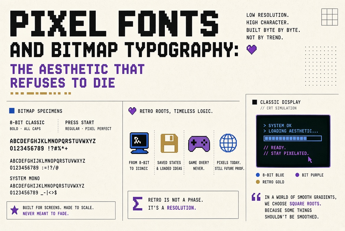
Pixel Fonts and Bitmap Typography: The Aesthetic That Refuses to Die
Why Pixel Fonts Existed in the First Place
In the early days of personal computing, screens had such low resolution that smooth curves were physically impossible to display. A typical monitor in the early 1980s had a resolution of 320x200 pixels. At that resolution, an "O" cannot be a smooth ellipse — it is a blocky approximation built from a handful of lit pixels on a grid. Fonts were designed pixel by pixel, drawn on graph paper, where each cell was either on or off. There was no anti-aliasing, no sub-pixel rendering, no hinting. You had a grid, and you made letters from it.
This constraint produced a specific aesthetic: hard edges, uniform stroke weights (usually one pixel wide), geometric simplicity, and a kind of brutal clarity. Each character occupied a fixed-width cell (typically 8x8, 8x16, or similar), which also made them inherently monospaced. The limitations were severe, but they forced a design discipline that produced remarkably legible results. The system fonts of the Apple II, Commodore 64, and early IBM PCs remain instantly recognisable decades later.
The Transition to Outline Fonts
When PostScript (1984) and TrueType (1991) introduced scalable outline fonts — defined by mathematical curves rather than fixed pixel grids — bitmap fonts became technically obsolete almost overnight. Outline fonts could be rendered at any size, on any resolution screen, and they looked smooth. The old pixel fonts were relegated to terminal emulators and nostalgic retro projects.
Or so everyone assumed. What actually happened is that pixel fonts went underground, incubated in indie game development, chiptune music communities, and demoscene subcultures, and then resurfaced as a mainstream design trend. By the 2010s, pixel typography was everywhere: indie games, brand identities, editorial illustration, motion graphics, and merch. The aesthetic that was born from limitation had become a choice.
Why Pixel Fonts Still Work
Pixel fonts communicate specific things that no smooth, modern typeface can replicate. They signal retro authenticity — a connection to early computing and gaming culture. They signal indie credibility — a rejection of polished corporate aesthetics. They signal playfulness — a willingness to embrace artificiality rather than pretending to be organic. And they have a distinctive visual rhythm that stands out precisely because everything else on a modern screen is smooth.
There is also a practical angle. Pixel fonts are extremely legible at small sizes on screen — they were literally designed for exactly that context. In UI design, particularly for information-dense dashboards or data displays, a well-designed pixel font at small sizes can be more readable than a smooth font that becomes blurry when the hinting system fails. This is why developers often gravitate toward pixel-perfect monospaced fonts for their code editors.
Designing with Pixel Fonts Today
If you want to use pixel fonts in a modern project, there are important technical considerations. Rendering size matters enormously. A pixel font designed on a 8x8 grid looks crisp at 8px, 16px, 24px, and 32px (integer multiples of the original grid). At 13px or 22px, the pixels do not align to the screen grid and the result is blurry and broken. Always render pixel fonts at exact multiples of their native size. In CSS, this means setting font-size to the native size (or a clean multiple) and using image-rendering: pixelated or -webkit-font-smoothing: none to prevent the browser from anti-aliasing the edges.
Mixing pixel and smooth fonts can create striking contrast, but it requires care. The pixel font needs enough visual weight to hold its own against smoother companions — a delicate 1px-stroke pixel font next to 18px Helvetica will feel fragile and lost. Use pixel fonts for headlines, labels, or UI elements where they can command attention, and pair them with a clean sans-serif for body text.
Notable Pixel Fonts Worth Exploring
The pixel font ecosystem is vast, but a few standouts deserve mention. Press Start 2P (available on Google Fonts) captures the arcade aesthetic perfectly. VT323 emulates the look of a VT320 terminal. Silkscreen by Jason Kottke is designed for maximum legibility at extremely small sizes. Cozette is a modern bitmap font for terminal use with excellent Unicode coverage. Scientifica packs remarkable detail into a tiny 5x11 grid. Each of these demonstrates that pixel typography is not a single look but a diverse design space with room for personality, experimentation, and genuine craft.