
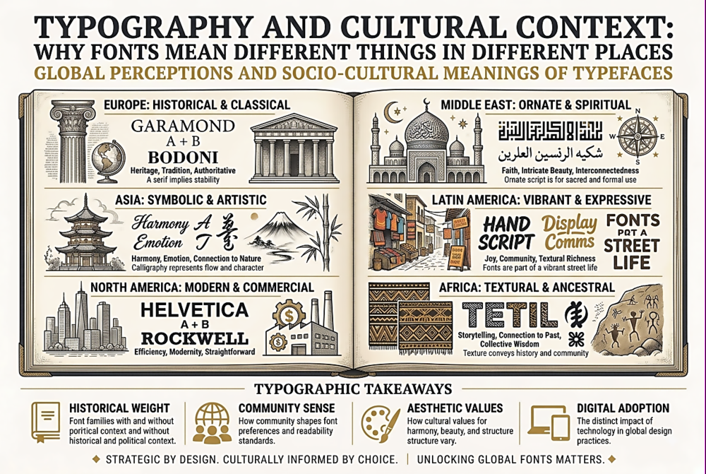
Typography and Cultural Context: Why Fonts Mean Different Things in Different Places
Typography Is Not a Universal Language
Western designers often treat typography as a set of universal principles: hierarchy, contrast, readability, whitespace. These principles are real, but they are applied within cultural frameworks that vary enormously. The associations that Latin-script readers bring to a serif font (tradition, authority, seriousness) are culturally learned, not inherent. A reader whose primary script is Arabic, Devanagari, or Chinese brings entirely different associations to typographic forms — associations shaped by different calligraphic traditions, different printing histories, and different visual cultures.
This matters increasingly because digital products serve global audiences. A SaaS dashboard designed in San Francisco will be used in Seoul, Mumbai, Berlin, and São Paulo. If the typography was chosen based exclusively on English-language aesthetics, it may actively miscommunicate in other markets — not because the font renders poorly, but because its cultural connotations are wrong.
Script-Specific Typographic Traditions
CJK (Chinese, Japanese, Korean) typography has fundamentally different design parameters. CJK characters are ideographic — each character occupies a fixed square cell, regardless of the character's visual complexity. A simple character (one, 一) and a complex character (dragon, 龍) occupy exactly the same space. This creates a uniform grid texture in blocks of text that is visually very different from the variable-width rhythm of Latin text. CJK fonts must include thousands or tens of thousands of glyphs (compared to a few hundred for a Latin font), which affects file sizes, loading strategies, and design economics. A high-quality CJK font family can take years to design.
Arabic typography is inherently calligraphic and contextual. Arabic letters change shape depending on their position in a word (initial, medial, final, or isolated). The text flows right to left. The calligraphic tradition values connected, flowing letterforms — "clean" geometric sans-serifs can feel culturally inappropriate for formal Arabic text because they conflict with the script's calligraphic heritage. Designing type for Arabic requires understanding Naskh, Nastaliq, and other calligraphic styles, each of which carries specific cultural and regional associations.
Devanagari (used for Hindi, Sanskrit, Marathi, and Nepali) features a distinctive headline — the horizontal line running along the top of characters. This headline connects letters within a word, creating a visual unit that has no equivalent in Latin typography. Devanagari typography must balance the weight and positioning of this headline with the character shapes below it. Fonts that handle this poorly create visual tension that native readers immediately notice, even if they cannot articulate why.
Colonial Legacies in Typography
In many post-colonial countries, Latin-script typography carries complex associations. English-language fonts may signal modernity and global connectivity — but they can also signal cultural imperialism, the erasure of local scripts, and economic power dynamics. A brand that uses only Latin-script typography in a market with its own script tradition is making a cultural statement, whether intentionally or not. The most culturally sensitive approach for global brands is to commission or select typefaces that have been designed holistically across scripts — where the Latin, Arabic, Devanagari, or CJK versions share design DNA and feel like parts of a unified family rather than an afterthought translation.
Google's Noto project is the most ambitious attempt at this: a family designed to cover every Unicode script with a consistent design philosophy. The name "Noto" stands for "no tofu" — referring to the empty rectangles (tofu blocks) that appear when a font cannot render a character. Noto is not the most characterful typeface in any individual script, but its comprehensiveness and consistency make it an invaluable resource for multilingual projects.
Practical Guidelines for Multilingual Typography
If your project serves a multilingual audience, consider these guidelines. Choose fonts with broad script coverage — or pair script-specific fonts from the same family (like Noto Sans, Noto Serif). Do not assume Latin typographic conventions translate — line height, character spacing, and size ratios that work for English may need adjustment for other scripts. CJK text, in particular, often needs different line-height values than Latin text. Test with native readers — a typographic choice that looks fine to a non-native eye may feel wrong, cheap, or culturally tone-deaf to someone who reads that script daily. Respect reading direction — right-to-left scripts (Arabic, Hebrew) affect not just text flow but layout symmetry, icon placement, and navigation patterns. Budget for script-specific type design — if your brand identity relies on a custom typeface, extending it to additional scripts is a significant design and engineering effort, not a quick translation.
The Opportunity
Cross-cultural typography is not just about avoiding mistakes — it is a design opportunity. Multilingual type design is one of the most intellectually rich areas in the field, requiring designers to understand the structural logic, calligraphic history, and reading habits of multiple scripts simultaneously. The best multilingual typefaces are not compromises; they are designs that find shared principles across scripts while respecting each script's unique characteristics. For designers willing to invest the time, multilingual typography is endlessly rewarding — and increasingly essential in a connected world.