
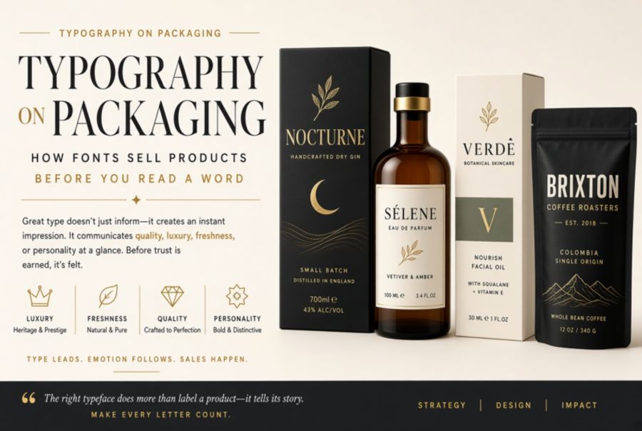
Typography on Packaging: How Fonts Sell Products Before You Read a Word
The 3-Second Shelf Test
A shopper scanning a supermarket aisle makes purchase-relevant judgments in roughly three seconds. In that window, they are not reading — they are recognising. The shape of the packaging, the colour palette, and the typography combine into a single, instant impression that either invites further attention or gets skipped. Typography carries a disproportionate share of this work because it communicates on two levels simultaneously: the literal meaning of the words, and the connotations of the letterforms themselves.
Think about what happens when you see a chocolate bar set in a heavy blackletter versus one set in a light geometric sans-serif. Before you have read the brand name, the first says "old-world, indulgent, European tradition" and the second says "modern, clean, possibly healthy." Neither message requires conscious processing. The typeface triggers associations built up over years of cultural exposure, and the shopper responds to those associations before they process a single word. This is why font choice on packaging is not a finishing touch — it is a strategic decision made at the same stage as formulation and pricing.
Category Conventions and Breaking Them
Every product category has typographic conventions, and those conventions exist because they work. Luxury goods lean toward high-contrast serif faces with generous spacing — think Didot, Bodoni, and their custom descendants. The thin strokes and sharp serifs signal precision and refinement. Organic and natural products gravitate toward rounded sans-serifs and hand-drawn lettering, often with visible irregularity, because imperfection suggests "made by humans, not factories." Children's products use chunky, bubbly letterforms with exaggerated proportions. Craft beverages reach for a mix of hand-lettered scripts and condensed industrials that say "small batch, made with care."
These conventions are powerful, but they are also a trap. When every organic snack bar uses the same rounded, earthy typeface, they all blur together on the shelf. The brands that break through are the ones that understand the convention well enough to deviate from it strategically. Oatly's packaging is a landmark example: instead of the expected soft naturalism, it uses a bold, almost aggressive hand-drawn type that feels like a protest poster. It violates every "rule" for dairy-alternative packaging, and that violation is precisely why it stands out. The typography says "we are not like the others," which turned out to be the most effective thing it could say.
Hierarchy at Arm's Length
Packaging typography operates under a constraint that screen and print designers rarely face: it must work at arm's length. The primary text — usually the brand name — needs to be identifiable from several feet away, which means it must be large, high-contrast, and distinctive in silhouette. The secondary text — flavour variant, product type — needs to be readable at about two feet. The tertiary text — net weight, nutritional claims, ingredients — only needs to work when the product is in the shopper's hand.
This three-tier hierarchy demands at least two and usually three typefaces (or weights within a family) that maintain coherence while serving very different purposes. The brand name typeface needs personality and memorability. The variant typeface needs clarity and quick differentiation — a shopper looking for "Honey Roasted" among eight flavours should not have to squint. The detail typeface needs pure legibility at small sizes on curved or uneven surfaces. Getting this hierarchy wrong is one of the most common packaging design failures: a beautiful brand name paired with a flavour label that disappears into the background, or legally mandated text so small it creates a consumer complaint.
The Weight Problem: How Fonts Lie About What's Inside
Research in consumer psychology has consistently shown that typography affects perception of the product itself — not just the brand. A 2017 study published in the Journal of Consumer Psychology found that lighter-weight typefaces on food packaging led consumers to perceive the product as lighter in calories, even when the actual nutritional information was identical. Heavier, bolder typefaces triggered associations with richness and indulgence. Round typefaces made products seem sweeter. Angular typefaces made them seem crunchier.
These findings are not trivial. They mean that a granola bar set in a thin sans-serif will be perceived as healthier than the same bar set in a bold slab serif, regardless of what the nutrition label says. Ethical brands take this seriously — if your product is genuinely healthy, using typography that signals "indulgent treat" misleads consumers, even if no explicit claims are made. Conversely, if your product is a rich dessert, dressing it in "wellness" typography is deceptive in its own way. The font is making promises that the product may not keep.
Global Packaging and Script Challenges
Brands that sell internationally face a typography problem that purely digital brands can often sidestep: the packaging must work across multiple scripts. A Japanese snack that sells in Japan, Korea, Thailand, and the United States needs typography in at least three scripts (CJK, Thai, and Latin), and all of them must coexist on a small physical surface without creating visual chaos.
The usual approach is to establish a typographic tone — light and geometric, or heavy and organic, or precise and classical — and then find typefaces in each required script that share that tone, even though the letterforms have nothing structurally in common. This is harder than it sounds. A geometric sans-serif like Futura has a clear "vibe," but finding a Japanese typeface that conveys the same feeling requires understanding the conventions of Japanese typography, where geometric purity reads differently than it does in Latin contexts. Many global brands commission custom type families that include matched designs across scripts — expensive, but the only way to maintain a coherent voice worldwide.
Printing Realities: What the Screen Won't Tell You
A packaging typeface that looks perfect on a designer's monitor can fail completely on the production line. Flexographic printing — the most common method for packaging — uses flexible relief plates that tend to spread ink slightly, a phenomenon called dot gain. Fine hairlines disappear. Thin serifs fill in. Small counters clog. A typeface designed for offset lithography or screen rendering may become an illegible mess when printed on corrugated cardboard at 130 lpi.
This is why experienced packaging designers choose typefaces with sturdy construction: generous x-heights, open counters, moderate stroke contrast, and no fine details that depend on precise reproduction. Some foundries design typefaces specifically for packaging and label printing — families like Verdana (originally designed for screen, but its open forms translate well to flexo) or bespoke designs that account for substrate, print process, and viewing distance from the start.
The gap between screen preview and printed result is also why physical prototyping matters. No amount of PDF proofing can substitute for printing a test run on the actual substrate with the actual inks and evaluating legibility under actual store lighting. The shelf is the final exam, and the font either passes or it does not.