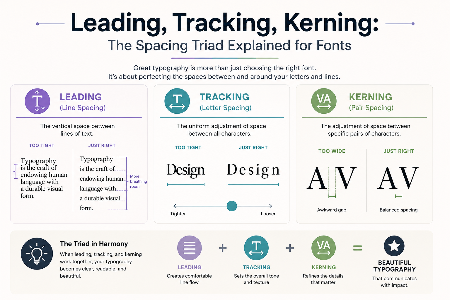
Three invisible forces shape how readable your text is. Most designers use them intuitively โ here's how to use them deliberately.
Typography tips, font roundups, tutorials, and platform news.
Three invisible forces shape how readable your text is. Most designers use them intuitively โ here's how to use them deliberately.
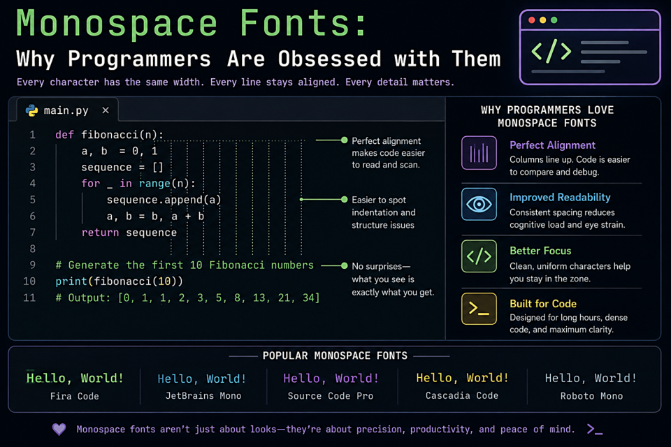
Choosing the right monospace font might be the most opinionated decision a developer makes. Here's what makes a great coding font and our top picks.
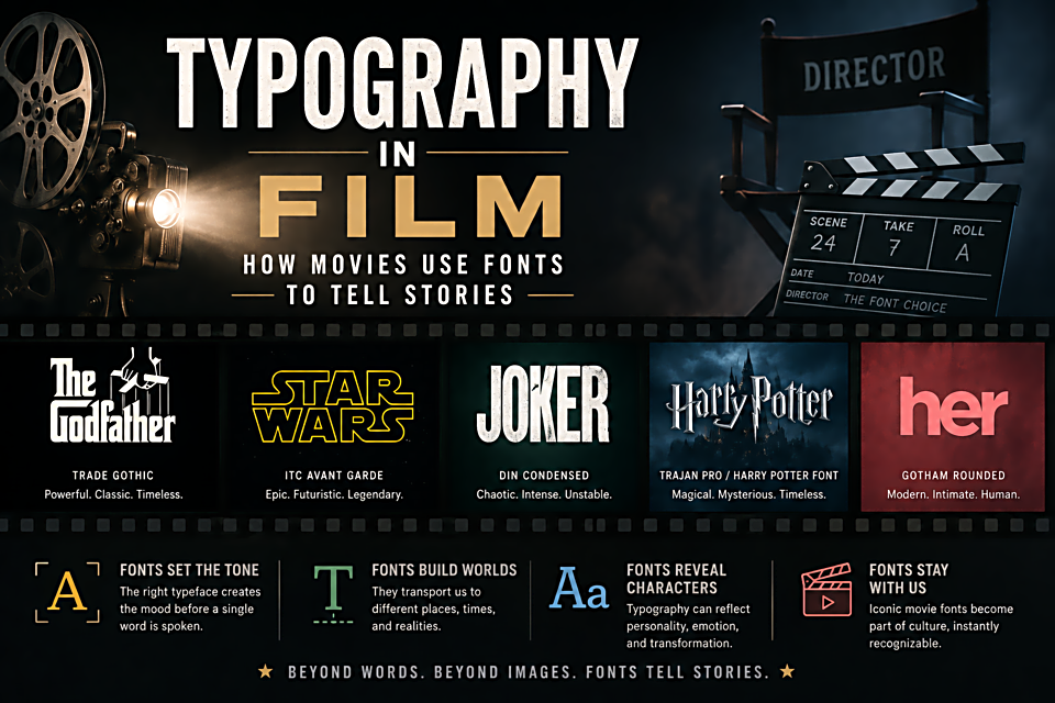
The fonts in a film's opening titles, posters, and on-screen text are never accidental. They're doing narrative work. Here's how Hollywood uses type.
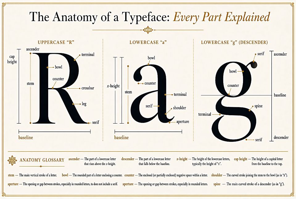
Ascenders, descenders, serifs, bowls โ type designers have names for every curve and stroke. Here's a plain-English guide to the anatomy of a letterform.
Introducing the FontsCorner blog โ your new source for typography tips, font roundups, design tutorials, and platform updates.