
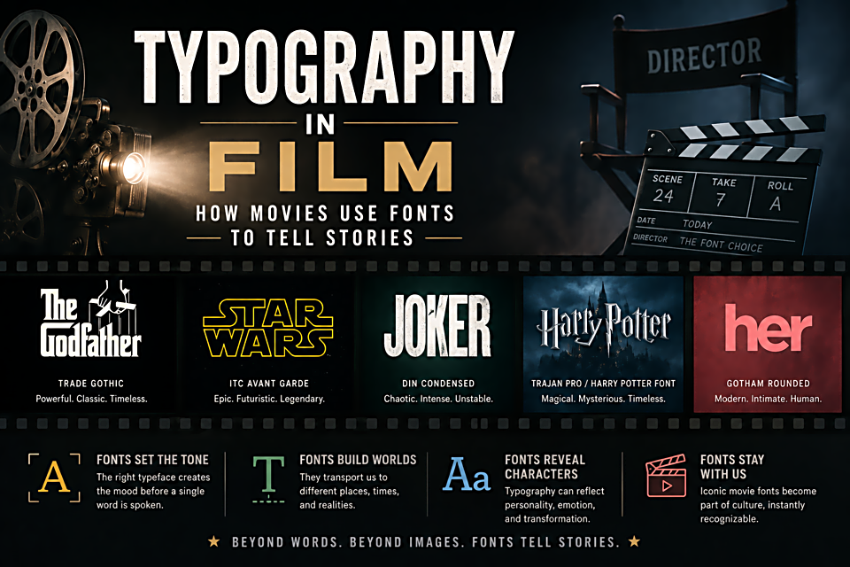
Typography in Film: How Movies Use Fonts to Tell Stories
The Title Sequence as Story
Before a word of dialogue is spoken, a film's title sequence is already doing characterization. The jagged, hand-lettered titles of early horror films like Psycho were chosen to create unease. The clean, modernist type in Stanley Kubrick's films (Futura, always) established an aesthetic of cold rationality that permeated every frame. Wes Anderson's use of Futura across his entire filmography is now so consistent that the font itself signals "Wes Anderson film" before any image appears.
Courier and the Screenplay
Every professional screenplay is written in 12pt Courier — not because it's beautiful, but because it's a standard. One page of properly formatted Courier screenplay equals approximately one minute of screen time. This mechanical relationship (inherited from typewriter days) has become the foundation of the entire film production scheduling system. Change the font and you break the industry's time calculations. Courier may be the most economically significant font in history.
Trajan: The Movie Font
Trajan, released by Adobe in 1989, is based on the letterforms carved into Trajan's Column in Rome (113 AD). It has been used on movie posters so consistently and for so long that it has become a cliché shorthand for "serious film." The Dark Knight, Gladiator, The Aviator, The Social Network, Les Misérables — the list is staggering. Film designer typographers use it not because it's necessarily the best choice, but because it reliably signals gravitas to an audience that has learned to associate it with prestige cinema.
Horror and the Distressed Font
Horror films have developed their own typographic vocabulary. Distressed, cracked, or dripping letterforms; fonts with inconsistent baseline alignment; handwritten scrawl — these all trigger unease because they signal disorder and the breakdown of the order that clean, professional type represents. The Texas Chain Saw Massacre's hand-painted title cards look DIY and raw precisely because that rawness is the point.
Subtitles as Invisible Design
The best subtitles are the ones you stop noticing. The ideal subtitle font is white with a subtle shadow or outline — readable against any background, not distracting during action sequences, and consistent. Tiresias, a font developed by the Royal National Institute for the Blind, is widely used for subtitles because it maximizes character distinction at small sizes on variable backgrounds. Good subtitle typography is defined by what it doesn't do to the viewer.