
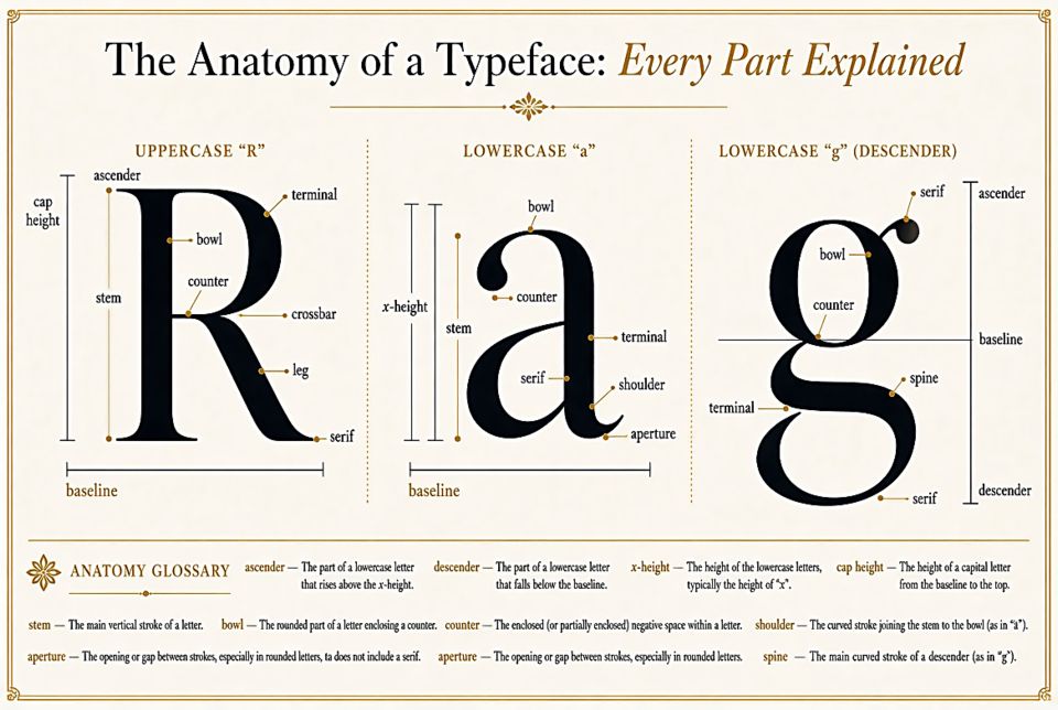
The Anatomy of a Typeface: Every Part Explained
Every letter in every font is built from named parts. Once you learn them, you'll never look at text the same way again — and you'll be able to talk about type like a professional.
The Baseline and X-Height
The baseline is the invisible line that most letters sit on. The x-height is the height of a lowercase "x" — and it's arguably the most important measurement in a typeface. Fonts with a large x-height (like Roboto or Georgia) feel spacious and readable at small sizes. Fonts with a small x-height feel elegant but can struggle at body text sizes.
Ascenders and Descenders
Letters like b, d, h, and l extend above the x-height — these are called ascenders. Letters like g, p, q, and y dip below the baseline — those are descenders. A font with long ascenders and descenders feels formal and classical; shorter ones feel modern and compact.
Serifs
Those small finishing strokes at the ends of letterforms are serifs. Fonts without them are called sans-serif (sans is French for "without"). Serifs come in many styles — bracketed, hairline, slab — and they each give a typeface a completely different personality.
Counters and Bowls
The enclosed or partially enclosed space inside letters like o, p, and d is called a counter. The curved stroke that creates it is a bowl. Large, open counters improve legibility, especially at small sizes. You can test this by squinting at a block of text — fonts with generous counters stay readable even when you can't quite focus.
Stems, Strokes, and Stress
The main vertical stroke of a letter is its stem. The variation in thickness between thick and thin parts of a letterform is called stroke contrast. High-contrast typefaces (like Bodoni) have dramatic thick-thin variation. Low-contrast faces (like Futura) are nearly uniform in weight. The angle at which this contrast is applied is called the stress — old-style fonts have diagonal stress; transitional and modern fonts have vertical stress.
Terminals and Apertures
Where a stroke ends without a serif, you'll find a terminal — it might be round, flat, angled, or tapered. The opening in letters like c, e, and s is the aperture. Wide apertures feel friendly and open; narrow apertures feel refined or sophisticated.
Why This Matters
Understanding anatomy helps you make better decisions. When a client says a font feels "too stiff," they're often responding to vertical stress and low apertures. When something feels "dated," check the serifs. When body text feels cramped, look at the x-height and counters. The vocabulary gives you the tools to diagnose and fix typographic problems rather than just cycling through options until something feels right.