
Leading, Tracking, Kerning: The Spacing Triad Explained
Leading: The Space Between Lines
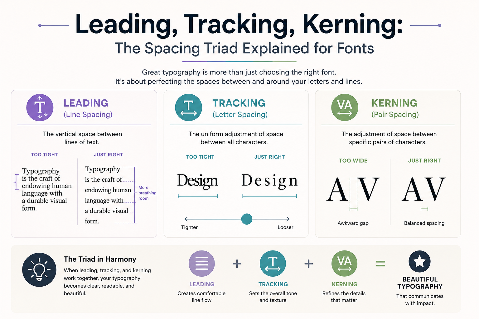
Leading (rhymes with "bedding" — named after the strips of lead used to separate lines in manual typesetting) is the vertical distance between lines of text, measured baseline to baseline. In CSS, this is line-height.
The appropriate leading depends on line length and font choice:
- For body text: 1.4–1.8 (multiply this by your font size to get the pixel value)
- For headlines: 1.1–1.3 — headlines are read in single glances, so they don't need the generous spacing of body text
- For very long line lengths (75+ characters): increase toward 1.8
- For short line lengths (40 characters or fewer): decrease toward 1.4
Too little leading makes text feel dense and exhausting. Too much leading makes the text float apart and lose cohesion — the reader's eye struggles to find the next line.
Tracking: The Space Between All Letters
Tracking (also called letter-spacing, which is the CSS property name) adjusts the space between every character in a block of text uniformly. It's the difference between N O R M A L and NORMAL.
Key rules:
- All-caps text always needs extra tracking — all-caps without tracking feels cramped. A value of 0.05–0.15em is typical
- Large display text often benefits from slightly tighter tracking — the same letter-spacing that looks fine at 16px can look gappy at 72px
- Body text rarely needs adjusted tracking — the font designer has already set appropriate values
- Luxury brands add tracking to signal premium quality — wide-spaced type reads as refined
Kerning: The Space Between Specific Letter Pairs
Kerning adjusts the space between individual letter pairs — not all letters uniformly, but specific combinations that create optical problems. The classic examples are AV, WA, To, and Yo — the shapes of these letters create gaps that look wrong even with correct overall spacing.
Professional fonts include kerning tables with hundreds of pair adjustments. Display and headline fonts typically have more kerning information than text fonts because the optical problems are more visible at large sizes.
In practice:
- Body text rarely needs manual kerning — trust the font's built-in kerning tables
- Large headlines often benefit from manual optical adjustments
- CSS offers
font-kerning: auto(default) andfont-kerning: none - In design software, always enable optical kerning for headlines and visual kerning for body text
The Three Together
These three spacing controls interact. Increasing tracking on a font that already has generous leading makes it feel spacious and refined. Tight tracking with tight leading creates intensity and compression — used deliberately in some editorial and advertising design, but unreadable if accidental.
When something feels off about your typography but you can't identify what, adjust one of these three variables. Usually one of them is the culprit.