
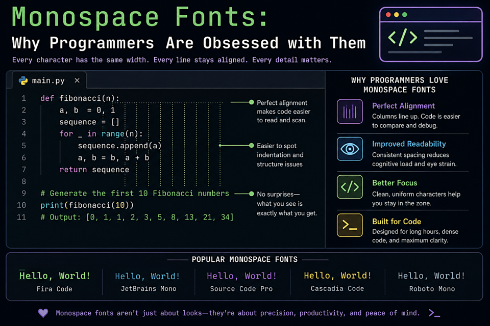
Monospace Fonts: Why Programmers Are Obsessed with Them
Ask a developer about their font and prepare for a thirty-minute conversation. Monospace font preference is one of the most personal decisions in the craft — right up there with tabs versus spaces and which editor to use. But beyond personal taste, there are genuine differences that affect how many hours a day feel when you're staring at code.
What Makes a Great Coding Font?
The requirements are specific:
- Clear disambiguation — 0 (zero) and O (oh), 1 (one) and l (el) and I (capital i), must be unmistakably different
- Consistent weight — all characters should read at the same visual weight so nothing pops unexpectedly
- Large x-height — increases readability at the small sizes developers often use
- Good rhythm — code is read in columns and patterns as much as linearly; the font's vertical rhythm matters
- Ligature support (optional but loved) — many coding fonts include programming ligatures that turn == into ≡ and => into ⇒
The Top Picks
1. JetBrains Mono
Created by JetBrains (makers of IntelliJ and WebStorm), this font was specifically engineered for reading code. Increased height for lowercase letters, minimized eye strain, and 142 programming ligatures. Free and open-source. Currently the most popular coding font among developers.
2. Fira Code
The font that popularized programming ligatures. Fira Code takes Mozilla's Fira Mono and adds an extensive ligature library. If you want -> to actually look like an arrow in your editor, start here.
3. Cascadia Code
Microsoft's open-source font designed alongside the new Windows Terminal. Clean, friendly, and excellent ligature support. The Cascadia Mono version drops ligatures for those who prefer them off.
4. Source Code Pro
Adobe's open-source monospace companion to Source Sans Pro. No ligatures, but extremely well-designed and balanced. The professional's low-drama choice.
5. IBM Plex Mono
IBM's open-source typeface system includes a stellar monospace member. A touch mechanical, a touch humanist — it reads like it was made for serious work, which it was.
6. Hack
Designed specifically for source code with attention to the characters developers see most often. Excellent bold and italic rendering for editors that use them for syntax highlighting.
A Note on Rendering
The same font can look radically different on macOS (which uses subpixel antialiasing) versus Windows (ClearType) versus Linux (depends entirely on your configuration). Download and try before committing — what looks beautiful on a screenshot may look quite different on your actual setup.