
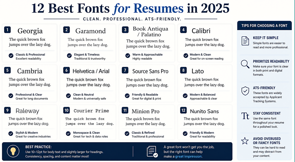
12 Best Fonts for Resumes in 2025
The ATS Problem
Most large employers run resumes through Applicant Tracking Systems before a human ever sees them. ATS software reads text, and exotic or decorative fonts can cause it to misread your content. Stick to widely supported, clean fonts and you'll pass this first filter every time.
Classic Serifs — Professional and Readable
1. Georgia
Designed specifically for screen readability. Georgia at 11pt in a resume body is the gold standard for a reason — it's impossible to go wrong with it. Slightly warmer than Times New Roman.
2. Garamond
Elegant and space-efficient. At 11pt, Garamond fits more content per line than most fonts without feeling cramped. Excellent for senior professionals with a lot of experience to summarize.
3. Book Antiqua / Palatino
A warm, humanist serif that reads as thoughtful and measured. Popular in academic and research roles.
Modern Sans-Serifs — Clean and Contemporary
4. Calibri
Microsoft's default font since 2007 — which means ATS systems can always read it flawlessly. Humanist proportions make it friendlier than Arial.
5. Cambria
A serif designed for screen and print. Sits beautifully between traditional and modern and works in finance, law, and consulting.
6. Helvetica / Arial
The Swiss workhorses. Neutral, professional, and universally readable. If you want the hiring manager focused entirely on your content rather than your design choices, Helvetica is your answer.
7. Source Sans Pro
Adobe's humanist sans — clean without being cold. Works especially well for tech, design, and creative roles.
8. Lato
Semi-rounded, friendly, and very readable. The semi-bold weight is excellent for section headers, creating clear hierarchy.
9. Raleway
Slightly distinctive without being unusual. Works particularly well for design, marketing, and creative fields where you want to subtly signal visual awareness.
Monospace — For Technical Roles
10. Courier Prime
An improved version of Courier. If you're in a field where monospace reads as technical credibility (development, security, data science), this is a legitimate choice — particularly for code samples in technical resumes.
Premium Picks
11. Minion Pro
Used in textbooks and serious publications worldwide. If your field values intellectual seriousness — academia, law, medicine — Minion Pro signals it immediately.
12. Nunito Sans
Rounded terminals make it feel approachable and warm. A great choice for education, healthcare, and non-profit roles.
Sizing Recommendations
Body text: 10–12pt. Headers: 14–16pt. Your name: 18–24pt. Avoid anything below 10pt — even if it fits more content, it signals either inexperience or that you have too much to say. One to two pages maximum.