
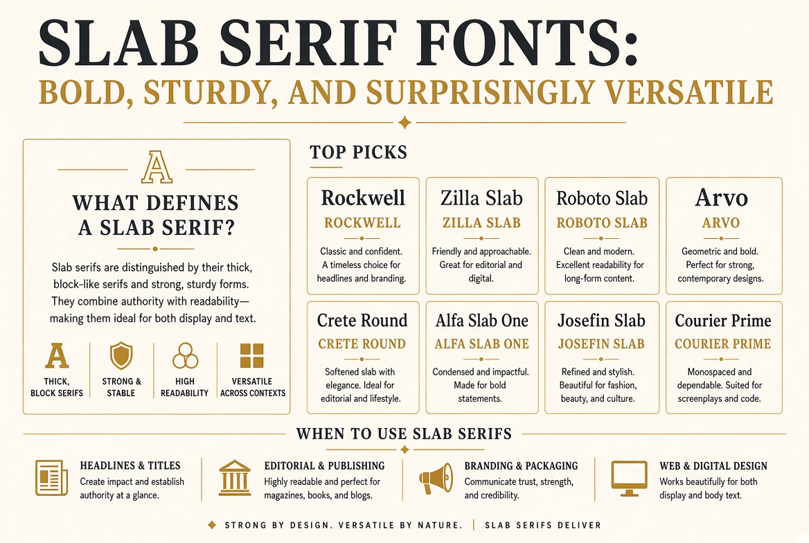
Slab Serif Fonts: Bold, Sturdy, and Surprisingly Versatile
A Brief History of the Slab
Slab serifs — also called Egyptian fonts, a name whose origins are disputed but possibly connected to the Napoleon-era fascination with Egypt — emerged in early 19th century England as commercial advertising type. The thin, delicate serifs of classical Roman letterforms didn't survive the coarse printing of the era, so type designers made the serifs as thick as the main strokes. The result was bold, sturdy, and impossible to miss on a Victorian broadside.
What Defines a Slab Serif
The defining characteristic is exactly what the name suggests: serifs that are thick, rectangular slabs rather than the tapered, bracketed finishing strokes of classical serifs. Stroke contrast is low — the thick and thin parts of letters are close in weight, which gives slab serifs their sturdy, solid presence. There's no fragility here.
Top Slab Serif Picks
1. Rockwell
The quintessential geometric slab. Perfect circles, mathematical proportions, and maximum confidence. If you want to communicate "solid and established," Rockwell is your starting point.
2. Zilla Slab
Created for Mozilla by Typotheque. Available free via Google Fonts. Clean, modern, and excellent for both display and text use — a versatility that most slabs lack.
3. Roboto Slab
A slab version of Google's ubiquitous Roboto. If your project uses Roboto for UI elements, Roboto Slab makes a natural heading companion with instant family coherence.
4. Arvo
A geometric slab designed specifically for web use. Slightly softer than Rockwell, which makes it work better in body text contexts. Good balance of formality and approachability.
5. Crete Round
A slab serif with rounded terminals — an unusual and particularly warm combination. Great for brands that want slab strength without slab coldness.
6. Alfa Slab One
Extreme display slab with maximum impact. Use at headline sizes only, but at those sizes it commands absolute attention.
7. Josefin Slab
A geometric slab in the style of 1930s Scandinavian poster design. Its thin weight is especially distinctive — a light slab serif is a genuinely unusual combination.
8. Courier Prime
A carefully refined version of the classic typewriter font. For technical documents, legal formatting, and anywhere the typewriter aesthetic serves the content.
When to Use Slab Serifs
Slab serifs work best when you want authority without coldness, boldness without aggressiveness, or tradition without formality. They're especially effective in editorial design, tech products that want to feel mature and considered, and brand identities that need to project confidence without corporate distance.