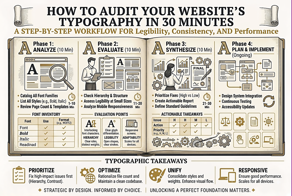
Your site probably has typographic inconsistencies you have never noticed โ redundant font loads, orphaned styles, accessibility gaps, and performance drains. Here is a fast, structured audit to find and fix them.
Typography tips, font roundups, tutorials, and platform news.
Your site probably has typographic inconsistencies you have never noticed โ redundant font loads, orphaned styles, accessibility gaps, and performance drains. Here is a fast, structured audit to find and fix them.
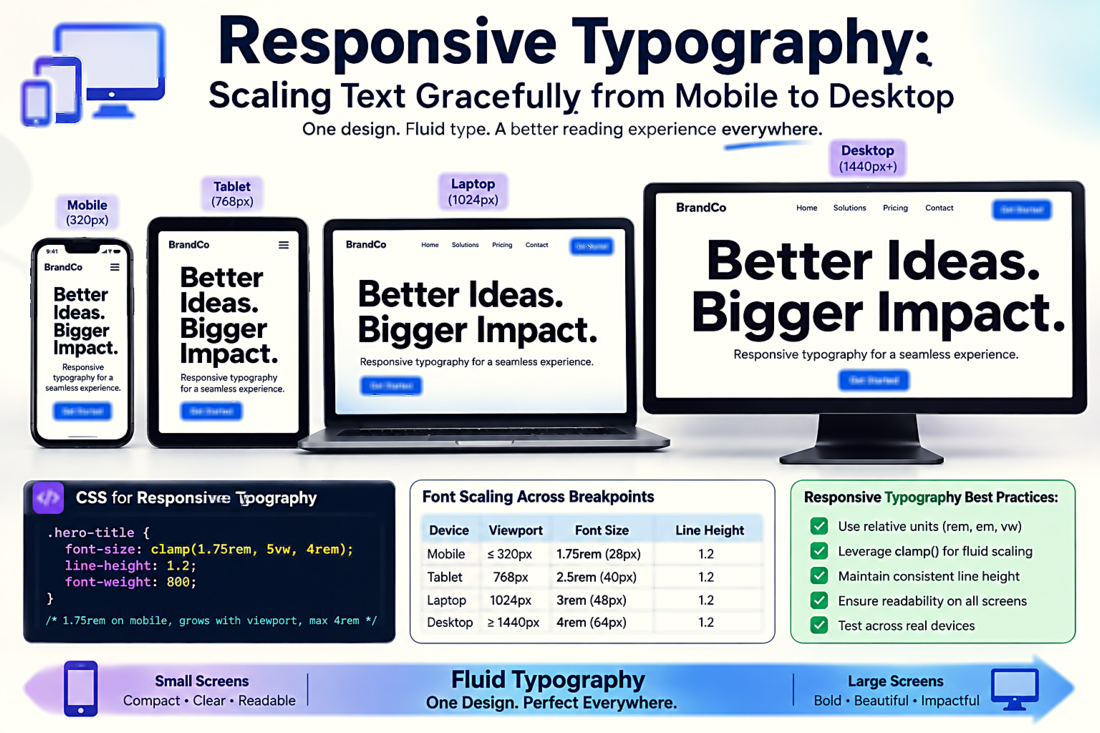
Setting font-size to 16px and walking away is not responsive typography. True responsive type scales fluidly with the viewport, maintains readable line lengths at every breakpoint, and adjusts its spacing and hierarchy dynamically.
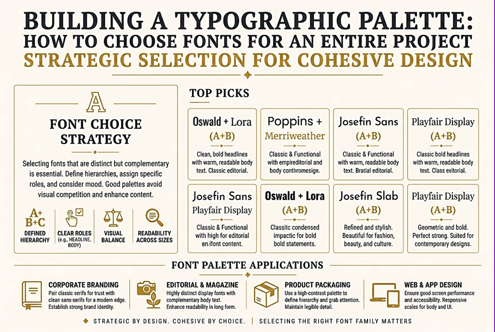
Choosing a font for a heading is easy. Choosing a coherent set of typefaces that work together across an entire website, app, or brand system is a fundamentally different challenge. Here is a systematic approach.
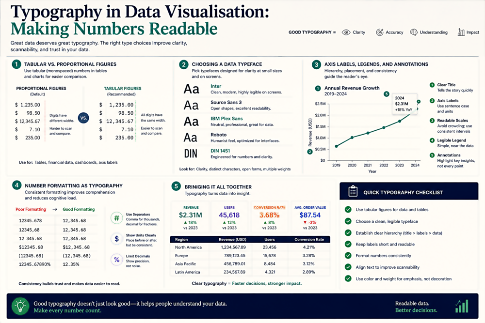
The fonts in your charts, tables, and dashboards are doing more work than you think. Bad typographic choices can make accurate data look misleading. Here is how to get it right.
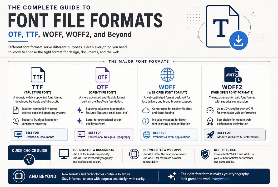
OTF or TTF? WOFF or WOFF2? EOT? SVG fonts? The number of font file formats is bewildering. Here's what each format actually does, when to use it, and which ones you can safely ignore.
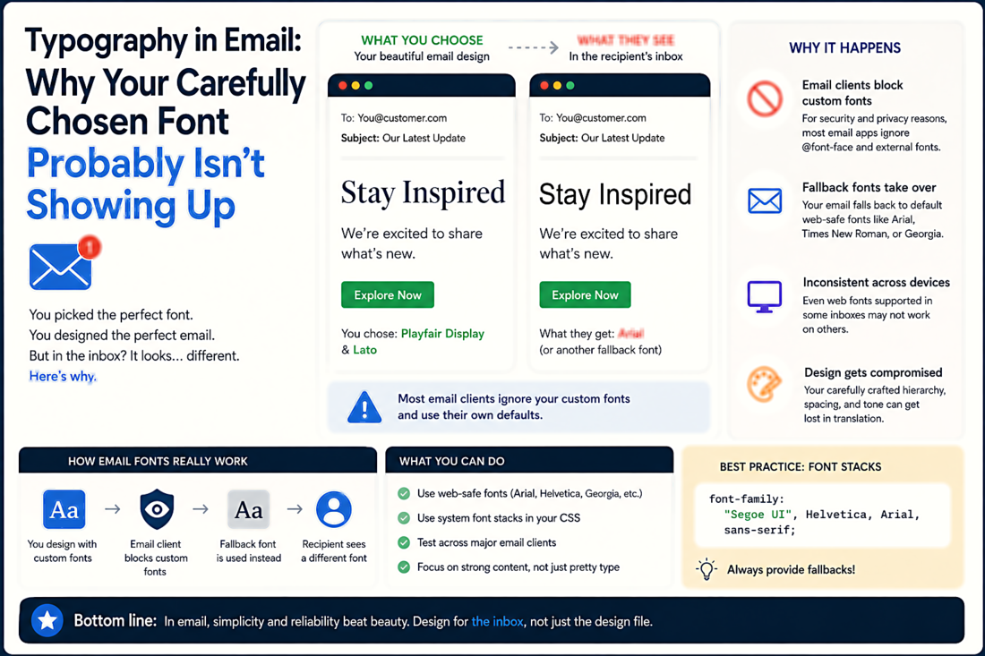
Email is where beautiful typography goes to die. Between rendering engines from 2007, aggressive security stripping, and the sheer number of email clients, getting fonts right in email is a unique challenge.
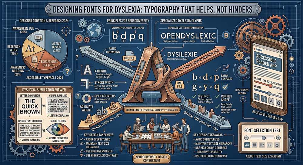
Roughly 15-20% of the population has some form of reading difficulty. The typographic choices you make can either ease their experience or make it significantly worse. Here is what the research actually says.
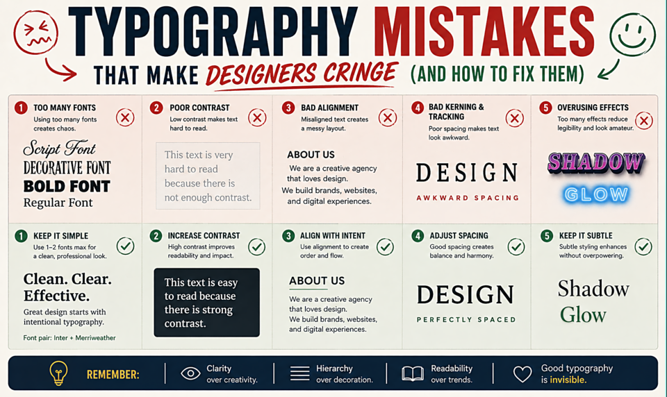
Smart quotes, real dashes, no widows โ the typographic details most people get wrong. Here's a practical guide to cleaning up the mistakes that undermine professional design.
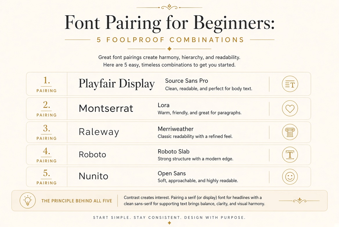
Skip the guesswork โ these five font combinations have been tested across thousands of real projects and they work every single time.
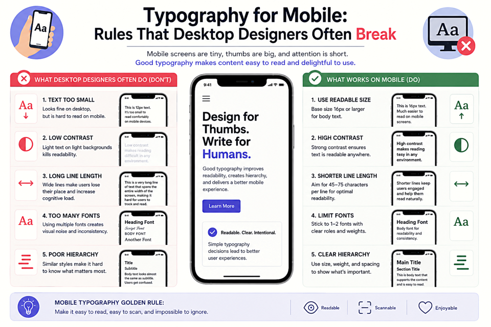
Mobile screens demand different typographic thinking. What looks great on a 27-inch monitor can be completely unreadable on a phone. Here's what to change.
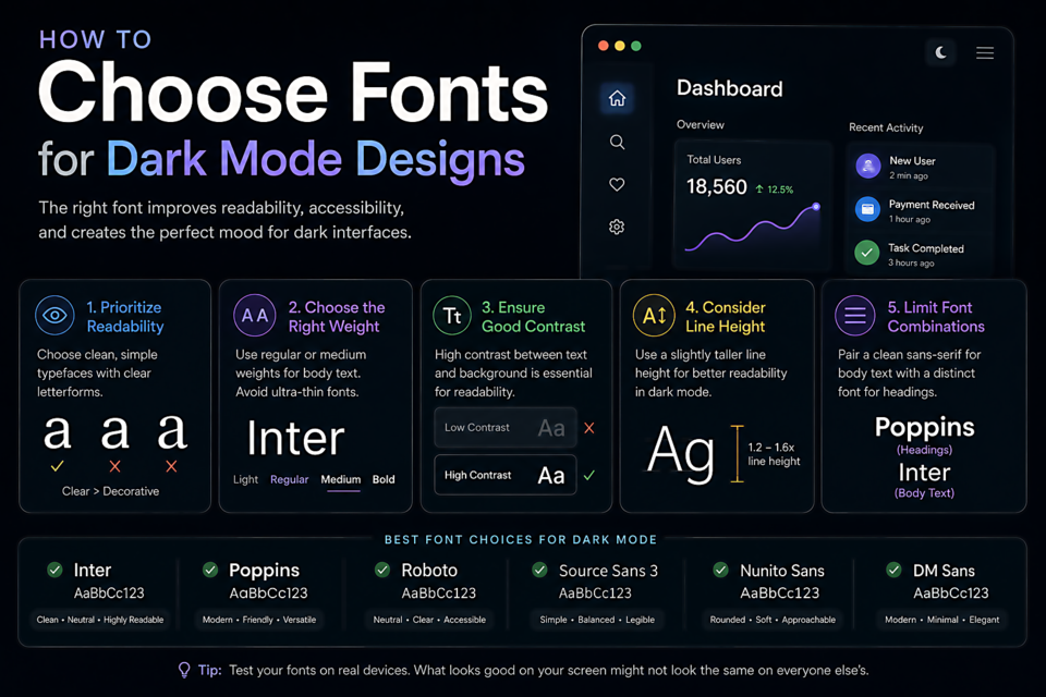
Dark mode isn't just inverting colors โ it changes how fonts look and feel. Here's how to choose and adjust typography specifically for dark backgrounds.
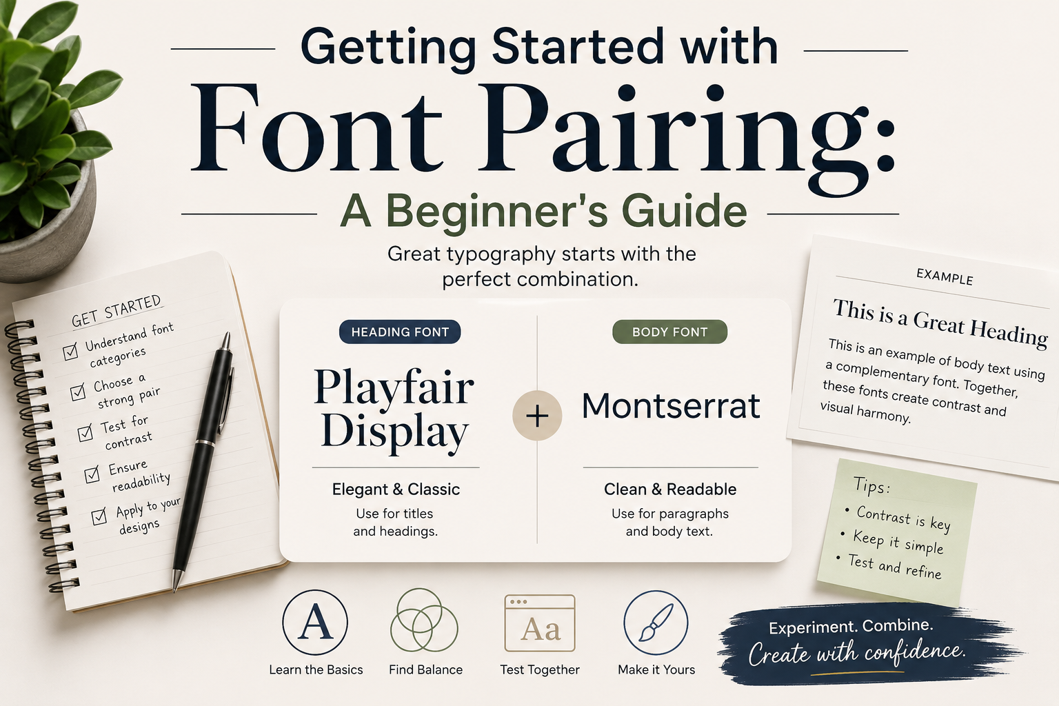
Font pairing doesn't have to be intimidating. Learn the basic principles and try our favourite combinations.