
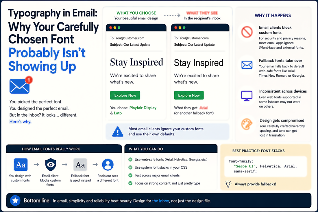
Typography in Email: Why Your Carefully Chosen Font Probably Isn't Showing Up
The Email Rendering Landscape
Unlike web browsers, which have largely converged on modern CSS and font rendering standards, email clients are a fragmented nightmare. Apple Mail and iOS Mail render web fonts beautifully — they support @font-face and @import just like a modern browser. Thunderbird does too. But Outlook for Windows (which Microsoft has been re-building on a web-based renderer, though the transition is gradual) has historically used the Word rendering engine for HTML — yes, Microsoft Word, the word processor. This means that Outlook strips web fonts, ignores much of your CSS, and renders your carefully designed email with all the typographic nuance of a Word document from 2007.
Gmail strips all <link> and @import statements, which eliminates web fonts entirely. It supports inline styles and <style> blocks (for most properties), but your custom typeface will be replaced with Gmail's default (usually Roboto on Android, the system sans-serif elsewhere). Yahoo Mail has similar restrictions. The result: the majority of your email recipients will never see your custom font.
Building a Bulletproof Font Stack
The practical solution is progressive enhancement with a carefully ordered font stack. Start with your desired web font (loaded via @import in a <style> block), followed by platform-specific system fonts that approximate its character, followed by generic families as the final fallback.
For a modern sans-serif feel, a good stack looks like: font-family: 'Your Custom Font', -apple-system, BlinkMacSystemFont, 'Segoe UI', Roboto, 'Helvetica Neue', Arial, sans-serif;. This gives you your custom font on Apple Mail and iOS Mail, Segoe UI on Windows, Roboto on Android, Helvetica Neue on older Macs, and Arial as the universal fallback. For a serif stack: font-family: 'Your Custom Serif', Georgia, 'Times New Roman', Times, serif; — Georgia is the best serif fallback because it was designed for screen rendering and is available on virtually every device.
What You Can Control
Even without custom fonts, you have significant typographic control in email. Font size is widely supported — set body text to at least 16px for readability on mobile. Line height works reliably as an inline style. Font weight (bold) and font style (italic) are universally supported. Color works everywhere. Letter-spacing works in most clients (Outlook is inconsistent). Text-align is universally supported.
The typographic properties you should avoid or use cautiously: font-variant (small caps) — inconsistent support. text-transform — mostly works but can interact poorly with some screen readers. word-spacing — poorly supported in Outlook. text-shadow — stripped by most email clients. Stick to the basics and your emails will render consistently across the vast majority of clients.
The Mobile-First Imperative
Over 60% of email opens now happen on mobile devices. This has a direct typographic implication: your font size, line spacing, and layout must be comfortable on a small screen. A 13px font that looks fine on a desktop monitor becomes an eye-straining pinch-to-zoom exercise on a phone. Set your body text to 16px minimum, use 1.5 line-height or higher, and keep your line length short enough that mobile users do not have to scroll horizontally. If you design your email typography for mobile first and let it scale up for desktop, you will produce better results than designing for desktop and hoping it works on phones.
Testing Is Non-Negotiable
Because of the rendering fragmentation, testing email typography across multiple clients is not optional. Services like Litmus and Email on Acid render your email in dozens of clients simultaneously and show you exactly what each one looks like. At minimum, test in: Apple Mail, iOS Mail, Gmail (web and mobile), Outlook (Windows desktop and the newer web-based version), and Yahoo Mail. These five cover the vast majority of your audience. If your font stack and fallbacks look good in all five, you can ship with confidence. If your custom font only shows up in Apple Mail, that is fine — as long as the fallback looks intentional and professional everywhere else.