
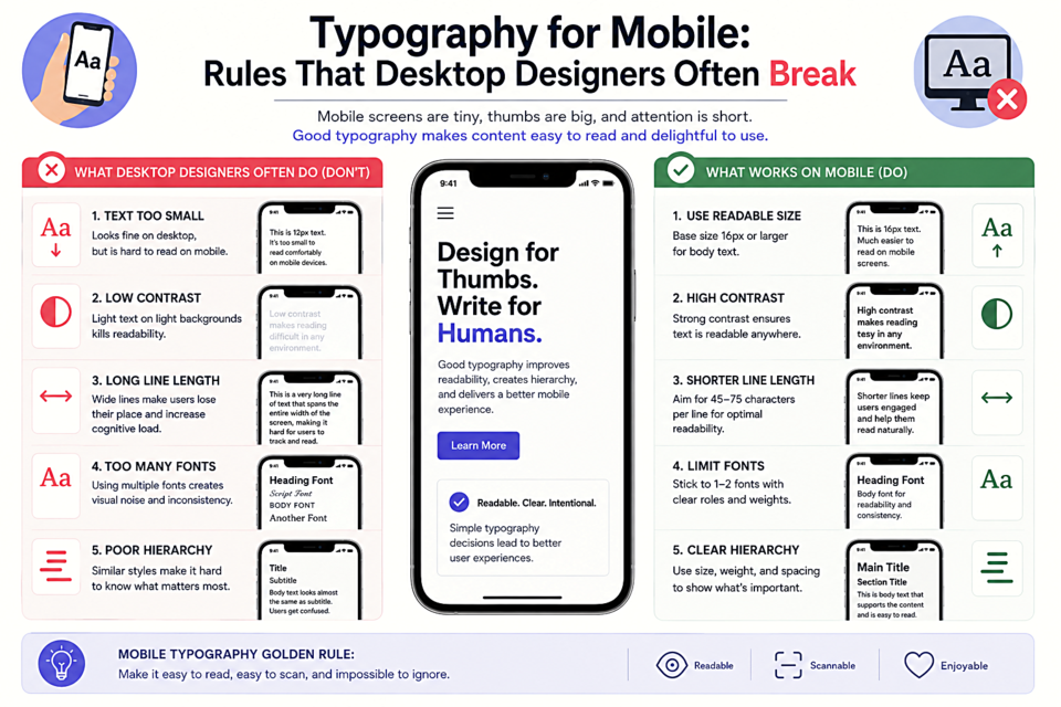
Typography for Mobile: Rules That Desktop Designers Often Break
The Minimum Size Problem
Designers working on desktop monitors sometimes set body text at 14px or even 13px and think it looks fine. On a phone held 12 inches from your face, 14px is borderline painful to read, especially outdoors or in bright light. The baseline for mobile body text is 16px — and Apple and Google both recommend it in their design guidelines. This isn't optional. Go below it and you'll see real drops in engagement and time-on-site.
Line Length: The Harder Problem
The ideal line length for reading is 50–75 characters. On desktop, this is easy — just set a max-width on your text containers. On mobile, a 375px-wide phone with 16px text and normal padding gives you about 35–45 characters per line — below the ideal. This isn't a bug you can fix; it's a constraint of the medium. The solution is to compensate with slightly tighter line-height (1.5 instead of 1.7) and ensure your paragraphs aren't too long. Shorter paragraphs feel less daunting on small screens.
Line Height: More Than Desktop
On mobile, lines of text are harder to track visually because the screen is small and you're more likely to be in motion. Increase your line-height to 1.6–1.75 for body text to give readers enough visual breathing room between lines.
Font Choice on Mobile
Avoid fonts with:
- Very thin strokes — they can disappear at mobile sizes
- Tight letter spacing — already compressed on small screens
- Small x-height — reduces readability at small sizes
- Complex, decorative letterforms — details become noise at 16px
Prefer fonts with generous x-height, open counters, and clear letter differentiation. Inter, Lato, Nunito, Merriweather, and Source Sans Pro are reliable choices.
Heading Sizes: Scale Down More Than You Think
An 48px H1 that looks bold and punchy on desktop becomes an overwhelming wall of text on mobile. Scale your heading sizes down significantly — an H1 might go from 48px to 32px, H2 from 36px to 24px. Use CSS clamp() to create smooth fluid scaling:
h1 {
  font-size: clamp(1.75rem, 5vw, 3rem);
}
Touch Targets and Whitespace
Links and buttons in the middle of text need enough padding to be tapped accurately — a minimum of 44×44px per Apple's Human Interface Guidelines. Don't set text links so tight that a mis-tap navigates away from what the reader was enjoying. Generous whitespace on mobile isn't a luxury — it makes content usable.