
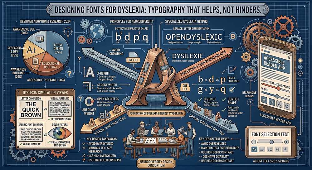
Designing for Dyslexia: Typography That Helps, Not Hinders
What Dyslexia Actually Does to Reading
Dyslexia is not "seeing letters backwards" — that is a persistent myth. Dyslexia is a neurological difference that primarily affects the phonological processing system: the brain's ability to connect written symbols to sounds. For people with dyslexia, reading requires more conscious effort, and certain visual patterns in text can amplify the difficulty. Typography cannot cure dyslexia, but it can either reduce or increase the cognitive load that reading demands.
The specific visual challenges that dyslexic readers commonly report include: letter mirroring (confusing b/d, p/q, and similar mirrored pairs), letter crowding (adjacent letters appearing to merge or swap), line jumping (losing track of which line the eye is on), and visual stress (the text appearing to shimmer, blur, or move on the page). Good typographic choices can mitigate all of these.
What the Research Recommends
The British Dyslexia Association and multiple peer-reviewed studies converge on a consistent set of typographic guidelines. Font choice: use sans-serif fonts with distinct letterforms. Arial, Verdana, and Calibri are commonly recommended. The key is that each letter should look clearly different from every other letter — particularly the commonly confused pairs (b/d, p/q, I/l/1, rn/m). Fonts with uniform letter shapes (like some geometric sans-serifs) can be problematic because they create more opportunities for confusion.
Font size: minimum 12-14pt for body text, with many guidelines recommending 16pt or larger for digital screens. Line spacing: at least 1.5x the font size, with many sources recommending 1.8x or even 2x. Letter spacing: slightly increased tracking (0.05-0.12em) reduces the crowding effect. Line length: 60-70 characters maximum. Paragraph spacing: generous gaps between paragraphs help prevent line jumping. Alignment: left-aligned (ragged right) text is strongly preferred over justified text, because justified text creates uneven word spacing that disrupts reading flow.
The OpenDyslexic Debate
OpenDyslexic is a free typeface specifically designed for dyslexic readers. Its letterforms are heavily weighted at the bottom, which is intended to anchor each letter and prevent the visual "flipping" that some dyslexic readers experience. It has become widely available — built into many e-readers, browser extensions, and educational software.
However, the research on OpenDyslexic is mixed. Several studies have found no measurable improvement in reading speed or accuracy compared to standard sans-serif fonts like Arial or Verdana. Some participants reported a subjective preference for OpenDyslexic (it "felt" easier), but their actual reading performance did not improve. Other studies found slight benefits for specific subgroups. The current consensus among researchers is that OpenDyslexic is not harmful, and individual preferences should be respected, but it is not a silver bullet. The spacing and layout guidelines listed above are more consistently supported by evidence than any specific font choice.
Colour and Contrast
Pure black text on pure white backgrounds creates maximum contrast, which might seem ideal. But for many dyslexic readers, this high contrast actually increases visual stress — the text can appear to vibrate or shimmer against the bright white. Reducing contrast slightly (using dark grey text like #333333 on an off-white background like #FAFAF5, or offering tinted background options) can significantly reduce this effect. Some readers find pastel-tinted backgrounds (pale yellow, cream, or light blue) particularly helpful.
This is why offering a reading mode or theme toggle is one of the most impactful accessibility features a website can provide. It costs almost nothing to implement and can make a meaningful difference for a significant portion of your audience.
Implementation Checklist
For web designers, here is a practical checklist: Use a clean sans-serif with distinct letterforms (Verdana, Tahoma, or a humanist sans-serif). Set body text to at least 16px. Set line-height to at least 1.5 (1.8 preferred). Add letter-spacing of 0.05em or more. Keep line length under 70 characters. Use left alignment, not justified. Avoid italic text for long passages (bold for emphasis instead). Provide sufficient paragraph spacing (at least 1.5x the line-height between paragraphs). Consider offering a high-contrast toggle and a tinted-background option. None of these changes will hurt non-dyslexic readers, and all of them will help dyslexic readers. That is the definition of inclusive design.