
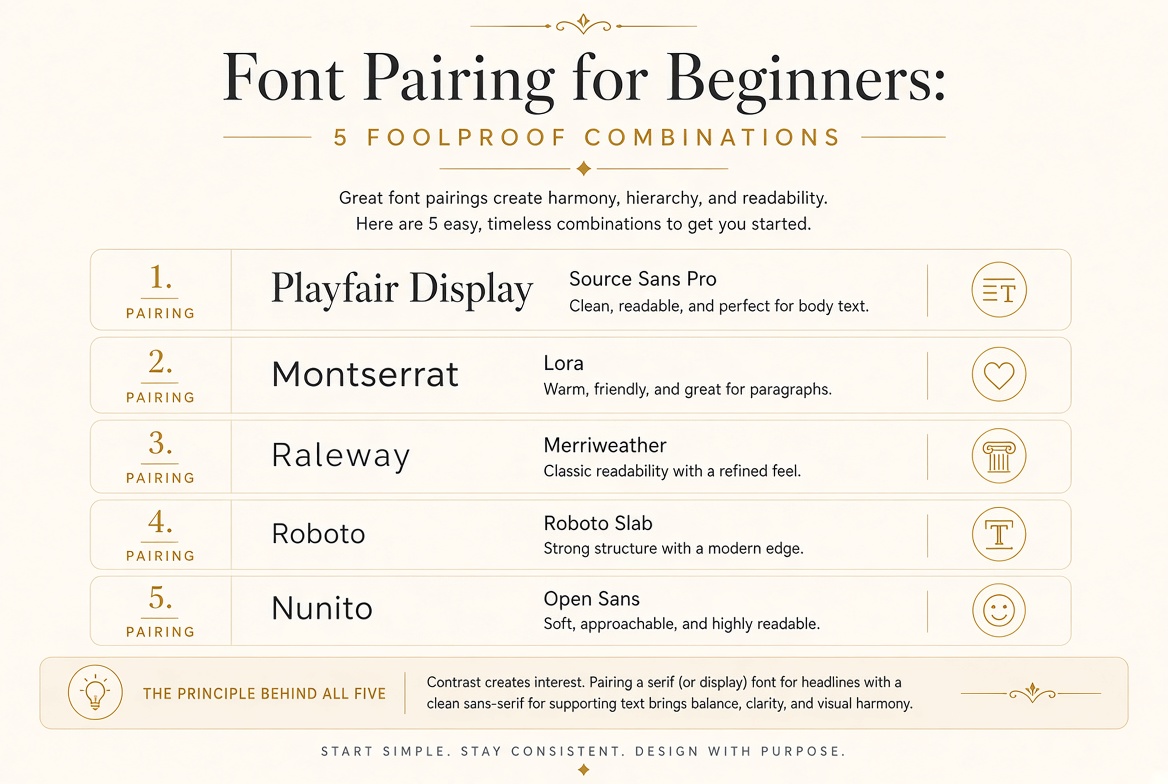
Font Pairing for Beginners: 5 Foolproof Combinations
Font pairing is one of those skills that feels intimidating until you understand the underlying principles — and then it becomes instinctive. While you develop that instinct, these five combinations will serve you well in virtually any project.
Combination 1: Playfair Display + Source Sans Pro
Good for: Blogs, editorial sites, professional portfolios, anything requiring elegance with readability
Playfair Display is an editorial serif with high contrast and drama — it commands attention at headline sizes. Source Sans Pro is a clean, neutral sans-serif designed by Adobe for maximum readability. The contrast between them is significant enough to create strong hierarchy while both remain refined. Use Playfair Display Bold or Black for headings (24px+), Source Sans Pro Regular for body text (16–18px).
Combination 2: Montserrat + Lora
Good for: Marketing sites, brand identity, landing pages
Here the roles are reversed — the geometric sans-serif (Montserrat) serves as the heading font, and the warm serif (Lora) provides body text. This combination is fresh because it breaks the expected pattern. Montserrat's geometric clarity in headings signals modernity; Lora's warmth in body text keeps readers engaged through long passages. Use Montserrat Bold or ExtraBold for headings, Lora Regular at 1.7 line-height for body.
Combination 3: Raleway + Merriweather
Good for: Design agencies, creative studios, lifestyle brands
Raleway has a distinctive "W" letterform and refined proportions that give any project a hint of premium quality. Merriweather was designed specifically for comfortable screen reading, with a large x-height and strong shapes at all sizes. The combination feels aspirational without being cold. Raleway Light or Thin for large display text creates a beautiful contrast with Merriweather Regular body text.
Combination 4: Roboto + Roboto Slab
Good for: Apps, dashboards, technical documentation, any UI
Sometimes the cleanest solution is within a single superfamily. Roboto and Roboto Slab share the same underlying proportions and x-height, so pairing them creates instant visual harmony. The switch from sans-serif to slab is enough contrast for clear hierarchy without any risk of the fonts clashing. This combination is especially effective in interfaces where you need to distinguish UI labels from content text.
Combination 5: Nunito + Open Sans
Good for: Apps for children, healthcare interfaces, community platforms, any context requiring warmth and approachability
Both fonts have rounded terminals — that subtle curve at the end of each stroke that makes letterforms feel friendly rather than severe. Nunito is slightly more distinctive, making it a natural choice for headings; Open Sans is one of the most legible fonts ever designed, making it perfect for body text. The rounded quality of both keeps the overall feeling warm and human.
The Principle Behind All Five
Each combination pairs fonts with clear difference (enough contrast to create hierarchy) and clear harmony (shared proportions, compatible periods, or complementary personalities). When choosing your own pairings, ask: are these fonts different enough? And: do they feel like they belong in the same world? Both answers should be yes.