
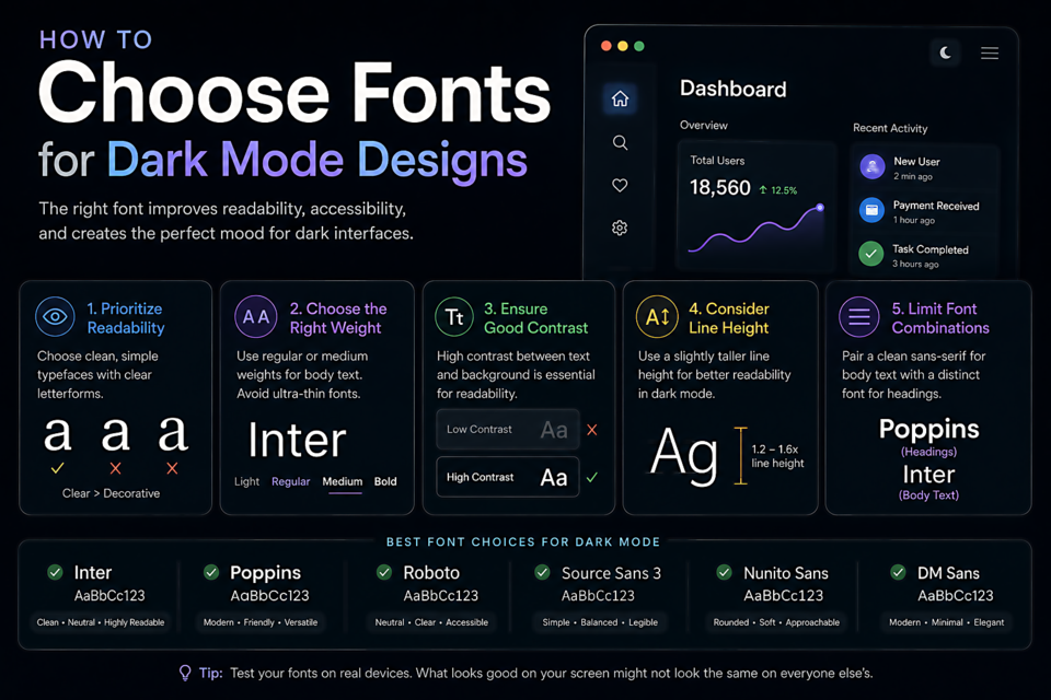
How to Choose Fonts for Dark Mode Designs
Why Dark Mode Changes Typography
Light text on a dark background triggers different visual processing than dark text on light. The Helmholtz-Kohlrausch effect means bright colors on dark backgrounds appear to "bloom" — they seem larger and more luminous than they are. White text on a black background can feel uncomfortably bright at full contrast, with fine strokes appearing to glow or fuzz at their edges.
The result: fonts that look perfect in light mode can feel heavy, blurry, or overly bright in dark mode using the same settings.
Reduce Font Weight for Dark Backgrounds
This is the most important adjustment. A font weight that reads as "normal" on white — say, 400 (regular) — often reads as slightly heavy on a dark background because of that blooming effect. Many dark mode implementations use weight 300 (light) for body text and step down all heading weights by one level.
@media (prefers-color-scheme: dark) {
  body {
    font-weight: 300;
  }
  h1, h2 {
    font-weight: 600; /* instead of 700 */
  }
}
Don't Use Pure White (#FFFFFF) for Text
Pure white text on pure black (#000000 background) creates extreme contrast — often too extreme for comfortable long-form reading. Reduce the text color to around #E8E8E8 or #D1D5DB. This brings contrast to a comfortable level without sacrificing legibility. Apple's Human Interface Guidelines recommend #EBEBF5 for primary text in dark mode on iOS.
High-Contrast Serif Fonts Need Care
Fonts like Bodoni and Didot have extreme thick-thin contrast. On a dark background, those hairline strokes can completely disappear or appear to glow unpredictably. If you use a high-contrast serif in dark mode, increase the font size and reduce the contrast ratio slightly. Better yet, switch to a lower-contrast alternative for your dark mode variant.
Fonts That Work Particularly Well in Dark Mode
- Inter — designed with screen rendering in mind across all modes; consistent at any contrast level
- IBM Plex Sans — slightly mechanical quality works well against dark backgrounds; clean and consistent at all weights
- Source Sans Pro — excellent rendering at light weights, which is exactly what dark mode wants
- Nunito — rounded terminals remain clear against dark backgrounds without the blooming issues that sharp-terminated fonts can exhibit
Test on Actual Devices
Dark mode looks dramatically different on OLED screens (true black, extreme contrast) versus LCD screens (deep gray, softer contrast). Your typography needs to work acceptably in both. Test on a phone with an OLED display and a laptop with an IPS LCD — if it works in both, you're safe.