
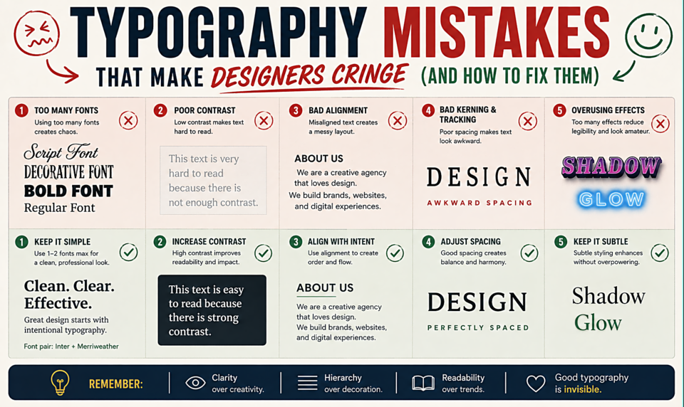
Typography Mistakes That Make Designers Cringe (And How to Fix Them)
Straight Quotes vs. Smart Quotes
The most common typographic mistake: using "dumb" straight quotes (") instead of "curly" quotation marks (" "). The straight quote (") is a typewriter legacy — typewriters had one key for both opening and closing quotes. Proper typographic quotes are directional: "opening" and "closing" (and 'single' versions). Most design software auto-corrects this. HTML requires the actual characters or HTML entities: “ and ”. Check your CMS settings — WordPress and most modern CMSes convert quotes automatically.
Hyphens vs. En Dashes vs. Em Dashes
Three different marks, three different purposes:
- Hyphen (-): Joins words and syllables. "Well-designed." "Pre-existing."
- En dash (–): Ranges. "Pages 12–14." "The 2020–2024 period." Type with Alt+0150 (Windows) or Option+hyphen (Mac).
- Em dash (—): Parenthetical or abrupt break in a sentence — like this. Type with Alt+0151 (Windows) or Shift+Option+hyphen (Mac).
Using a hyphen where an em dash belongs is the single most common punctuation mistake in designed documents.
Widows and Orphans
A widow is a single short word or the end of a hyphenated word sitting alone on the last line of a paragraph. An orphan is the first line of a paragraph sitting alone at the bottom of a column or page. Both interrupt reading flow and signal careless typesetting.
Fix widows by adjusting line length, rewriting the text slightly, or using a non-breaking space (HTML: ) before the last word of a paragraph to force it to stay with the preceding word.
Too Many Fonts
Using more than two fonts in a design almost always creates visual chaos. The rule of thumb: one font for display/headings, one for body text. A third font should be a deliberate, considered choice with a clear purpose — not a "this also looks nice" addition.
Fake Small Caps
Like fake italics, "small caps" applied through software scaling (making regular caps 80% of their normal size) look wrong. True small caps are redrawn to match the stroke weight of the surrounding lowercase text at their smaller size. Scaled small caps have strokes that are too thin. Use a font with genuine small cap variants, or don't use small caps at all.
All Caps Without Tracking
All-caps text without increased letter spacing feels compressed and hard to read. Words set in uppercase lose their shape-based recognition cues (we read words partly by their overall shape, which disappears when everything is the same height), so the extra spacing between letters is necessary to maintain readability. Add at least 0.05–0.1em of letter-spacing to any all-caps text.
Justified Text on the Web
CSS justification without proper hyphenation (using hyphens: auto) creates rivers of white space through text — uneven gaps between words that the eye follows through the paragraph rather than along the lines. On the web, left-aligned text (ragged right) is almost always the correct choice for body text. If you must justify, always add hyphens: auto.