
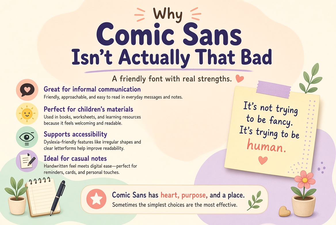
Why Comic Sans Isn't Actually That Bad
Comic Sans was designed in 1994 by Vincent Connare at Microsoft. He created it for the speech bubbles of Microsoft Bob — a friendly mascot app — and it was explicitly designed to feel casual, approachable, and informal. It was never meant for PowerPoint presentations or funeral notices. But the font escaped its intended context, spread everywhere, and became a cultural punching bag.
The Dyslexia Argument
Here's something many designers don't know: Comic Sans is genuinely helpful for many people with dyslexia. Its irregular, slightly asymmetric letterforms make it harder to flip or mirror letters — a common difficulty for dyslexic readers. The letters b, d, p, and q all look distinctly different in Comic Sans, whereas in many "professional" fonts they're essentially the same shape rotated. Organizations like the British Dyslexia Association have noted that informal, irregular fonts like Comic Sans can significantly improve reading speed and comprehension for dyslexic readers.
It's Extremely Readable
Strip away the cultural baggage and Comic Sans is actually a solid reader's font. It has a generous x-height, wide letter spacing, and open counters. These are exactly the qualities that type designers aim for when creating fonts for maximum legibility. There's a reason why many children's books, educational materials, and reading tools default to fonts that share these characteristics.
The Real Problem Is Context
Comic Sans looks wrong in a law firm's letterhead not because it's a bad font, but because it's a casual font used in a formal context. The same principle applies in reverse — Times New Roman would look bizarre in a children's birthday party invitation. Every font has an appropriate context. Comic Sans lost that context when it escaped Microsoft Bob and became available to everyone.
The Lesson for Designers
The hatred of Comic Sans reveals something uncomfortable about design culture: we sometimes prioritize in-group aesthetics over actual human needs. A font that helps people with dyslexia read more comfortably is doing something genuinely valuable — more valuable, arguably, than a perfectly-crafted geometric sans-serif that only works for neurotypical readers with perfect vision.
So the next time you see Comic Sans, maybe resist the urge to cringe. It might just be the right tool for someone who really needs it.