
Typography and Wayfinding: How Fonts Guide Us Through Physical Spaces
The Stakes of Sign Typography
Wayfinding typography operates under constraints that screen designers rarely face. A highway sign must be readable at 65 mph from 500 feet away, at night, in rain. A hospital sign must be decipherable by someone in pain or distress who may not speak the local language. An airport sign must communicate to millions of travellers annually across dozens of languages and literacy levels. In these contexts, a poorly chosen font is not a design flaw — it is a safety hazard.
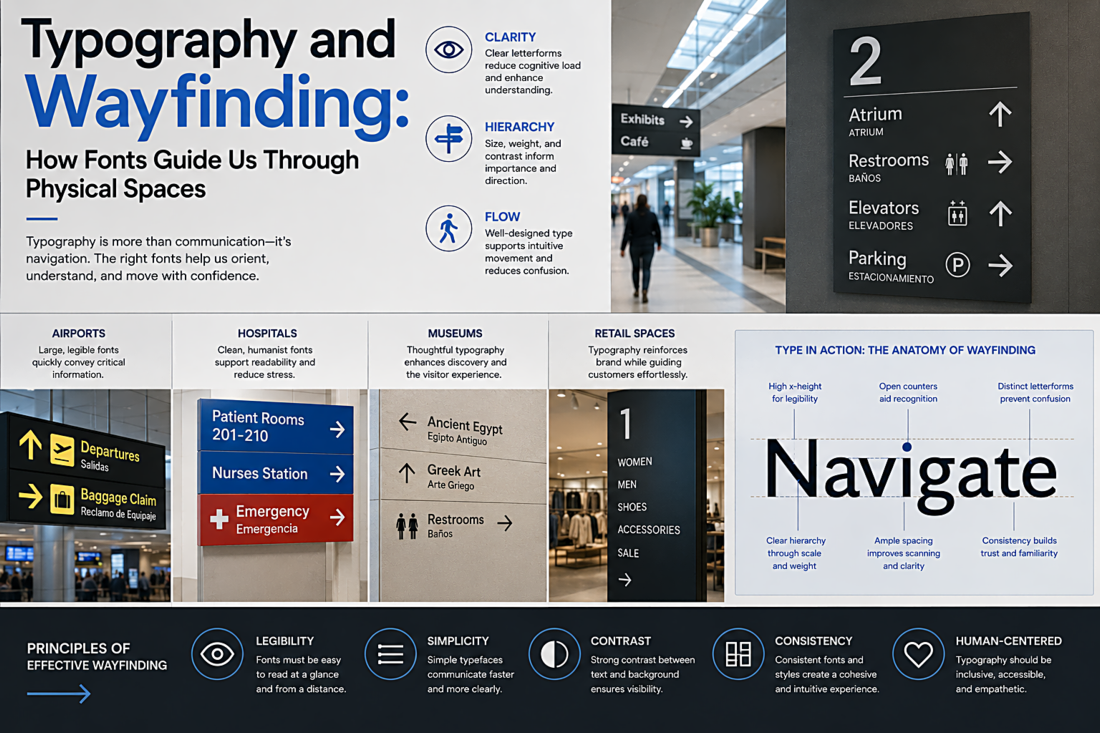
The fundamental requirement is legibility at speed and distance. This means large x-heights, open counters (the enclosed spaces inside letters like "e" and "a"), generous letter spacing, and distinct letterforms. The worst thing a wayfinding font can do is make two different characters look alike. If a driver mistakes an "a" for an "o" at 70 mph and takes the wrong exit, the font has failed at its only job.
Highway Gothic and Clearview: A Case Study in Incremental Improvement
For decades, American highways used a typeface called Highway Gothic (formally the FHWA Standard Alphabets). Designed in the 1940s, it was engineered for retroreflective sheeting — the material that makes signs glow in headlights. Highway Gothic worked, but it had a problem: at night, the retroreflective material caused letters to "bloom" or "halate," where the bright reflection spread into the counters and made letters blur together. An "e" could look like an "o." A "B" could look like an "8."
In 2004, a typeface called Clearview was approved as an alternative. Clearview was designed specifically to solve the halation problem. It used larger, more open counters, mixed-case letterforms (instead of all-caps), and slightly wider spacing. Research showed it improved nighttime legibility by 16% for older drivers. However, in 2016, the FHWA withdrew its approval, citing insufficient evidence of broad improvement and concerns about standardization. The debate continues — it is a genuine case where font design intersects with public policy and lives.
The Airport Standard: Frutiger
Adrian Frutiger designed the typeface that bears his name for Charles de Gaulle Airport in Paris in 1975. The brief was specific: create a typeface that is legible on signs viewed at acute angles, from a distance, and in peripheral vision. Frutiger solved this by designing letterforms with open apertures, no unnecessary decoration, and carefully calibrated stroke weights that remain distinct even when viewed obliquely.
The result was so successful that Frutiger (and its descendants) became the de facto standard for airport signage worldwide. When you walk through Heathrow, JFK, or Changi, you are almost certainly reading Frutiger or a typeface directly influenced by it. The NHS in the UK adopted Frutiger for its entire visual identity precisely because of its proven legibility in stressful, time-critical environments.
Transit Systems and Typographic Identity
Major transit systems often develop or commission custom typefaces that serve dual purposes: wayfinding legibility and brand identity. The London Underground uses Johnston (designed in 1916 by Edward Johnston, updated to "New Johnston" in 1979 and "Johnston100" in 2016). The New York City subway uses Helvetica, implemented during Massimo Vignelli's landmark 1970 redesign. Berlin's transit system uses Transit, a typeface designed specifically for its signage requirements.
These choices matter because a transit typeface must work at every scale: from the giant station name on the platform wall to the tiny route number on a system map to the real-time departure board flickering overhead. A typeface that works beautifully at billboard scale but collapses at 8pt on a paper map is useless for transit. The best transit typefaces are typographic Swiss Army knives — reliable across every context.
Lessons for Screen Designers
Wayfinding typography teaches screen designers something fundamental: context determines everything. A font that looks gorgeous in a portfolio mockup may fail completely on a mobile screen viewed in direct sunlight. The wayfinding discipline forces designers to test their typography in the actual conditions where it will be used — not in the controlled comfort of a design studio. That principle transfers directly to digital work. Test your type on real devices, in real lighting, with real users. The sign does not care about your aesthetic preferences. Neither does the user.