
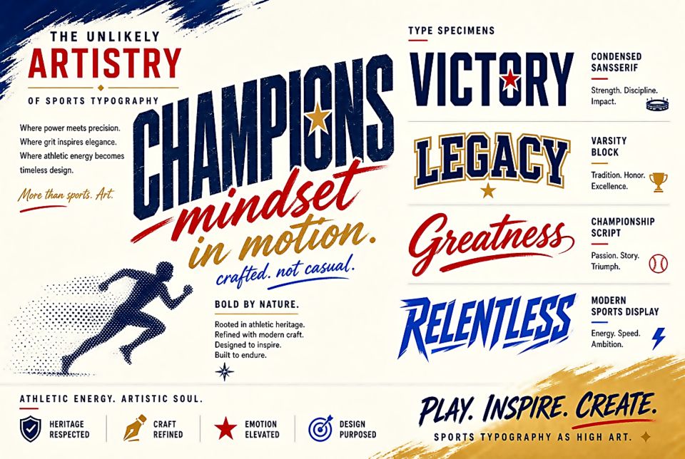
The Unlikely Artistry of Sports Typography
Sports typography operates under constraints that would terrify most type designers. It must be readable at 50 meters. It must survive screen-printing, embroidery, and weathering. It must be distinguishable at a sprint. And increasingly, it must also be brand-appropriate, commercially licensed, and visually coherent across every touchpoint from a stadium billboard to a phone notification icon.
The Jersey Number Problem
A jersey number needs to be instantly readable at distance, in motion, under artificial lighting, and against the visual noise of a game in progress. This demands specific characteristics: generous width, high contrast, no thin strokes that might disappear under embroidery, and letterforms that remain distinct under the slight distortion of moving fabric.
The NBA's custom number systems — particularly the work done for teams like the Miami Heat and Golden State Warriors — represent some of the most technically sophisticated applied typography in existence. Every number is custom-kerned to read beautifully when paired with every other number, accounting for the specific visual relationships that occur most frequently on a basketball court.
Club Identity Fonts
Major sports clubs treat their typographic identity with the same seriousness as any luxury brand. The New York Yankees' iconic script — never officially named, just "the Yankees script" — is as recognizable as the Nike swoosh. Manchester United's "Manchester" wordmark is custom-designed and trademarked. The NFL's custom font family, developed for consistent use across all thirty-two teams' materials, balances individual club identity with league-wide coherence.
The Number Design Craft
The numerals on sports jerseys represent a specific sub-genre of type design: block letters with deliberate modifications for the medium. The "1" needs extra width (a single vertical stroke looks lost on a wide jersey). The "4" and "9" need closed counters that survive the stress of stretching fabric. The "8" needs enough space between its two loops that they don't merge under printing. Every design decision is a performance decision.
Stadium Wayfinding
Stadium wayfinding typography faces the same constraints as transit design but adds the challenge of crowd density and excitement. Signs need to be read at a glance by people moving in groups, under emotional stress, and often having consumed significant quantities of stadium food and drink. Clear hierarchy, high contrast, and generous sizing are non-negotiable. The signage system at AT&T Stadium (Dallas Cowboys) and the Tottenham Hotspur Stadium in London represent recent state-of-the-art approaches.