
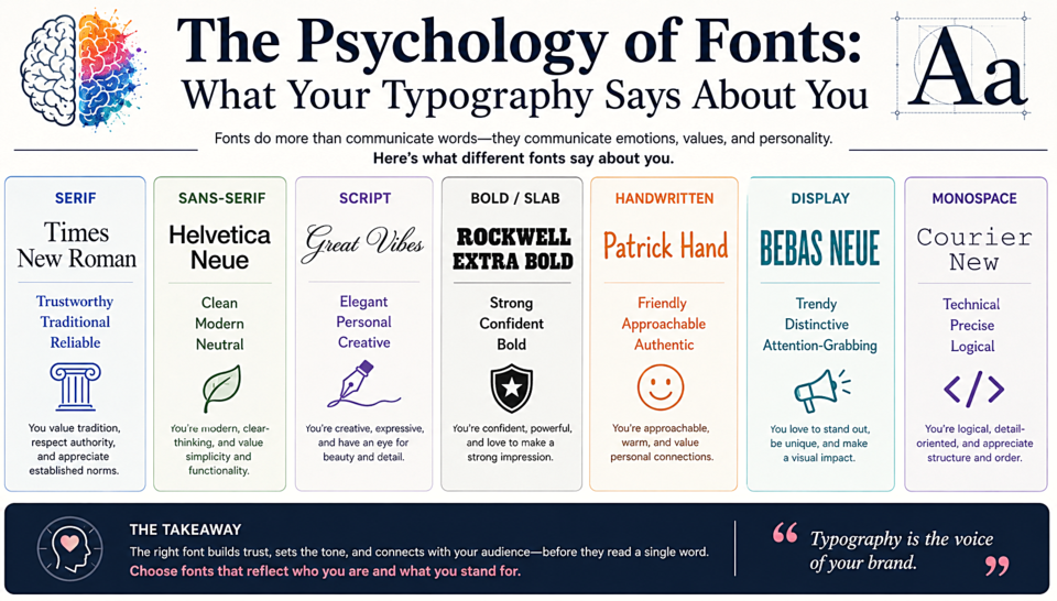
The Psychology of Fonts: What Your Typography Says About You
In 2012, psychologist Eryn Newman ran a study asking people to judge whether trivia statements were true or false. The statements presented in easy-to-read fonts were judged as more credible than identical statements in hard-to-read fonts. Typography literally affects whether people believe what they're reading.
Serifs Signal Trust and Tradition
Serif fonts carry centuries of cultural baggage — they're what books, newspapers, and legal documents have always used. Research consistently shows that people rate serif fonts as more trustworthy, established, and authoritative than sans-serifs. This is why banks, law firms, universities, and newspapers default to serifs. They're borrowing that accumulated credibility.
But serifs also read as traditional, which can work against you if your brand is trying to signal innovation or disruption. There's a reason most tech startups avoid them.
Sans-Serifs Signal Modernity and Approachability
Clean sans-serifs feel contemporary, efficient, and objective. Studies show people rate sans-serif text as more "modern," "clean," and "approachable" than equivalent serif text. This explains why healthcare, technology, and consumer apps overwhelmingly choose sans-serifs — they want to feel helpful and accessible, not imposing.
Scripts Signal Personality and Warmth
Script fonts trigger associations with handwriting — and handwriting feels personal. A script font on a bakery's packaging signals human hands, individual care, and artisanal quality. On a law firm's letterhead, the same font would signal a lack of professionalism. Context matters enormously.
Weight Carries Meaning Too
Heavy, bold fonts read as confident, loud, and powerful. Light fonts feel elegant, refined, and sometimes fragile. This is why luxury brands often use ultra-thin weights — they're communicating that they don't need to shout. Budget brands use heavy weights because they're competing for attention on crowded shelves.
Letter Spacing and Perceived Quality
Slightly increased letter spacing (tracking) consistently reads as higher quality and more premium, regardless of the font used. This is why luxury brands — from fashion houses to five-star hotels — almost universally use widely-spaced type. Tight tracking feels casual and dense.
Practical Takeaway
Before you choose a font, ask: what do I want people to feel in the first three seconds? Write that feeling down. Then choose a font category that research suggests triggers that emotion, test it with your actual audience, and trust the data over your personal aesthetic preferences.