
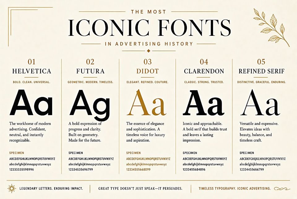
The Most Iconic Fonts in Advertising History
Coca-Cola's Spencerian Script
The Coca-Cola logo has used a form of Spencerian script — a calligraphic style popular in 19th century America for business writing — since 1887. Bookkeeper Frank Mason Robinson is credited with writing the first logo by hand; the design has been refined but never fundamentally changed in nearly 140 years. This script is among the most recognized letterforms in human history. It's so synonymous with the brand that the font itself triggers Coca-Cola brand associations even when used for other content.
Futura and Volkswagen
Volkswagen's use of Futura across its global advertising — particularly in the legendary Doyle Dane Bernbach "Think Small" campaign of 1959 — helped cement Futura as the font of rational, honest, modernist thinking. The combination of Futura's geometric clarity with VW's deliberately understated advertising positioning created one of the most effective brand/font combinations in history.
Gotham and Obama
When Barack Obama's 2008 presidential campaign chose Gotham — a typeface designed by Jonathan Hoefler inspired by mid-century American vernacular lettering — for all campaign materials, it changed the font's trajectory completely. "Hope" posters, bumper stickers, campaign signs: all Gotham. The font became associated with aspiration, openness, and American democratic optimism. Within two years, major brands across the country were adopting Gotham to borrow those associations.
Apple and Myriad Pro
From 2002 to 2017, Apple used Myriad Pro — an Adobe humanist sans-serif — as its primary brand font. During that period, Apple transformed from a struggling computer company to the most valuable brand on earth. Myriad became the visual voice of aspirational technology. In 2017, Apple replaced it with their custom San Francisco font, but Myriad Pro sales surged for years after designers tried to capture that "Apple feeling."
Helvetica and the American Corporation
American Airlines, American Apparel, 3M, BMW, Gap, Jeep, Lufthansa, Nestlé, Panasonic, Staples, Target — at various points all have used Helvetica as their primary brand font. The font became so ubiquitous in corporate America that it functionally defined what "professional brand" looked like for three decades. Whether this represents Helvetica's excellence or its overuse is still debated.
What These Examples Teach Us
The most powerful font-brand relationships aren't one-directional. Coca-Cola didn't just use a script — it made that script mean Coca-Cola. Apple didn't just use Myriad Pro — it made Myriad Pro mean aspirational technology. The font borrows meaning from the brand as much as the brand borrows character from the font. Decades of consistent application create an inseparable association that becomes a strategic asset.