
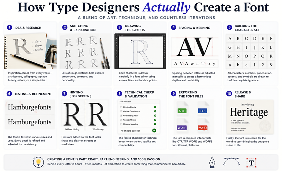
How Type Designers Actually Create a Font
Every font you use started as an idea — usually a sketch, sometimes a scanned piece of lettering, occasionally a direct response to a visual problem a designer couldn't solve with existing typefaces. The journey from that first mark to a releasable font is longer and more complex than most users ever imagine.
Step 1: Concept and Research
Professional type designers begin with research. What gap does this typeface fill? What historical references are relevant? What problem is it solving? A type designer creating a font for wayfinding will study how letters read at distance and in motion. One designing a display face might start with historical specimens from a specific era or region.
Step 2: Drawing Key Characters
Rather than designing all 26 letters from scratch, type designers begin with a small set of "control characters" that establish the design's DNA. For lowercase letters, the classic set is n, o, p, a, g — these few glyphs contain almost every curved and straight stroke that will appear across the entire alphabet. Get these right and the rest follow.
Step 3: Digital Drawing with Bezier Curves
Scanned sketches are imported into type design software — most professionals use Glyphs App, Robofont, or FontLab. Each letterform is traced and refined using bezier curves, the same mathematical curves used in vector illustration software. The craft of bezier drawing for type has very specific rules: points should sit on extremes of curves (top, bottom, left, right), curves should be as smooth as possible with as few points as needed, and the "optical illusions" inherent in letterforms must be deliberately designed — circles that look perfectly round are actually slightly wider than they are tall.
Step 4: Spacing
Once the first letters are drawn, spacing begins. This is arguably the most important and least visible part of type design. The designer sets the left and right sidebearings (the space padding around each glyph) so that strings of letters create an even rhythm of black and white. "Good type is about the spaces as much as the shapes" is a cliché because it's completely true.
Step 5: Kerning
Spacing handles regular letter pairs, but some combinations — AV, WA, To, Yo — have shapes that create optical gaps even with correct sidebearings. Kerning adjusts the space between specific pairs. A professionally kerned font might have hundreds or thousands of kerning pairs, all adjusted by hand.
Step 6: Building the Full Character Set
A professional "complete" font includes not just 26 uppercase and 26 lowercase letters, but: numerals, punctuation, diacritical marks (é, ü, ñ, ø, etc.), ligatures (fi, fl, ff), small caps, multiple numeral styles, currency symbols, arrows, and much more. A full Unicode Latin character set can run to 800+ glyphs.
Step 7: Testing, Testing, Testing
Fonts are tested in real documents, at many sizes, in many languages, on screen and in print. Issues that only appear in certain letter combinations or at specific sizes are hunted down and fixed. Many type designers release beta versions to trusted users for real-world testing before public launch.
From first sketch to release, a serious typeface often takes 18 months to three years. Every font you use for free represents that investment of human creativity and precision.