
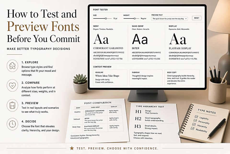
How to Test and Preview Fonts Before You Commit
Why Font Specimens Lie
Every type foundry shows their fonts in the best possible light. The specimen uses ideal letter combinations, generous sizing, carefully chosen sample text, and often carefully controlled background conditions. This is like evaluating a car by looking at a glamour shot rather than driving it. A font that looks stunning in a specimen might be unreadable in your actual use case.
Test with Your Actual Content
The most important test: replace the specimen text with your real content. If you're designing a food blog, type your actual recipe names. If you're designing a tech product, type your actual UI labels. Fonts that look beautiful in "The quick brown fox jumps over the lazy dog" can look awkward or wrong when they meet your actual words — especially if those words include unusual character combinations or letters the font designer didn't optimize carefully.
The Sizes That Matter
Test at every size you'll actually use. A font that looks gorgeous at 60px for your hero headline might be mediocre at 16px for body text. If you need a font that works at multiple sizes, test them all before deciding. Specifically look for:
- At body text sizes (14–18px): Are numerals legible? Are similar letters easily distinguished (b/d, i/l/1)? Does it feel comfortable to read 200+ words at a stretch?
- At display sizes (36px+): Do the letterforms hold up under scrutiny? Are the spacing and proportions balanced at this scale?
- At caption sizes (10–12px): If you need captions, does the font survive them?
Test in Context
Drop the font into a rough mockup of your actual design — not a beautiful showcase, but the real layout with the real colors and backgrounds. A warm serif that looks beautiful on white can look heavy and dark on a cream or light gray background. A bright, light font can become washed out against a light brand color.
Test on Multiple Devices
Font rendering varies significantly between operating systems and screens. macOS uses a different anti-aliasing approach than Windows, which uses a different approach than Android. A font that looks crisp on your Mac might look fuzzy on a PC, or vice versa. If you have access to multiple devices, test on them. If not, browser developer tools let you simulate different screen densities.
Use FontPlatform's Live Preview
FontPlatform's type tester on every font page lets you type your own text and adjust the size — exactly the kind of real-condition testing that specimen sheets don't provide. Type your actual headlines. Type your actual body text. Adjust to your expected sizes. Only then decide.
The "Blur Test" for Hierarchy
For projects using multiple fonts together: set up a quick mockup with both fonts at their planned sizes, then apply a Gaussian blur in your design software or browser developer tools. If you can still distinguish headlines from body text — if the hierarchy reads at a blur — the combination is working. If everything blurs into one undifferentiated gray, increase the contrast between your font choices.