
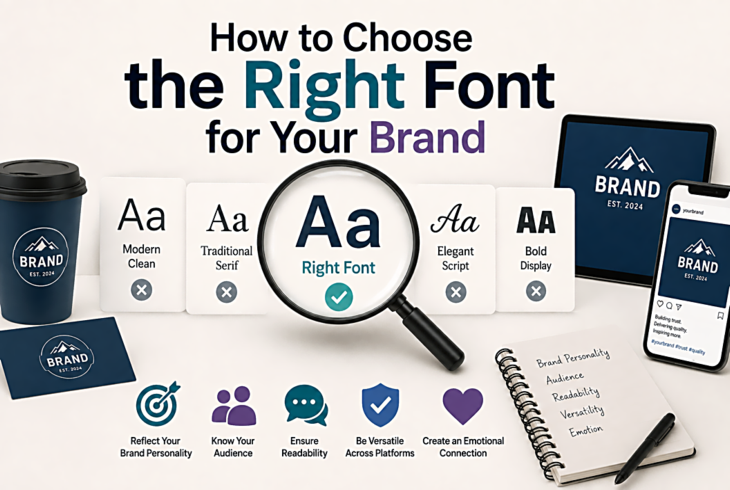
How to Choose the Right Font for Your Brand
Why Font Choice Matters
Typography is one of the first things people notice about a brand — even if they can't articulate why. A law firm using Comic Sans sends a very different message than one using a classic serif. Your font choice instantly communicates professionalism, creativity, warmth, or authority.
Step 1: Define Your Brand Personality
Before browsing fonts, write down 3-5 adjectives that describe your brand. Are you modern or traditional? Playful or serious? Luxurious or accessible? These words will guide your font selection and help you filter through thousands of options.
Step 2: Understand Font Categories
Each category carries its own associations:
- Serif fonts — tradition, authority, elegance. Think law firms, newspapers, luxury brands.
- Sans-serif fonts — modern, clean, approachable. Think tech companies, startups, healthcare.
- Script fonts — personal, creative, elegant. Think wedding planners, bakeries, fashion.
- Display fonts — bold, unique, attention-grabbing. Think entertainment, food & drink, events.
Step 3: Test at Multiple Sizes
A font that looks stunning as a headline might be unreadable at body text size. Always test your chosen font at the sizes you'll actually use. FontPlatform's live preview tool lets you type your own text and adjust sizes before downloading.
Step 4: Check Readability
Beautiful doesn't always mean readable. Test your font on different devices, at different sizes, and with different background colours. Pay special attention to how it renders on mobile screens, where most of your audience likely reads.
Step 5: Build a Type System
Most brands need at least two fonts: one for headlines and one for body text. The key is contrast — pair a serif headline font with a sans-serif body font, or vice versa. Avoid pairing fonts that are too similar; the subtle differences will look like a mistake rather than a design choice.