
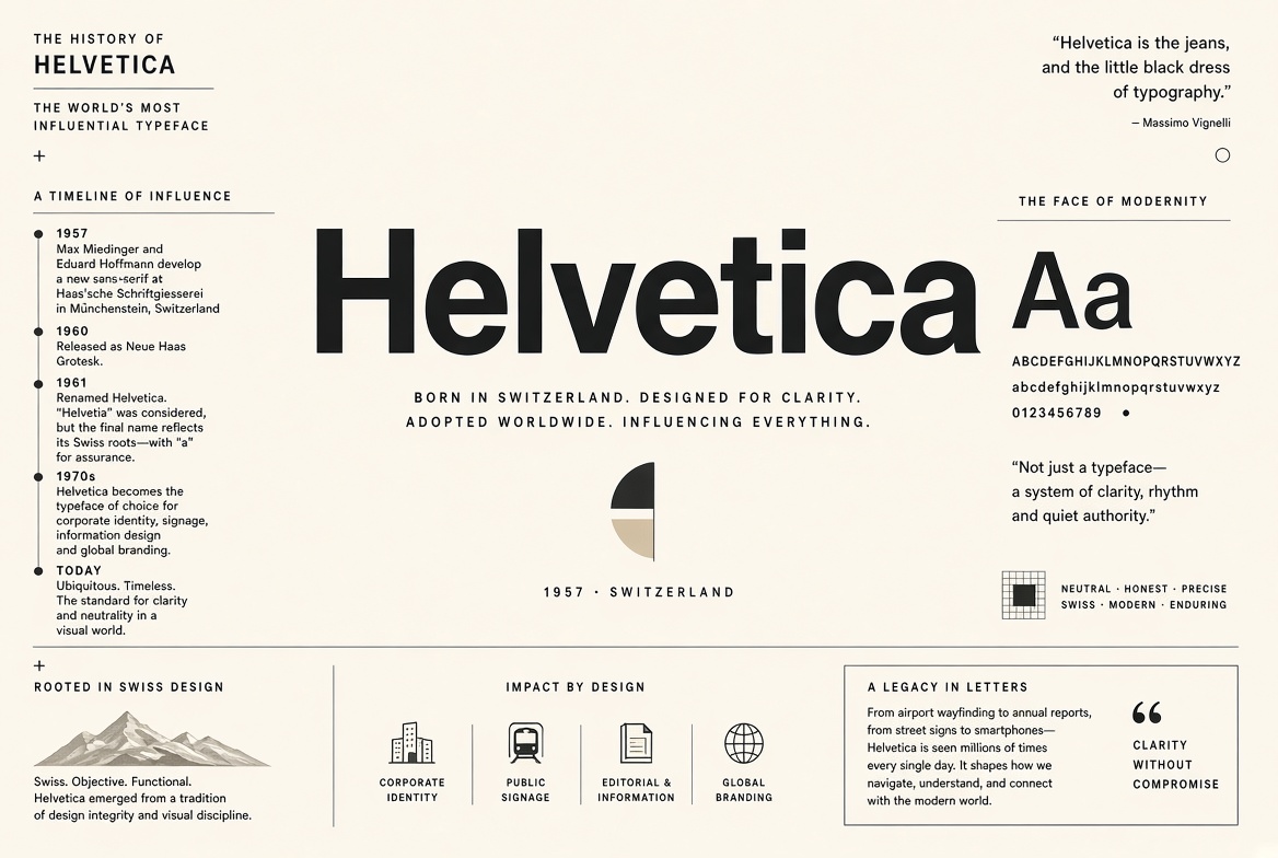
The History of Helvetica: The World's Most Influential Typeface
In 1957, Swiss type designer Max Miedinger and Eduard Hoffmann at the Haas Type Foundry in Münchenbuchsee, Switzerland, released a new typeface. They called it Neue Haas Grotesk. It was designed to be completely neutral — to carry information without adding any stylistic personality of its own. They couldn't have imagined it would go on to become the most recognized typeface in human history.
From Switzerland to the World
Haas was a subsidiary of the German Stempel foundry, which was in turn part of Linotype. When Stempel licensed the design in 1960, they renamed it Helvetica — the Latin adjective for Switzerland — to make it easier to market internationally. The timing was perfect. The 1960s brought the International Typographic Style (also known as Swiss Design) to global prominence, and Helvetica was its signature expression.
The Corporate America Adoption
By the late 1960s, American corporations discovered that Helvetica looked distinctly modern and efficient — qualities American business was eager to project. American Airlines redesigned its identity around Helvetica in 1967. The New York City Transit Authority adopted it for the entire subway system in 1970 (and uses it to this day). The IRS, the US government's tax authority, used Helvetica on its forms. NASA. Toyota. Kawasaki. Jeep. Oral-B. Target. American Apparel. Lufthansa. Nestlé. The list is staggering.
Why Did It Work So Well?
Helvetica's genius is its designed neutrality. Its proportions are balanced, its strokes are even, and its letterforms carry no historical associations — unlike serifs, which carry centuries of European literary tradition. This neutrality means it disappears behind its message. An airline wants you to think about their flights, not their font. Helvetica delivers that invisibility while still looking clean and professional.
The Documentary and the Backlash
In 2007 — Helvetica's 50th anniversary — filmmaker Gary Hustwit released a documentary simply called Helvetica. It sparked a wave of design discourse about the font's cultural dominance. Critics argued that Helvetica had become so universal that it represented corporate conformity rather than clarity. Designer David Carson famously quipped that Helvetica was "the font of fascism" (he was being provocative). Erik Spiekermann, who spent years advocating for typeface diversity, described Helvetica as a font that "says nothing."
The Legacy
What Helvetica's 70-year dominance actually demonstrates is this: a typeface can become cultural infrastructure. Like concrete or glass, it becomes invisible not because it's boring but because it's so pervasive that we stop seeing it. Whether that's a success or a failure is a question that type designers, brand identity professionals, and cultural critics are still arguing about. Meanwhile, Helvetica is on a billion documents, signs, screens, and products — and it shows no signs of leaving.