
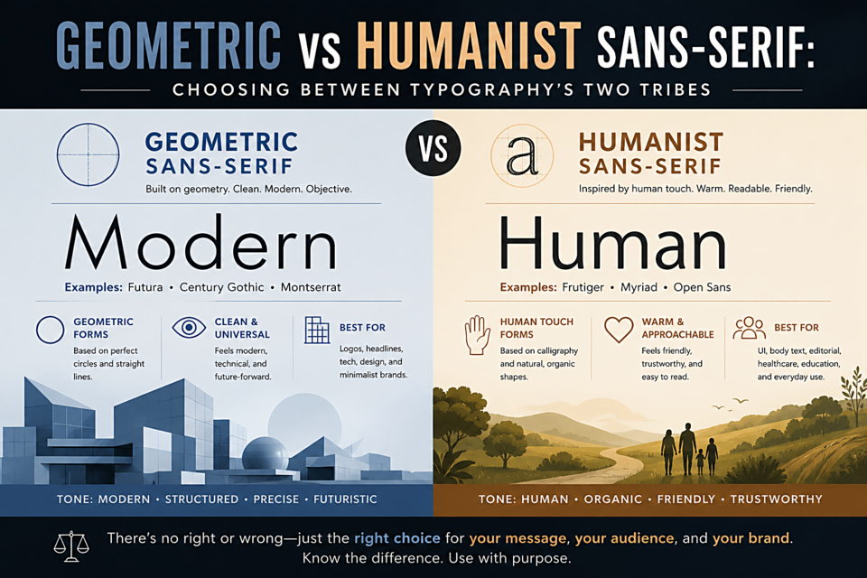
Geometric vs Humanist Sans-Serif: Choosing Between Typography's Two Tribes
Two Ways to Draw a Letter
When sans-serif type emerged in the 19th century, different designers answered the same question differently: if you remove the serifs, what should govern the shapes of the remaining strokes? Two main answers emerged, and they've defined the sans-serif landscape ever since.
The Geometric Approach
Geometric sans-serifs are built from mathematical forms. The lowercase "o" is a circle. Strokes are uniform in weight. Letters are drawn with a compass and ruler rather than a pen. Futura (1927), Avant Garde (1970), and Century Gothic are pure expressions of this philosophy.
What geometric fonts communicate: rationality, modernity, precision, objectivity. They feel engineered rather than written. Associated with technical fields, premium brands that want to signal precision, and any context where "modern" is the primary message.
The drawbacks: Geometric fonts can feel cold and impersonal. The uniform stroke weight that creates visual clarity also creates a kind of robotic consistency. At small body text sizes, the closed apertures of some geometric fonts (tight counters in e, c, etc.) can hurt readability.
Best geometric sans-serifs available free: Nunito (softened geometric), Josefin Sans, Jost, Poppins
The Humanist Approach
Humanist sans-serifs are designed as if they were drawn with a pen — just a pen that doesn't make serifs. The strokes vary slightly in weight. The letterforms have optical corrections built in. The "o" isn't a perfect circle; it's subtly elliptical and angled, as a handwritten "o" would be. Gill Sans (1928), Optima, and the current workhorse Inter are humanist designs.
What humanist fonts communicate: warmth, approachability, humanity, trustworthiness. They feel written rather than constructed. Associated with healthcare, education, civic institutions, and brands that want to feel human and accessible.
The drawbacks: Humanist fonts can lack the graphic punch of geometric types in large display contexts. Their warmth can work against contexts where coldness is the right signal (finance, some luxury brands, scientific communications).
Best humanist sans-serifs available free: Inter, Lato, Source Sans Pro, Open Sans, Cabin
Grotesque: The Third Camp
A third category sits between them: grotesque (or gothic) sans-serifs like Helvetica, Arial, and Franklin Gothic. These emerged from 19th century wood type and have neither the mathematical purity of geometrics nor the warm irregularity of humanists. They're the neutral pragmatists — functional without philosophy.
Choosing Between Them
Ask what your brand or project needs to feel like. For technology companies that want to feel precise and innovative: geometric. For healthcare, education, or community: humanist. For corporate and institutional contexts where neutrality is the point: grotesque. There are no wrong answers — but there are mismatches, and they're usually felt even by people who can't articulate why.