
Fonts That Defined Each Decade: A Visual History of Type
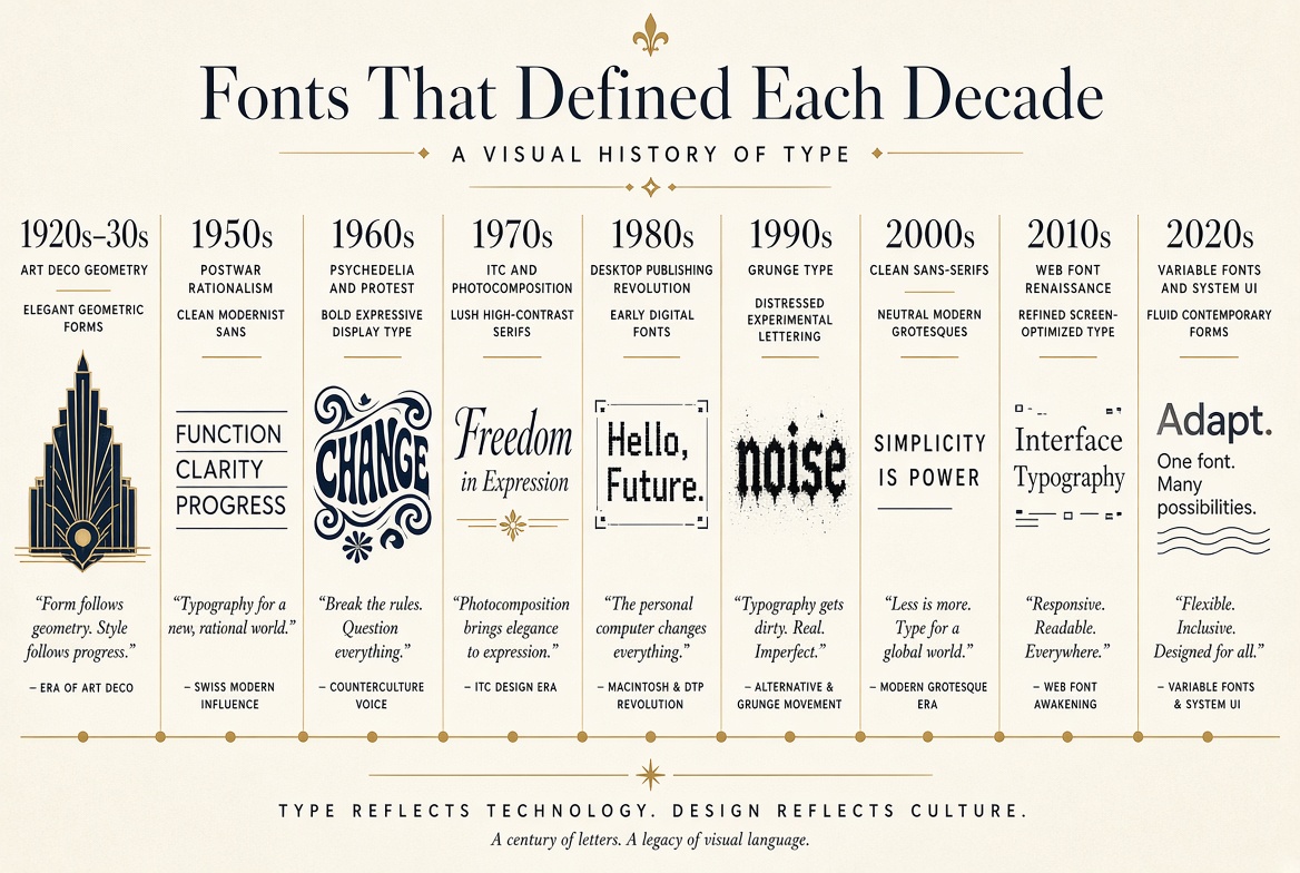
The 1920s–30s: Art Deco Geometry
The geometric typefaces of the Bauhaus era — Futura (1927), Kabel (1927) — embodied the optimism of modernism. Clean circles, mathematical proportions, and rejection of ornament. These fonts said: the future is rational and beautiful. They still feel contemporary nearly a century later.
The 1950s: Postwar Rationalism
Helvetica and Univers both launched in 1957, and together they defined a decade of corporate graphic design. The "Swiss International Style" spread from Zürich to Madison Avenue, bringing clean grids, objective photography, and sans-serif type to global brand identity. The world wanted to look modern, efficient, and trustworthy after the chaos of WWII.
The 1960s: Psychedelia and Protest
The counterculture reaction to Helvetica's corporate cleanliness arrived in the late 1960s. Distorted, hand-lettered posters from Haight-Ashbury artists like Victor Moscoso used illegibility as a design statement. If you had to work to read it, it wasn't for the establishment.
The 1970s: ITC and the Photocomposition Boom
Fonts became more widely available with photocomposition technology, and the International Typeface Corporation (ITC) released a wave of expansive, friendly faces. ITC Avant Garde (1970) with its distinctive geometric lowercase became ubiquitous. Type got rounder, friendlier, and less austere.
The 1980s: The Desktop Publishing Revolution
Apple's Macintosh launched in 1984 with a built-in font library. Times, Helvetica, and a handful of others suddenly appeared in every office document. PostScript (1985) and the laser printer democratized professional-quality type. The downside: everyone now had access to ten fonts and used all ten in the same document.
The 1990s: Grunge Type
Designers like David Carson and the team at Emigre magazine deliberately broke every rule of legibility and composition. Fonts were layered, distorted, photocopied, and stretched. The subtext: digital technology had made everything too clean and easy, so deliberate difficulty became the aesthetic of authenticity.
The 2000s: Clean Sans-Serifs Everywhere
Web design's early constraints — limited fonts, small screens, slow connections — pushed design toward maximum simplicity. Arial and Verdana dominated; both were designed specifically for low-resolution screens. Cleanliness became the default mode of the early internet.
The 2010s: The Web Font Renaissance
@font-face CSS support arrived around 2010 and Google Fonts launched the same year. Suddenly, any font could appear on any website. Custom typography proliferated. Slab serifs (Rockwell-inspired faces) became the signature of the early startup era. Then flat design arrived and everything got lighter and simpler.
The 2020s: Variable Fonts and System UI
Two competing trends define the current decade. On one hand, variable fonts enable fluid, responsive typography that adapts to screen size and context. On the other, "system UI" fonts — San Francisco on Apple, Segoe UI on Windows, Roboto on Android — are increasingly chosen for their near-zero load time. Performance and personalization are in tension, and the decade hasn't resolved it yet.