
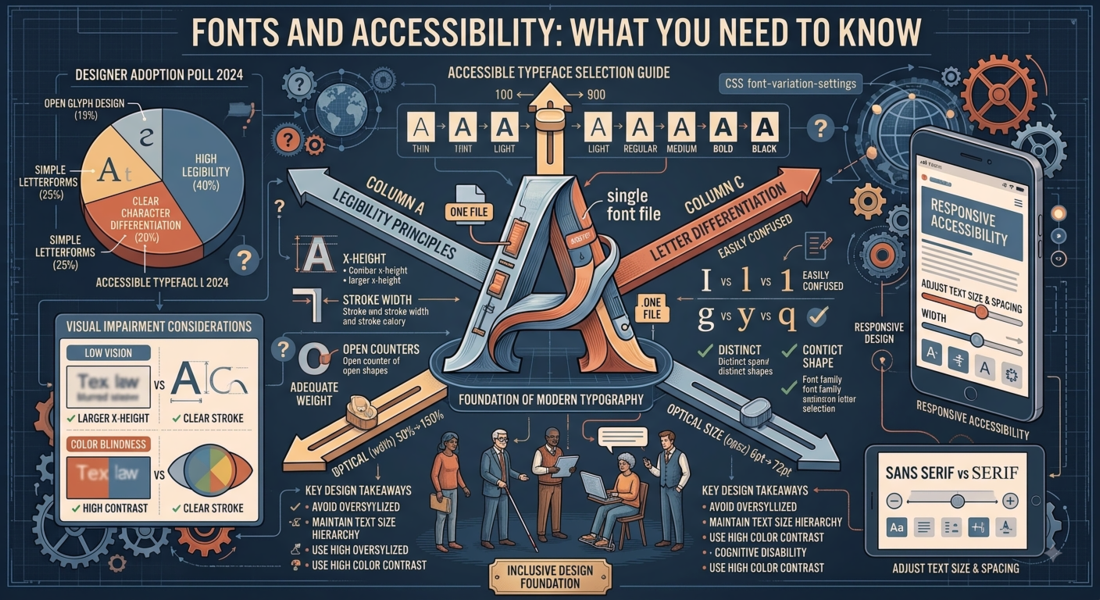
Fonts and Accessibility: What You Need to Know
Accessible typography isn't a constraint — it's good design. Fonts and typographic settings that help people with visual impairments, dyslexia, or cognitive differences also tend to help everyone. Clearer type is more readable for all users.
Contrast: The Non-Negotiable
WCAG 2.1 requires a minimum contrast ratio of 4.5:1 for normal text and 3:1 for large text (18pt+ or 14pt+ bold). This isn't optional for any site serving the public — it's a legal requirement in many jurisdictions. Low-contrast text (light gray on white, for example) fails these requirements and creates real barriers for users with low vision or color vision deficiencies.
Use a contrast checker like WebAIM's Contrast Checker on every color combination you use for text.
Size: Don't Go Below 16px for Body Text
16px is the recommended minimum for body text. Below it, users with low vision may need to zoom — and many websites break at zoom levels above 150%. Design to 16px body text and your layout will handle user zoom far more gracefully.
Font Choice for Users with Dyslexia
Several characteristics make fonts more accessible for dyslexic readers:
- Distinctive letterforms — b, d, p, q should look clearly different, not like the same shape rotated
- Generous letter spacing — tightly packed letters are harder to parse individually
- Open counters — the spaces inside letters like e, a, and o should be clearly open
- Medium x-height — not too low, not so high that ascenders and descenders become cramped
Fonts that score well on these criteria include: Lexend, Atkinson Hyperlegible (specifically designed for low vision), and — yes — Comic Sans. The British Dyslexia Association also distributes their own free "sylexiad" font.
Atkinson Hyperlegible: The Purpose-Built Choice
Released by the Braille Institute, Atkinson Hyperlegible is a free font specifically designed to maximize legibility for low-vision readers. It makes every letter as visually distinct as possible — no two letterforms can be confused for each other. It's an excellent choice for UI elements, wayfinding, and any context where clarity is paramount.
Line Length and Line Height
Long lines of text are harder to track — especially for users with dyslexia or attention difficulties. Aim for 60–75 characters per line maximum. Combined with 1.5–1.7 line height, this creates a comfortable reading experience for the widest range of users.
Don't Justify Body Text
Justified text creates uneven spacing between words, which can make it harder for dyslexic readers to track lines. Left-aligned text with a ragged right edge provides more consistent rhythm and is easier to read for most users.