
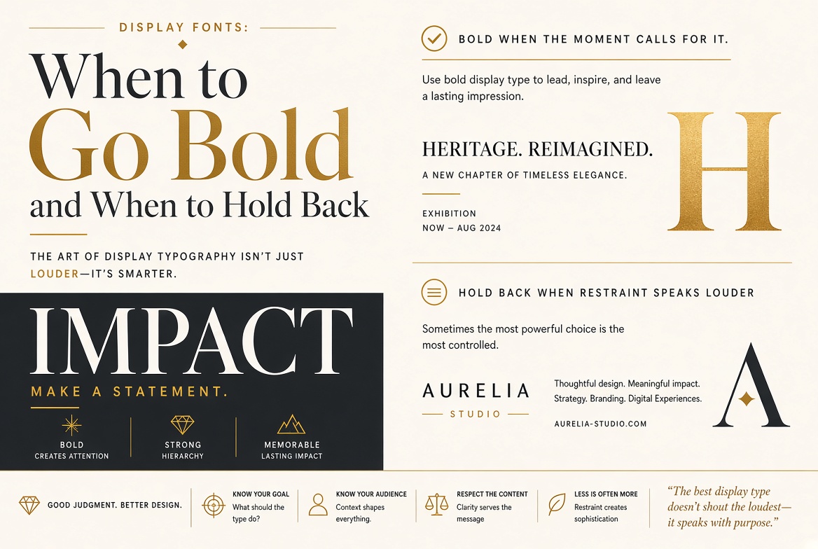
Display Fonts: When to Go Bold and When to Hold Back
What Is a Display Font?
A display font is designed for use at large sizes — typically 36pt and above. At these sizes, designers can pack in details, texture, quirks, and personality that would become illegible or distracting at smaller sizes. Display fonts are the entire opposite of body text fonts; where body text fonts optimize for long-form reading at small sizes, display fonts optimize for immediate impact at a distance.
The Cardinal Rule: Never Use Display Fonts for Body Text
This rule exists because display fonts are designed with assumptions that don't hold at small sizes:
- Fine details — serifs, swashes, texture — become noise below 24pt
- Tight letter spacing that looks elegant at 60pt becomes a compressed muddle at 12pt
- Quirky letterforms that read as distinctive at large sizes become confusing at small sizes
- Low x-height (common in elegant display faces) becomes unreadable below 18pt
Categories of Display Fonts
High-Contrast Serifs
Fonts like Didot, Bodoni, Playfair Display, and their relatives feature dramatic variation between thick and thin strokes. They feel luxurious and high-fashion. The thin strokes that make them beautiful at large sizes are exactly what makes them unusable for body text — those hairlines disappear at small sizes.
Slab Serifs
Heavy, blocky serifs that feel bold, solid, and confident. Rockwell, Courier, and Alfa Slab One. Often used in editorial design and advertising when the message is meant to hit like a punch. More versatile than high-contrast serifs.
Decorative and Novelty
Fonts with built-in illustrations, extreme personality, or theme-specific styling. Use exactly once per project, at maximum one size level, for maximum effect. These are the fonts where restraint saves you.
Extreme Weights
Ultra-light or ultra-black weights of otherwise normal sans-serif families — when used at display sizes, these become display fonts by virtue of their exaggerated proportions. A 100-weight Thin at 72pt is unmistakably a display choice.
How to Pair Display Fonts
The safest pairing formula: one display font for the single most important element (headline, product name, hero text), paired with a highly readable text font for everything else. The display font earns attention by contrast — if everything is expressive, nothing is.
The dangerous pairing: two display fonts competing for the same space. It almost never works. Even two display fonts from the same designer feel awkward together. Display fonts are designed to be the only voice in the room.