
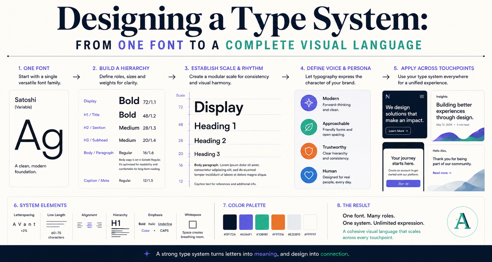
Designing a Type System: From One Font to a Complete Visual Language
What's the Difference Between a Type Scale and a Type System?
A type scale is a list of size values. A type system is the full set of decisions that govern how typography works: which fonts, in which weights, at which sizes, with which colors, with which spacing, in which contexts. A type system is what large organizations use to keep hundreds of designers, developers, and marketers producing consistent typography without constant oversight.
Step 1: Choose Your Fonts Intentionally
Most type systems use 1–2 fonts. A brand with more than two fonts is usually a brand without a clear visual voice. Consider:
- One font system: A single superfamily with enough weights and styles to cover all needs. Robust, coherent, but potentially monotonous. Works exceptionally well for digital products.
- Two font system: One font for display/headings, one for body/UI. Creates hierarchy through contrast. The most common approach for brand identities.
Step 2: Define Your Scale
Choose a modular ratio (see our article on the Golden Ratio in typography) and generate your sizes. Name them semantically, not descriptively:
- Don't call them: 12px, 14px, 16px, 20px
- Do call them: caption, body, body-large, heading-sm, heading-md, heading-lg, display
Semantic names decouple the name from the value, making it possible to adjust sizes without renaming everything. In CSS custom properties:
:root {
  --text-caption: 0.75rem;
  --text-body: 1rem;
  --text-body-lg: 1.125rem;
  --text-heading-sm: 1.25rem;
  --text-heading-md: 1.5rem;
  --text-heading-lg: 2rem;
  --text-display: 3rem;
}
Step 3: Define Styles, Not Just Sizes
Each level in your scale should have defined: size, weight, line height, letter spacing, and often color. A heading-md might be 1.5rem, weight 700, line-height 1.2, letter-spacing -0.01em, color: your primary text color. Define these completely and document them.
Step 4: Write Usage Rules
The most valuable (and most ignored) part of a type system. Which level goes on which element? Some examples:
- Page titles: heading-lg
- Section headings: heading-md
- Card titles: heading-sm
- Body text: body
- Captions and metadata: caption
- Button labels: body, weight 600
- Navigation: body-sm, letter-spacing 0.02em
These rules prevent designers from making ad-hoc decisions that introduce new sizes, weights, or combinations that undermine system coherence.
Step 5: Maintain It
A type system only works if it's maintained and enforced. Review it when adding new components, update it when user testing reveals problems, and make the rules accessible to everyone who makes typography decisions — designers, developers, and content creators.