
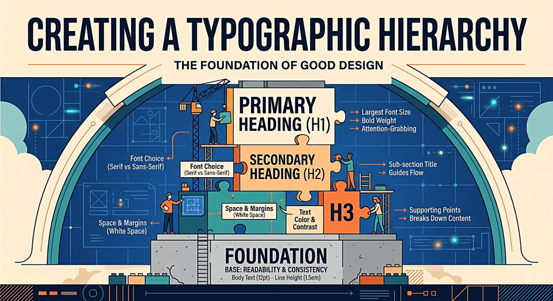
Creating a Typographic Hierarchy: The Foundation of Good Design
Hierarchy is the arrangement of elements to show their order of importance. Typographic hierarchy tells your reader: this is what you should read first, this is what you should read second, and this other thing — it's less important. Without it, the eye wanders and attention scatters.
The Three Levels
Most effective typographic systems work with three levels:
- Primary — headlines, titles, the first thing the eye should land on
- Secondary — subheadings, labels, navigational elements
- Tertiary — body text, captions, footnotes
The visual difference between these levels should be immediately apparent, even to someone who isn't consciously reading — just scanning.
The Tools of Hierarchy
Size
The most obvious tool. Headlines are bigger than subheadings, which are bigger than body text. But the relationships matter as much as the absolute values. A scale like 48/32/16px creates clear steps. A scale like 20/18/16px creates confusion — the differences are too subtle to read instantly.
Weight
Bold text draws attention. Use it deliberately — for one or two key words in a paragraph, not randomly throughout. The moment everything is bold, nothing is bold. Weight can substitute for size difference when screen space is tight.
Color and Contrast
In a page of black text on white, a single element in your brand color immediately becomes the focal point. Color change is the most powerful hierarchical tool you have, which means it should be used sparingly. Reserve it for your single most important action or piece of information.
Spacing
White space is hierarchy. More space above a heading than below it signals: this heading is the start of something new, not the end of something old. Generous margins around an element make it feel important. Tight spacing makes elements feel subordinate.
Typeface Contrast
Using different fonts for different levels (e.g., a serif for headlines and a sans-serif for body) creates instant categorical distinction. Readers don't need to consciously analyze the size — the font itself signals the level.
A Practical Exercise
Take any page of your current design and blur it using CSS filter: blur(8px) or Photoshop's Gaussian blur. If you can still tell the headlines from the body text, and the most important element from the least important, your hierarchy is working. If it all blurs into an undifferentiated gray — you need more contrast between your levels.
The Most Common Mistake
Inconsistency. Designers who establish a heading style and then deviate from it "just this once" across a document destroy the reader's subconscious understanding of the system. Every deviation costs cognitive effort. Establish your scale and apply it without exception.