
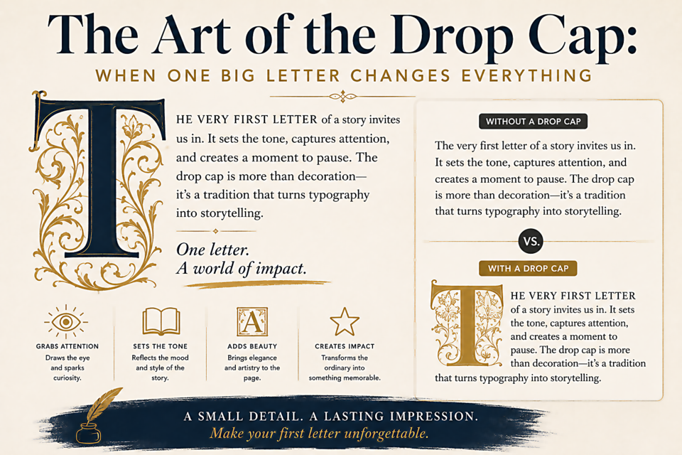
The Art of the Drop Cap: When One Big Letter Changes Everything
A Thousand Years of Drop Caps
The drop cap — an enlarged initial letter that drops below the baseline of the first line — appears in illuminated manuscripts from the 8th century. Medieval monks used them to signal the beginning of important sections, often decorating them elaborately with gold leaf and illustrated borders. The tradition passed from manuscripts into early printed books and eventually into the world of magazine and newspaper design, where it has remained a standard tool of editorial typography ever since.
Why They Work
Drop caps do several things simultaneously. They provide a visual entry point — the eye is drawn to the largest element on the page, and a drop cap gives readers a place to begin. They signal "long-form content" — a drop cap announces that what follows is worth reading carefully, not scanning. And they break up the visual monotony of a text column, adding texture and visual interest without distracting from the content itself.
Choosing the Right Font for a Drop Cap
The drop cap font can either match or contrast with the body text. Matching creates unity; contrasting creates drama. Both work — the choice depends on context.
For contrasting drop caps, display serifs work beautifully against sans-serif body text. Decorative or hand-lettered initial caps feel warm and crafted against mechanical type. The key is that the drop cap font should have visual interest at large sizes — something that rewards close inspection.
Implementing a Drop Cap in CSS
p:first-of-type::first-letter {
  float: left;
  font-size: 4em;
  font-family: 'Playfair Display', serif;
  font-weight: 700;
  line-height: 0.85;
  margin-right: 0.08em;
  margin-top: 0.05em;
}
The ::first-letter pseudo-element selects only the first letter of the paragraph, and float: left allows the text to wrap around it. The line-height and margins require tuning for each specific font — values that work perfectly for Playfair Display may need adjustment for other typefaces.
When NOT to Use Drop Caps
- In dense, information-heavy documents — drop caps signal narrative text, not reference material
- After images or pull-quotes — the drop cap should follow naturally from silence, not from another visual element
- In short articles — a drop cap on a 400-word piece feels disproportionate
- With first words that are articles or conjunctions (A, An, The, And) — these feel underwhelming as drop caps; some editors skip the initial cap and apply the effect to the next word