
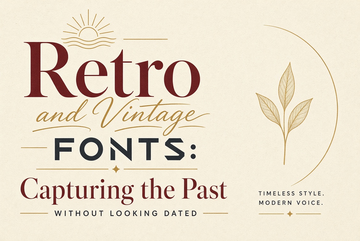
Retro and Vintage Fonts: Capturing the Past Without Looking Dated
Nostalgia is one of the most powerful forces in design. When something feels like it comes from a simpler time — or from a time that was cooler than the present — it triggers an emotional response that's hard to manufacture any other way. The challenge with retro fonts is using them to invoke an era without the design itself feeling like a museum exhibit.
Art Deco (1920s–30s Style)
Poiret One
Geometric and elegant, named after the Art Deco fashion designer Paul Poiret. Thin strokes, geometric construction, and decorative precision — it looks like it belongs on a 1920s Parisian department store. Best used in display sizes with generous letter spacing.
Josefin Sans
Inspired by Scandinavian design of the 1920s–30s, Josefin Sans has a geometric rationalism that reads immediately as "vintage modernism." The all-caps version with wide tracking is the Art Deco shorthand.
1950s–60s Americana
Boogaloo
Casual, rounded, and redolent of US diner culture and mid-century advertising. Great for food and drink brands, casual retail, and anything wanting to channel postwar American optimism.
Pacifico
Based on 1950s American scripts from Pacific Coast surf culture. Bold, confident, and instantly evocative of that specific moment when California became cool.
Alfa Slab One
Heavily influenced by the slab serifs used in 1950s US magazine advertising — big, bold, and completely of its era. Excellent for packaging, poster design, and editorial headlines.
1970s Groovy
Righteous
Wide, rounded, and slightly retro in a distinctly 1970s way. The width and circular forms recall the typographic excesses of the disco era without fully committing to parody.
Weathered and Worn
Oswald
Originally a clean condensed font, Oswald combined with subtle texture treatments in Photoshop or Illustrator creates a believable weathered effect for print applications.
Rye
A Western-style font with built-in decorative elements that recall 19th century American wood type. For whiskey brands, steakhouses, and anything leaning into frontier Americana.
Using Retro Fonts Without Looking Dated
The trick is pairing. A vintage display font works in a contemporary design when paired with a clean, modern sans-serif for supporting text. The contrast signals intentional choice rather than ignorance. Vintage fonts paired with other vintage elements without any modern counterweight read as pastiche rather than homage.
Also: restraint. One vintage element per design, used for a single purpose, speaks confidently. Three vintage elements fighting for attention look like a flea market.