
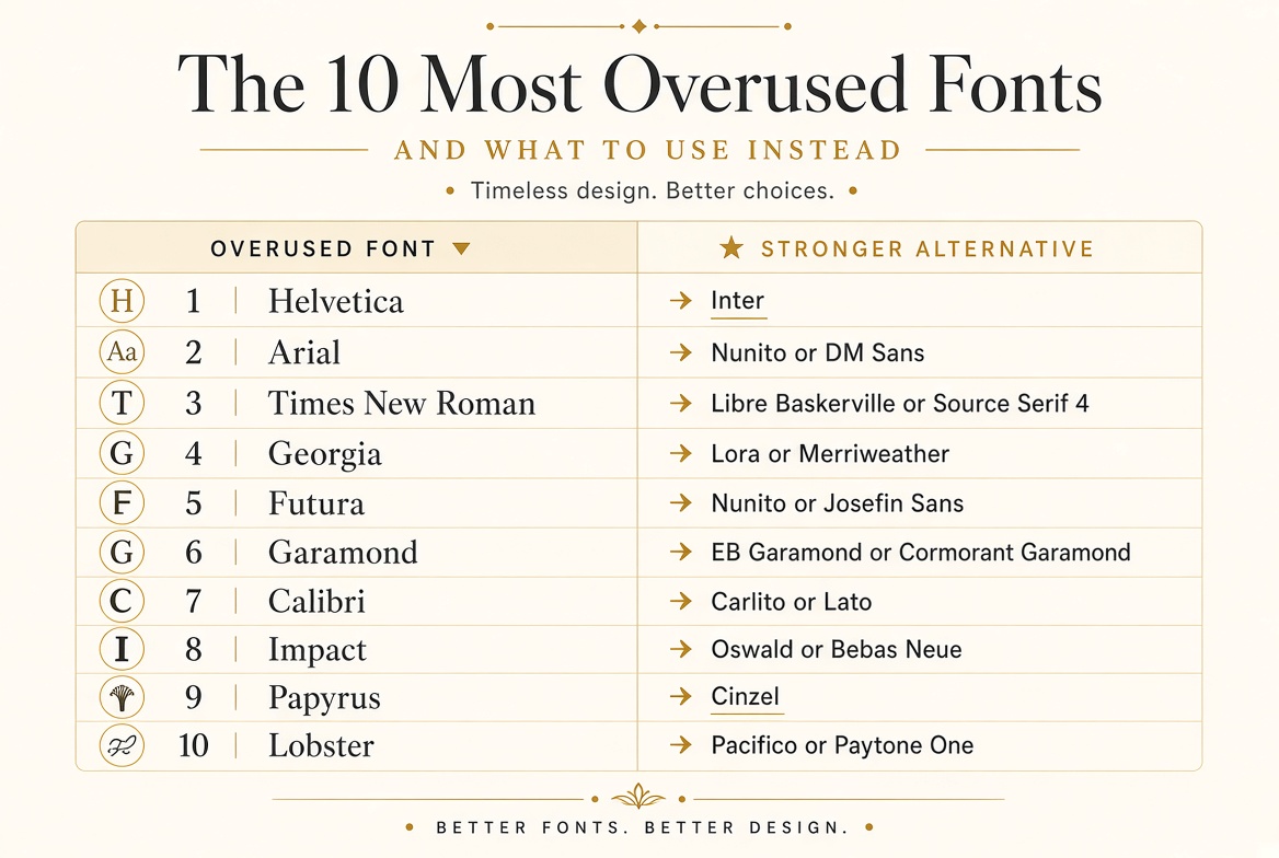
The 10 Most Overused Fonts (And What to Use Instead)
1. Helvetica → Try: Inter
Helvetica is beautiful, but it's also what every major corporation, wayfinding system, and generic corporate document defaults to. Inter was designed specifically for digital screens and offers a cleaner, more legible alternative with better OpenType features and a free license.
2. Arial → Try: Nunito or DM Sans
Arial was designed as a metrically identical free alternative to Helvetica and carries none of Helvetica's intentional design quality. Nunito adds warmth; DM Sans adds precision. Either is a meaningful upgrade.
3. Times New Roman → Try: Libre Baskerville or Source Serif 4
Times was designed in 1931 for newspaper printing and optimized for that context. For modern digital reading, Libre Baskerville and Source Serif 4 share its authority but are designed from the ground up for screens.
4. Georgia → Try: Lora or Merriweather
Georgia is excellent — but it's the default serif on millions of websites. Lora and Merriweather share its readability advantages while giving your work a distinct identity.
5. Futura → Try: Nunito or Josefin Sans
Futura is expensive and widely used by major brands, which makes it feel less distinctive as a choice. Josefin Sans captures Futura's geometric spirit for free. Nunito adds friendlier, rounder terminals.
6. Garamond → Try: EB Garamond or Cormorant Garamond
If you love Garamond's classical elegance, the open-source alternatives are actually better for modern use. Cormorant Garamond in particular is one of the most beautiful free fonts available.
7. Calibri → Try: Carlito (identical metrics!) or Lato
Calibri became Microsoft's default in 2007 and is now a signal of minimum-effort documents. Carlito is metrically identical (perfect for shared documents) but less recognizable. Lato is slightly more distinctive.
8. Impact → Try: Oswald or Bebas Neue
Impact is the original meme font. Oswald and Bebas Neue provide the same condensed punch without the cultural baggage, and both look dramatically more considered.
9. Papyrus → Try: Cinzel or Trajan Pro alternatives
Papyrus appears on approximately half of all spa and wellness brand materials. Cinzel uses actual ancient Roman letterforms — far more sophisticated and still clearly evocative of antiquity.
10. Lobster → Try: Pacifico or Paytone One
Lobster was everywhere from 2010 to 2015. It now reads as dated. Pacifico captures similar retro-script energy with a slightly different character. Paytone One gives you bold personality without the script approach.