
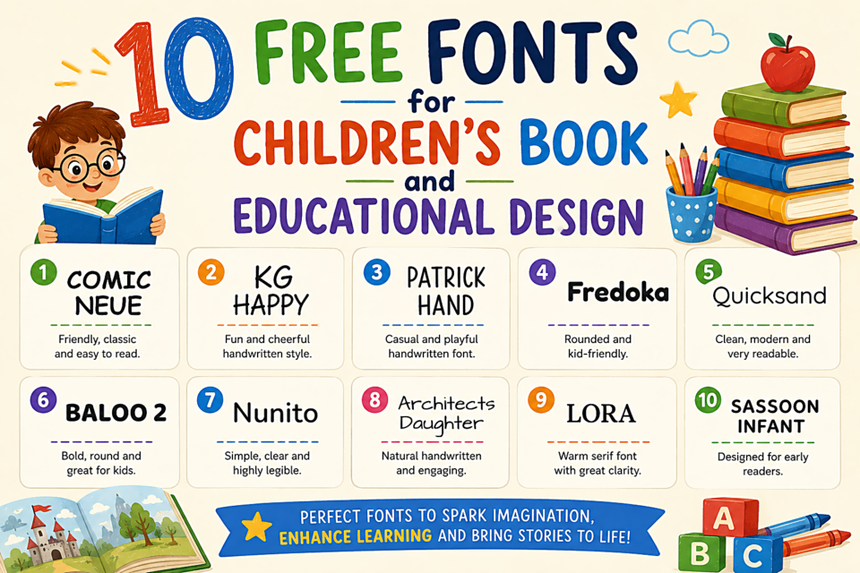
10 Free Fonts for Children's Book and Educational Design
Typography for children isn't just about looking friendly — it's about supporting early readers who are still learning to recognize letterforms. The wrong font can make it harder for children to distinguish similar letters, which has real implications for reading development.
What Makes a Font Good for Children?
- Clear, single-story "a" and "g" — young readers often confuse the double-story a and g (the kind in most books) with other letters. Single-story versions look like handwriting and match what children are taught to write
- Generous x-height — larger lowercase letters are easier to read
- Wide letter spacing — prevents letters from blurring together
- Distinct letterforms — b, d, p, q should all look clearly different
- Friendly, rounded aesthetic — conveys approachability and warmth
The Top Picks
1. Nunito
Rounded terminals on every letterform create warmth without sacrificing legibility. Available in multiple weights, making it versatile across headings and body text. One of the most reliably friendly fonts available.
2. Quicksand
Light, rounded, and unintimidating. Its relatively thin strokes feel like something a skilled illustrator might letter by hand. Best used at medium sizes — the thin strokes can disappear in very small text.
3. Patrick Hand
Designed to look like careful, clear handwriting. It bridges the gap between the formal type in books and the handwriting children are practicing — making reading feel connected to their own writing practice.
4. Baloo 2
Playful, rounded, and warm. Baloo 2 has an appealing energy without being chaotic. Available in five weights, making it genuinely versatile. Originally designed for Devanagari script and Latin simultaneously — excellent multilingual support.
5. Fredoka One
Bold, rounded, and clearly designed for a young audience. Best for headings, titles, and short display text — the single weight limits its use for body copy.
6. Varela Round
A geometric sans-serif with fully rounded terminals. Its geometric structure provides visual order; the rounded details provide warmth. Clean enough for older children's content, friendly enough for younger readers.
7. Poppins
A geometric sans-serif that works as well for educational materials as it does for professional design. Available in 18 styles, which makes it the most versatile option on this list. The medium and semibold weights are especially clear for reading.
8. Titan One
Bold, chunky, and unmistakably designed to make words feel exciting. Excellent for chapter titles, book covers, and any context where the text itself needs to feel like a visual event.
9. Schoolbell
A font specifically designed to simulate clean classroom handwriting. Immediately recognizable as educational without being childish. Perfect for worksheet headers and classroom display materials.
10. Andika
Designed by SIL International specifically for literacy and basic reading programs. Single-story a and g, clear letter discrimination, and excellent character set for multiple languages. Purpose-built for exactly this use case.