
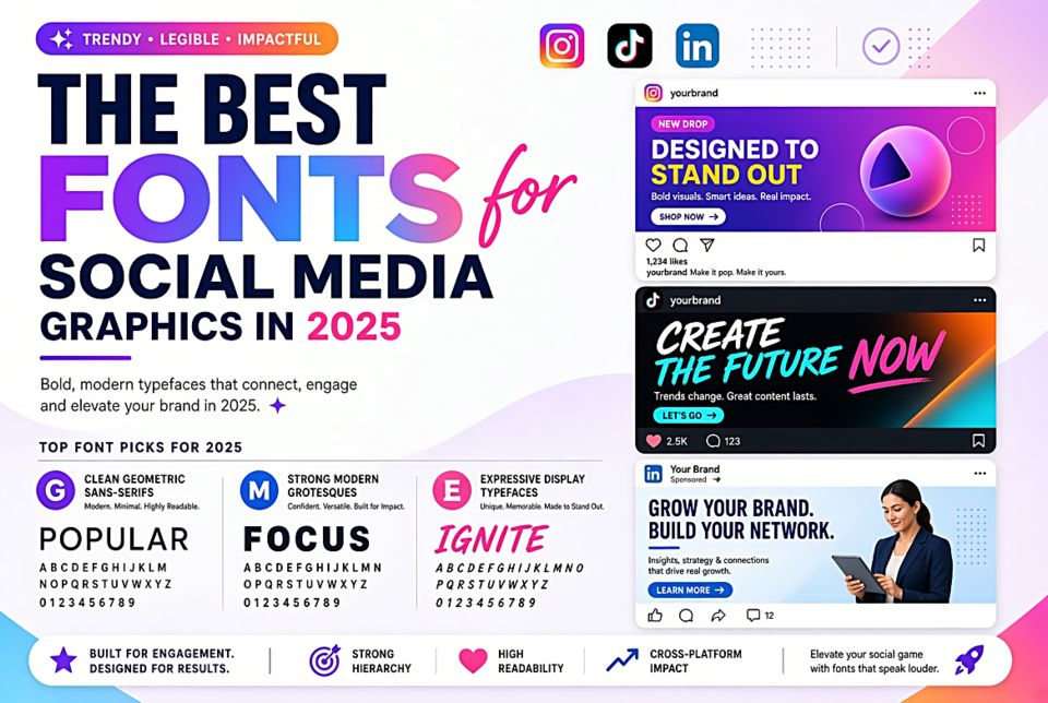
The Best Fonts for Social Media Graphics in 2025
What Social Media Typography Needs
Social media graphics are consumed in a fraction of a second — a thumbnail on a phone screen, scrolled past in a feed. The typography has roughly 300 milliseconds to register before the user has moved on. This demands fonts that are: immediately legible at small sizes, visually distinctive enough to stop the scroll, and appropriate for the brand's voice.
For Instagram — Bold and Visual
Bebas Neue
All-caps condensed ultra-bold. Impossible to miss on any background. Used by fitness brands, sports accounts, and lifestyle influencers worldwide. The universal language of "look at this right now."
Playfair Display Black
For fashion, beauty, and lifestyle brands that want impact with elegance. The Black weight at large display sizes is dramatic and unmissable while retaining refinement.
Pacifico
For food, travel, and lifestyle content with a warm, personal feel. Pacifico's bold brush script reads as handcrafted and authentic — qualities that perform well in feeds full of polished, corporate content.
For LinkedIn — Professional but Not Boring
Montserrat Bold
The professional's workhorse for thought leadership content. Geometric, clean, and confident without feeling corporate-generic. Works beautifully with white space for quote graphics and key statistics.
Raleway ExtraBold
More distinctive than Montserrat while maintaining professional credibility. The slightly unusual letterforms make text feel authored and considered.
For Pinterest — Readable and Aspirational
Lora
Pinterest users spend more time reading than most social media audiences. Lora's warmth and readability serve long-form recipe names, how-to headlines, and inspirational quotes well.
Josefin Sans Light
The all-caps light weight has a minimalist, aspirational quality that performs exceptionally well on Pinterest home decor, wedding, and fashion boards.
For YouTube Thumbnails — Maximum Impact
Anton
Designed specifically for web use and legibility at small sizes. Anton in a thumbnail image survives compression and small rendering sizes better than most fonts — critical when viewers see a 180×100px preview.
Black Han Sans
Ultra-heavy weight sans-serif with maximum visual weight. For thumbnails where competition is fierce and the stakes of not being clicked are high.
General Principles for Social Media Type
- Never use more than two fonts per graphic
- Ensure text is legible against the background — add a subtle shadow, overlay, or background block if needed
- Keep body text rare — social media audiences read headlines, not paragraphs
- Test at actual thumbnail/preview sizes, not at full resolution