
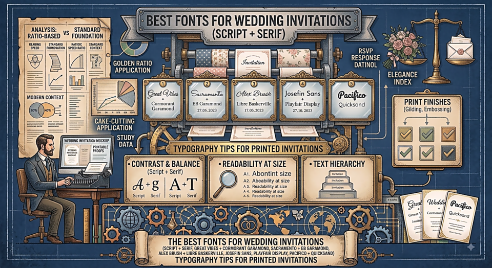
Best Fonts for Wedding Invitations
Your wedding invitation is often the first tangible thing guests receive, and it sets the tone for everything that follows. The typography choice communicates — before a single word is read — whether your event is formal or relaxed, classic or contemporary, intimate or grand.
The Classic Approach: Script + Serif
The timeless combination: an elegant flowing script for names and key details, paired with a refined serif for the body text. This contrast creates immediate visual hierarchy while maintaining a cohesive formal feel.
Great Vibes + Cormorant Garamond
Great Vibes brings calligraphic flourish to names and the date; Cormorant Garamond handles the details with aristocratic restraint. The pairing feels like a Jane Austen novel come to life.
Sacramento + EB Garamond
Sacramento is perhaps the most delicate script available — gossamer-thin strokes and flowing connections. At large sizes for the couple's names, it's breathtaking. EB Garamond provides sturdy, readable support for venue and time information.
Alex Brush + Libre Baskerville
For invitations that need to work in print (where hairline scripts can fail), Alex Brush is slightly heavier than Sacramento while retaining elegance. Libre Baskerville is reliable and warm.
The Modern Approach: Clean and Minimal
Contemporary couples often prefer invitations that feel like design objects rather than traditional cards. For these, ditch the script and lean into geometric or humanist sans-serifs with intentional whitespace.
Josefin Sans
Geometric, elegant, and naturally uppercase. All caps with generous letter spacing creates an ultra-modern invitation feel. Works beautifully with minimalist design and architectural or industrial venues.
Playfair Display
When you want to be modern but not sterile, Playfair Display's high-contrast letterforms bring warmth and drama without resorting to script. The bold italic weight as a display element is especially striking.
The Romantic Boho Approach
For garden weddings, barn venues, and couples who want warmth and organic texture:
Pacifico + Quicksand
Pacifico's bold brush strokes feel handmade and joyful. Quicksand in its light weight provides a gentle, friendly companion that doesn't compete.
Typography Tips for Printed Invitations
- Script fonts with hairline strokes can fail in low-quality printing — test with your printer first
- Body text should be no smaller than 10pt for comfortable reading
- Use maximum two fonts — one for display, one for body
- Increase letter spacing (tracking) on all-caps elements — it feels more refined
- Dark ink on cream or ivory paper is more elegant than stark black-on-white